 JabKit
component
Button
A semantic, accessible action button with primary, secondary, ghost, and destructive treatments.
28 results
Component catalogue
1–24 of 28
component
A semantic, accessible action button with primary, secondary, ghost, and destructive treatments.
component
A compact rounded-md CTA with a chart-token indigo-to-pink wash that brightens on hover.

component
A compact analytics card with a token gradient rim, two stats, a seven-bar spark, and a local-radius details action.
component
A 6px-rounded outline CTA whose circular fill sweeps in from the far corner on hover.
component
Pill Explore/CTA control whose label and arrow slide on hover, matching the Mugsys Mugs shopping layout.

block
Slim launch bar with clipped primary blooms, a small-radius glass CTA, and a dismiss control.
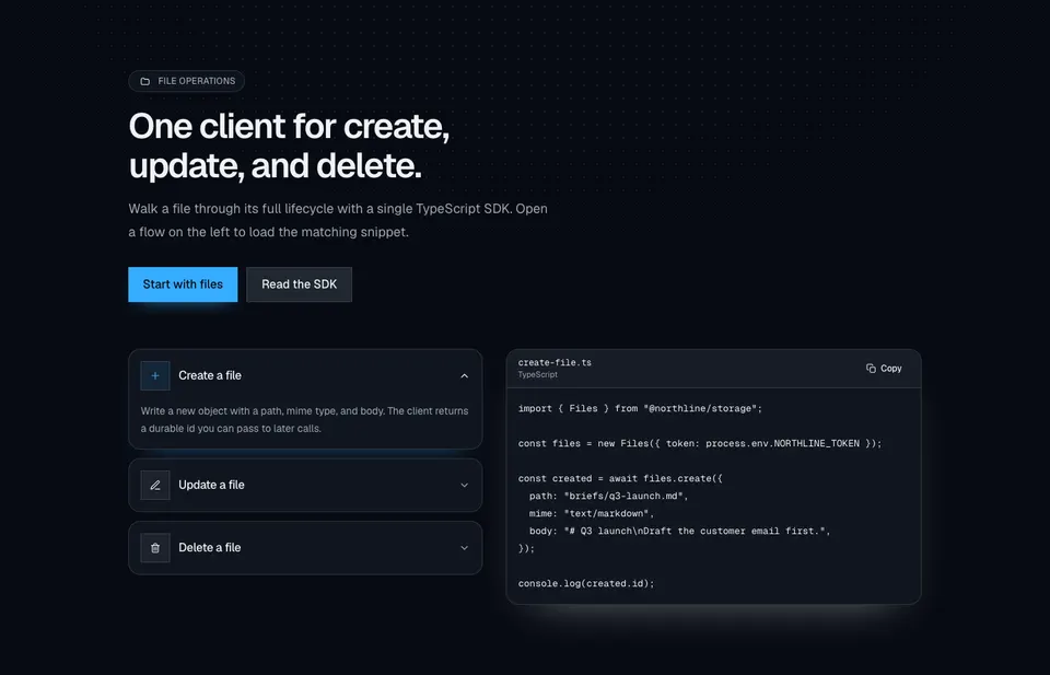
block
File-ops marketing section with a dotted radial wash, dual CTAs, accordion rows for create/update/delete, and a synced TypeScript snippet with copy.
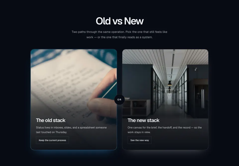
block
Centered old-versus-new marketing compare with two tall photo cards, bottom scrims, outline actions, and a circular OR chip in the gutter.
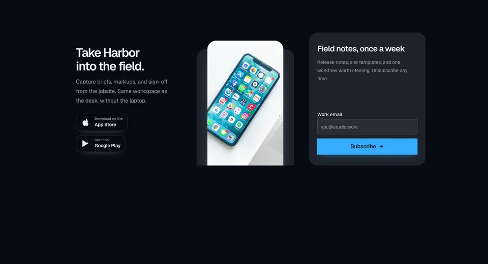
block
Marketing CTA with a dark app-download panel, store badges, overlapping phone imagery, and a muted newsletter form in a three-column grid.
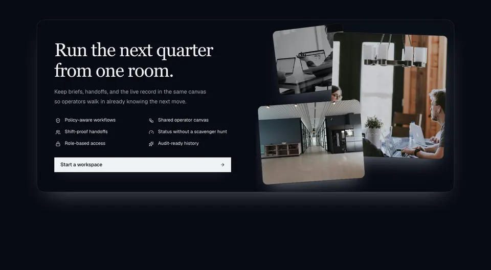
block
Dark enterprise CTA with a serif headline, two-column icon capability grid, wide action, and a layered photo collage on extra-wide layouts.

block
Full-viewport fashion hero with synced autoplay campaign slides and a product thumbnail rail.
block
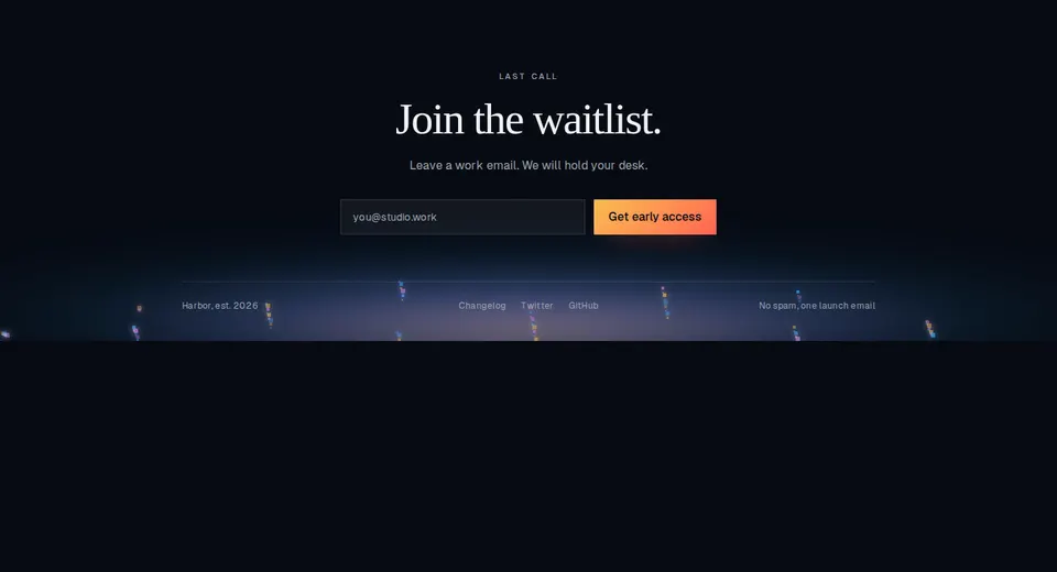
Animated ember footer with a waitlist form, dark radial canvas bed, slim link row, and success transition.
block
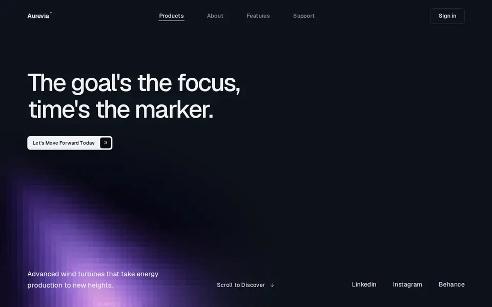
Full-bleed dark energy hero with a bottom-left lattice plate, left-aligned headline, rounded-lg CTA with inset arrow, and a footer of copy, scroll cue, and social links.

block
Full-bleed cinematic hero with a glowing curtain plate, italic wordmark, square metal CTAs, word-staggered headline, and a trusted-by logo row.

block
Full-bleed sunflower-field hero with a floating pill nav, serif headline, glass demo CTA, and a circular play control.

block
Full-bleed aviation hero with a sunset window plate, staggered title lines, squared CTAs, and two feature highlights.

block
Full-bleed retreat hero with a painterly landscape, pill nav CTA, italic emphasis headline, glass search field, and press wordmarks.

block
Cinematic marketing hero with a framed looping video panel, bottom-left offer, a light header, and a logo marquee.
block
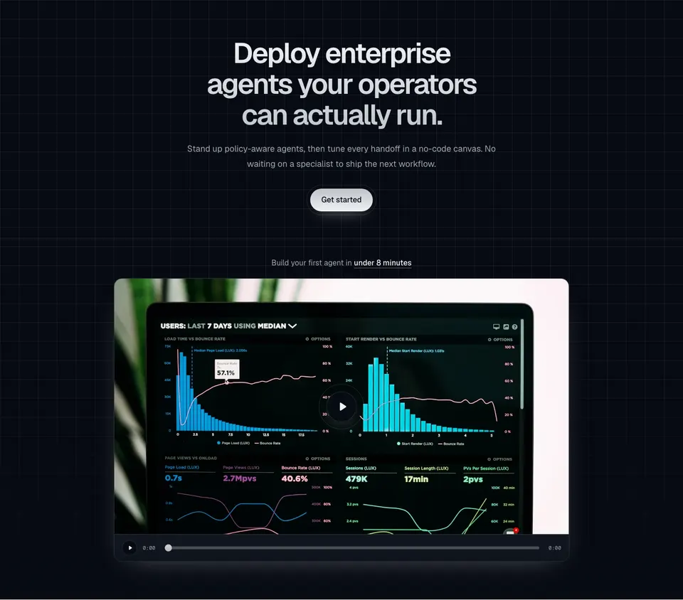
Centered AI-agents hero on a square grid wash, with a gradient headline, metallic get-started pill, and a framed video teaser that exposes a play bar and optional presentation embed.

block
Centered marketing hero with a pill kicker, dual pill CTAs, an auto-scrolling logo ticker, and an autoplay filmstrip of raised image cards.

block
Split marketing hero with left-aligned copy and dual CTAs, a faded logo marquee, and a 3D coverflow of portrait cards.
block
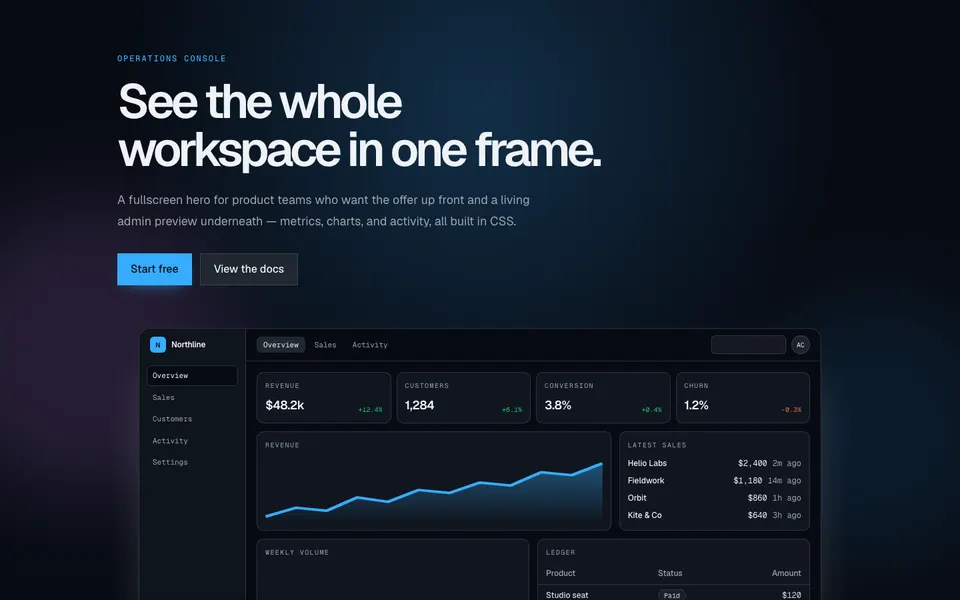
Fullscreen marketing hero with an oversized headline, paired CTAs, and a CSS-built admin dashboard that tilts in a 3D perspective scene.
block
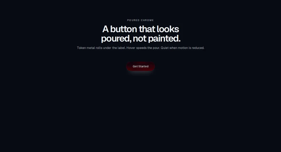
Marketing CTA block with a liquid-metal pill, token chrome field, glowing rim, and hover pour. Still when motion is reduced.
block
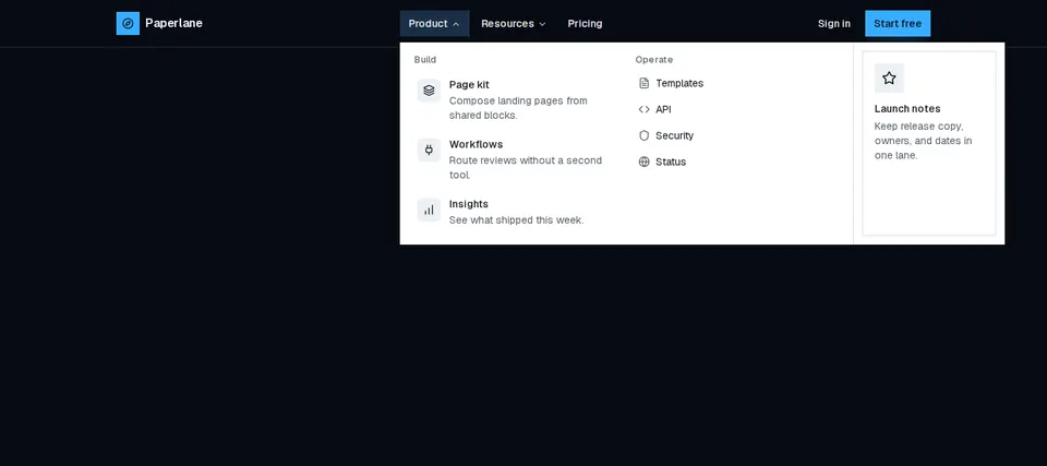
Marketing header with animated desktop mega menus, a primary CTA, and a slide-in overlay for small screens.