
atoms
Avatar
Accessible Avatar primitive adapted from shadcn/ui.

atoms
AvatarBorder
Identity avatar wrapped in a token-colored conic ring that can spin or stay still.

atoms
Badge
Accessible Badge primitive adapted from shadcn/ui.
atoms
Button
A semantic, accessible action button with primary, secondary, ghost, and destructive treatments.
atoms
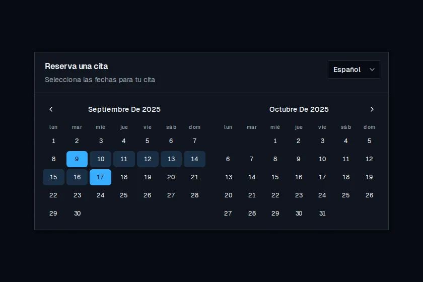
CalendarWithLocalisation
Two-month appointment calendar with a language switcher that localizes copy, weekdays, and month titles.

atoms
Checkbox
Accessible Checkbox primitive adapted from shadcn/ui.

atoms
Dialog
Accessible modal dialog with trigger, overlay, header, description, and footer composed on Base UI.
atoms
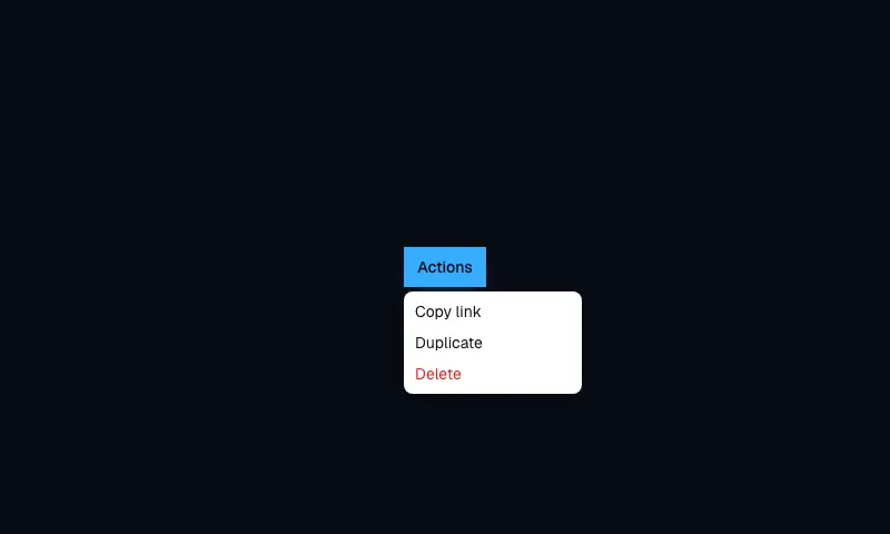
DropdownMenu
Accessible DropdownMenu primitive adapted from shadcn/ui.
atoms
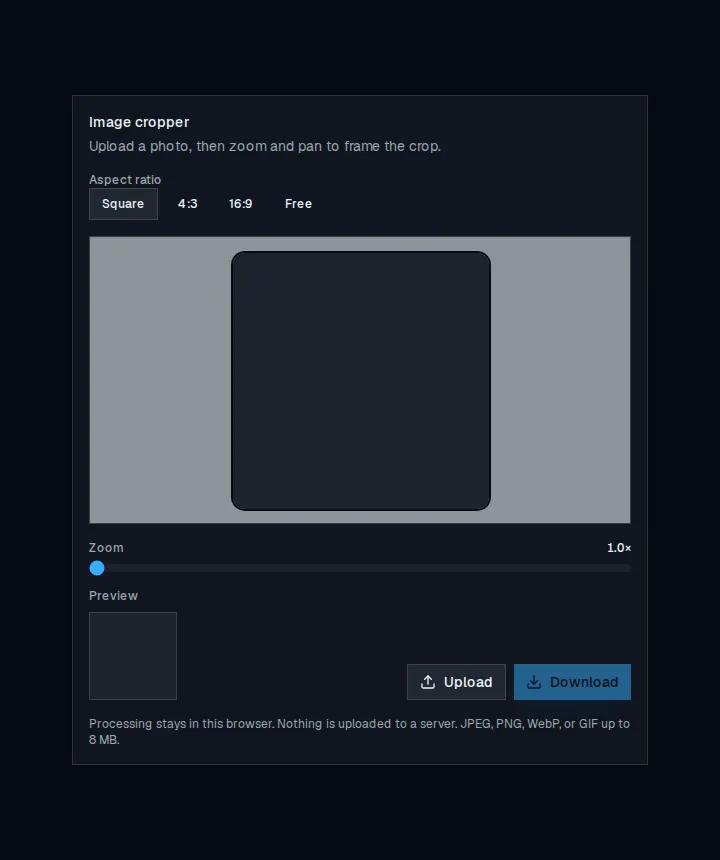
ImageCropper
Upload a photo, zoom and pan to frame a crop, then preview and download the result.
atoms
Input
Accessible Input primitive adapted from shadcn/ui.
atoms
Label
Accessible Label primitive adapted from shadcn/ui.
atoms
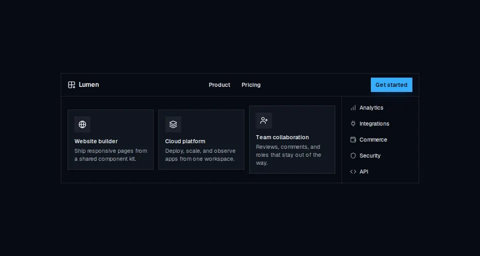
NavigationMenu
Accessible site navigation with desktop mega menus, compact link lists, and a mobile disclosure drawer.
atoms
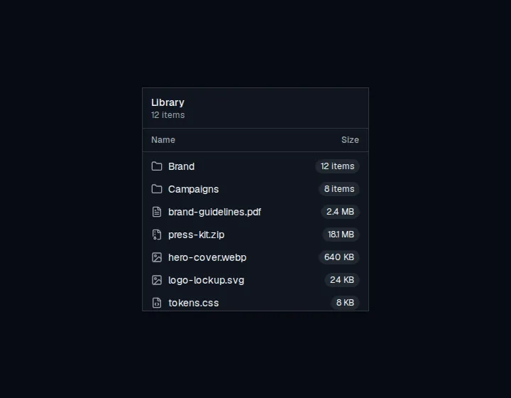
ScrollArea
A focusable overflow region with token-styled scrollbars for clipped lists and panels.
atoms
Separator
Accessible Separator primitive adapted from shadcn/ui.

atoms
Skeleton
Accessible Skeleton primitive adapted from shadcn/ui.
atoms
Switch
Accessible Switch primitive adapted from shadcn/ui.
atoms
Textarea
Accessible Textarea primitive adapted from shadcn/ui.
atoms
Toast
Temporary status messages with stacking, swipe dismiss, actions, and success, info, warning, and error types.
atoms
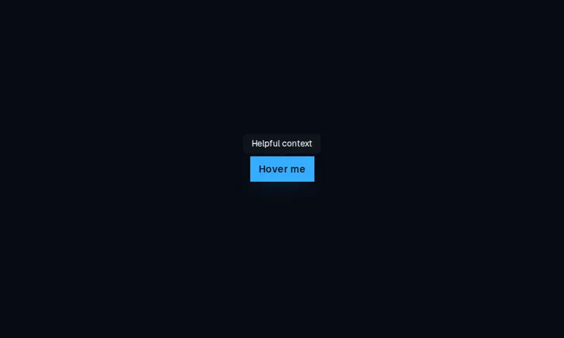
Tooltip
Accessible Tooltip primitive adapted from shadcn/ui.
marketing
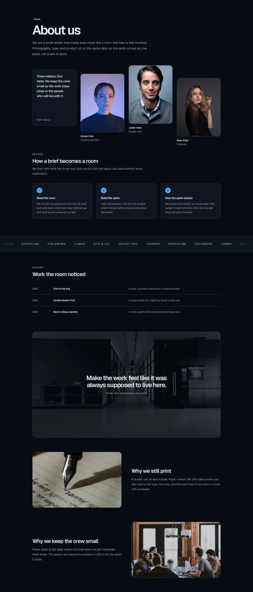
About11
Creative-studio about block with staggered team photos, a process grid, logo marquee, honors table, quote overlay, and two motivation plates.
marketing
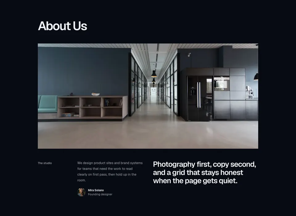
About14
Six-column about block with a large headline, full-width hero image, labeled intro, inline avatar profile, and a philosophy statement.
marketing
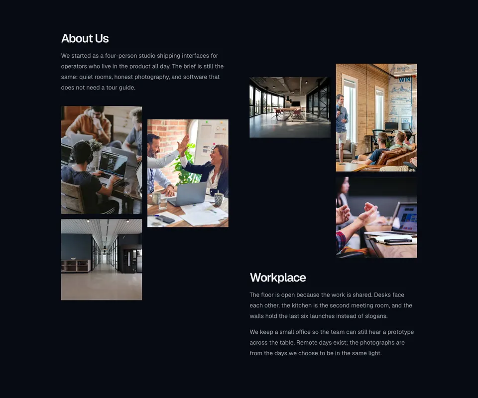
About6
Two-column about section with story copy, a staggered workplace photo grid, and an offset second column of images and paragraphs.
marketing
About8
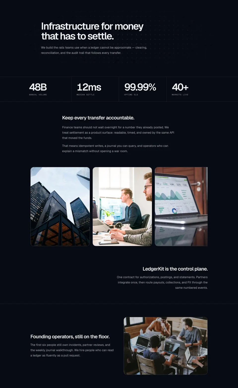
Fintech about section with a plus-sign field, bordered stats, mission copy, a snap image carousel, a right-aligned product note, and a founding-team plate.
marketing
Awards6
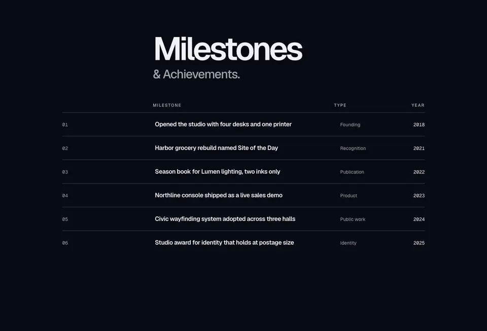
Milestones ledger with a display heading, labeled columns, and separator rows for title, type, and year.
marketing
Bento19
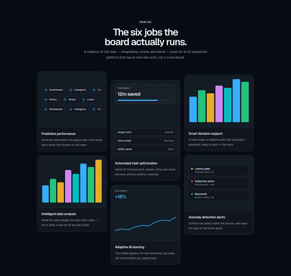
Three-column masonry bento of six bordered cards with integration pills, compact charts, and AI ops illustrations.
marketing
CarouselCards
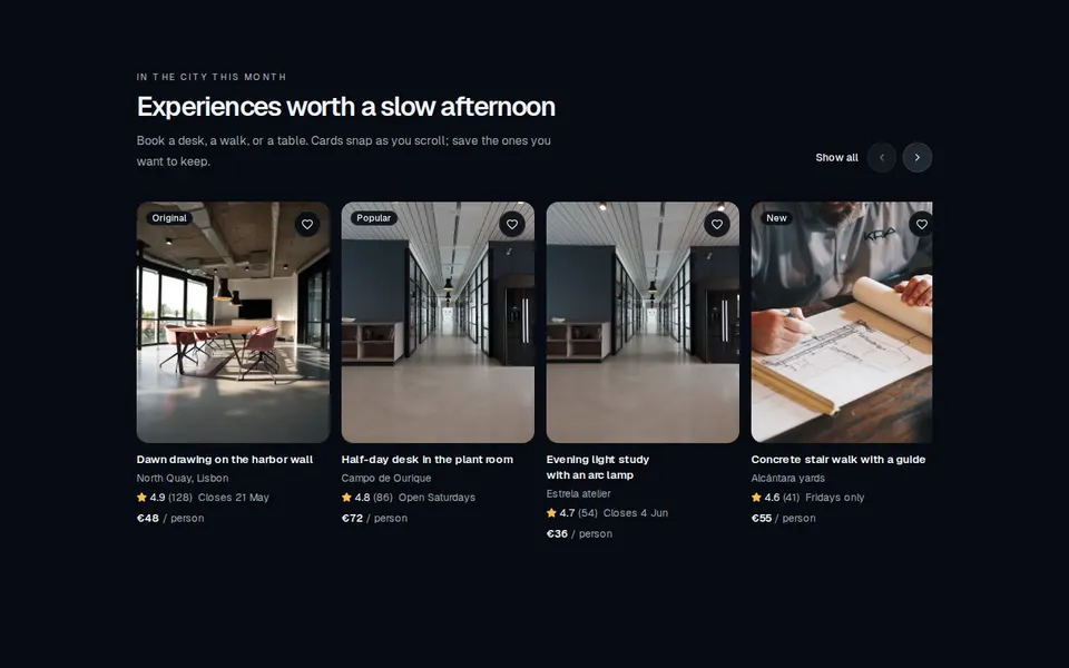
Horizontally scrollable marketing rail of listing cards with image, rating, price, and a favorite control.
marketing
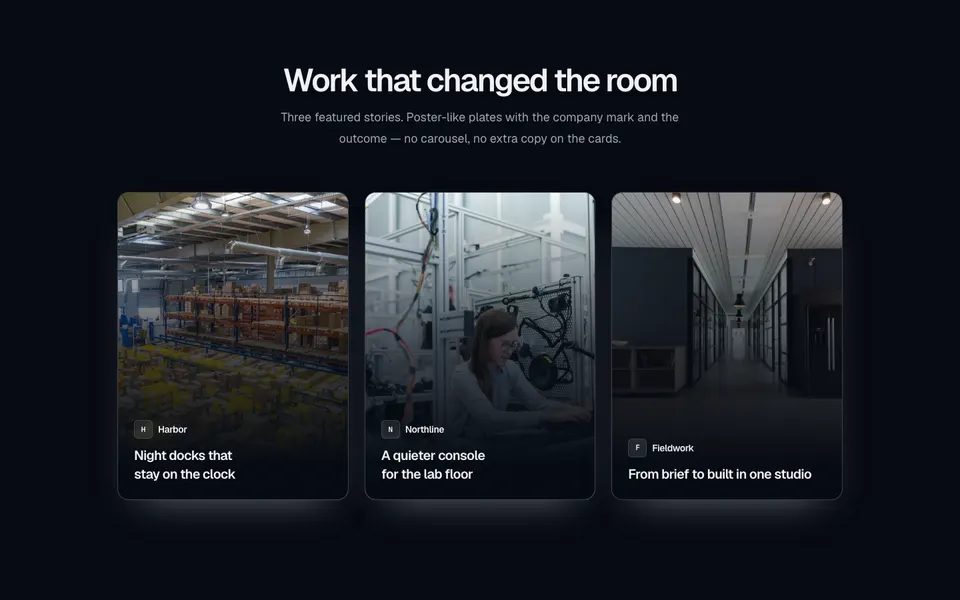
CaseStudies11
Centered case-study section with a three-column grid of portrait poster cards — full-bleed photography, a bottom gradient, company mark, and title.
marketing
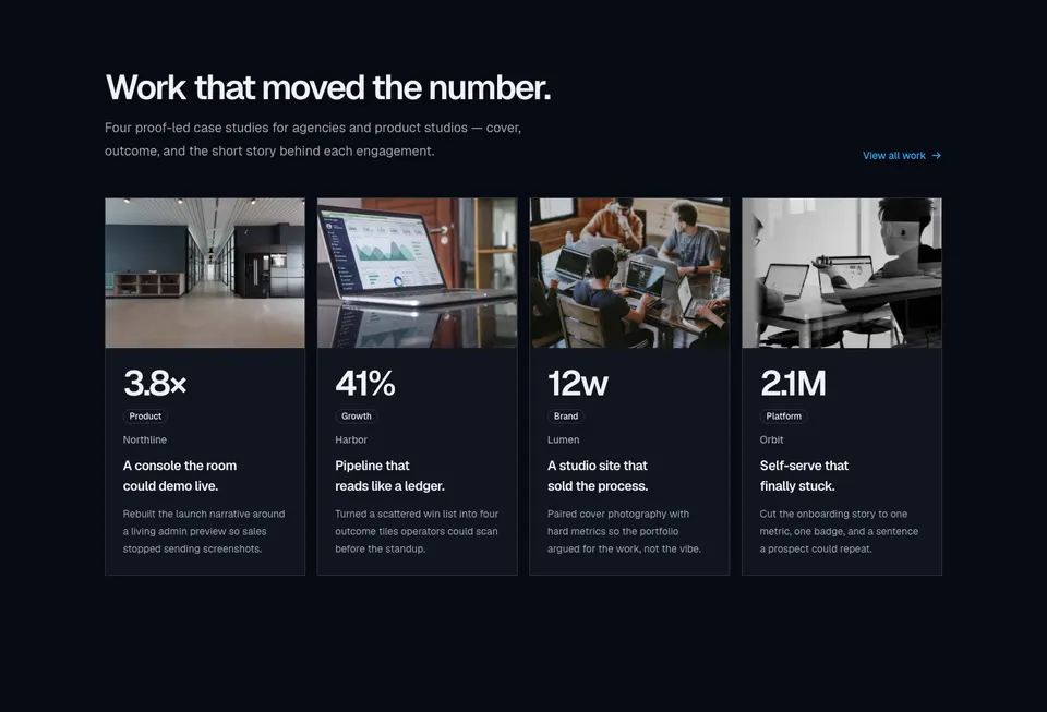
CaseStudies13
Four-column case-study grid with cover photographs, large outcome metrics, category badges, and short client stories.
marketing
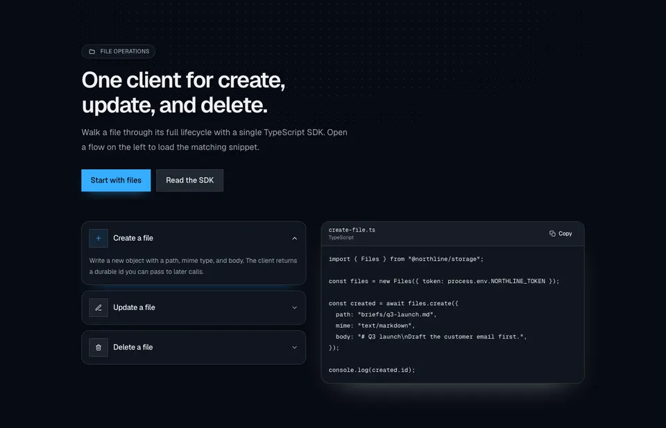
CodeExample14
File-ops marketing section with a dotted radial wash, dual CTAs, accordion rows for create/update/delete, and a synced TypeScript snippet with copy.
marketing
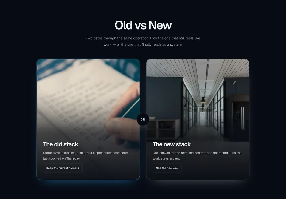
Compare5
Centered old-versus-new marketing compare with two tall photo cards, bottom scrims, outline actions, and a circular OR chip in the gutter.
marketing
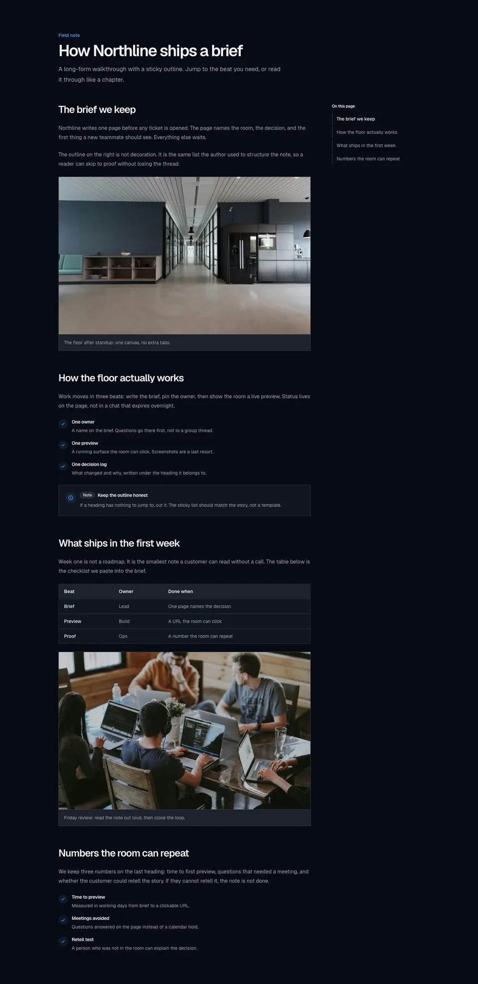
Content1
Long-form marketing article with a sticky in-page outline, scroll-linked active sections, and rich body blocks for images, lists, tables, and callouts.
marketing
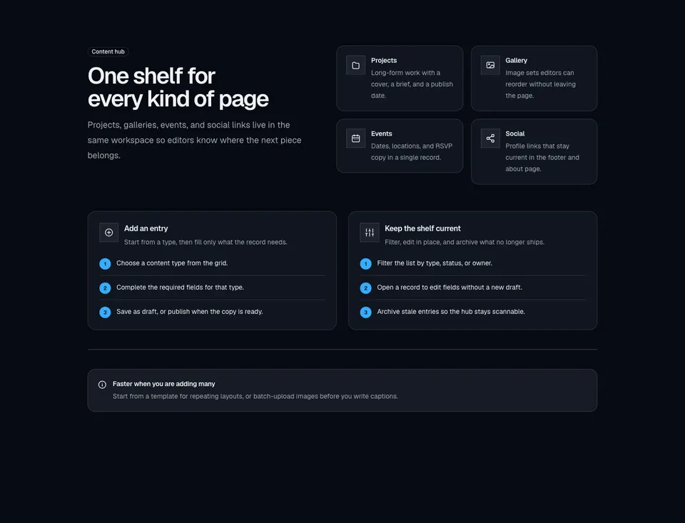
Content2
Content-hub explainer with a labeled intro, icon type grid, create and manage how-to panels, and an inline tip alert.
marketing
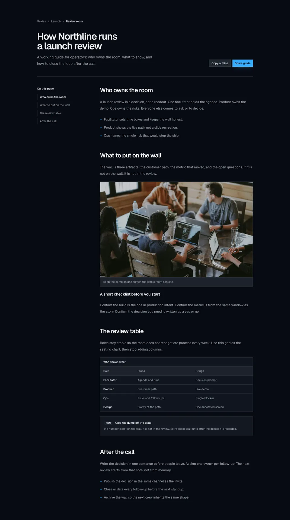
Content3
Knowledge-style marketing article with breadcrumbs, headline actions, a sticky topic rail, inline figures, a data table, and a callout.
marketing
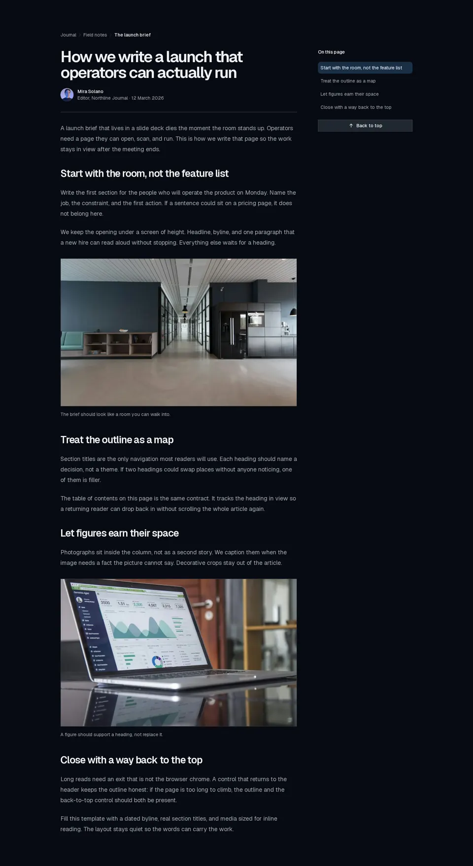
Content4
Publication-style long read with breadcrumbs, author byline, inline figures, a scroll-aware table of contents, and a back-to-top control.
marketing
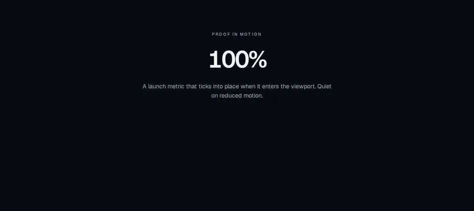
CountUp
Marketing proof figure that counts from a start value to a target when it enters view, honoring prefers-reduced-motion.
marketing
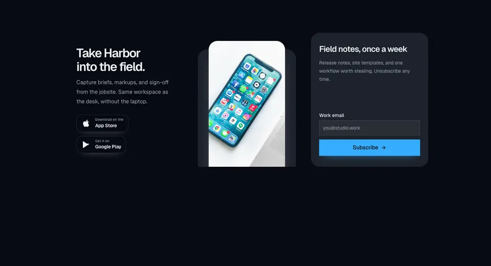
Cta22
Marketing CTA with a dark app-download panel, store badges, overlapping phone imagery, and a muted newsletter form in a three-column grid.
marketing
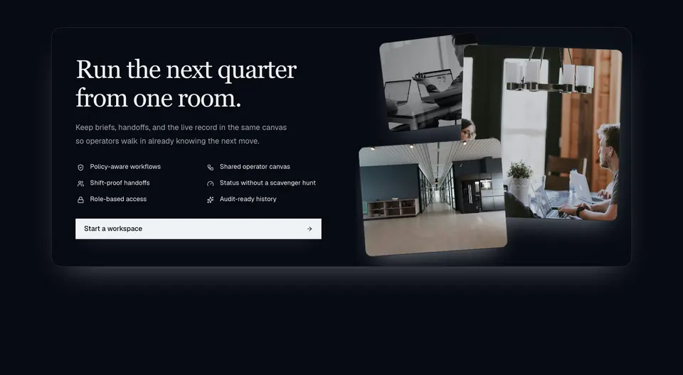
Cta28
Dark enterprise CTA with a serif headline, two-column icon capability grid, wide action, and a layered photo collage on extra-wide layouts.
marketing
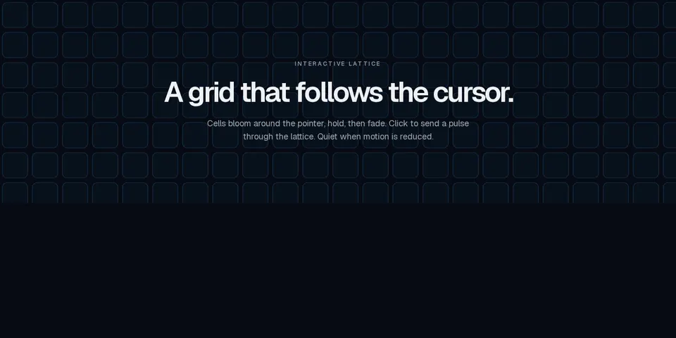
CursorGrid
Marketing canvas lattice that lights cells around the cursor with configurable falloff and click pulses, honoring prefers-reduced-motion.

marketing
EcommerceHero8
Full-viewport fashion hero with synced autoplay campaign slides and a product thumbnail rail.
marketing
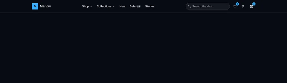
EcommerceNavbar2
Dense storefront header with nested dropdowns, a mega shop panel, search, wishlist and cart badges, account menu, and an accordion mobile sheet.
marketing
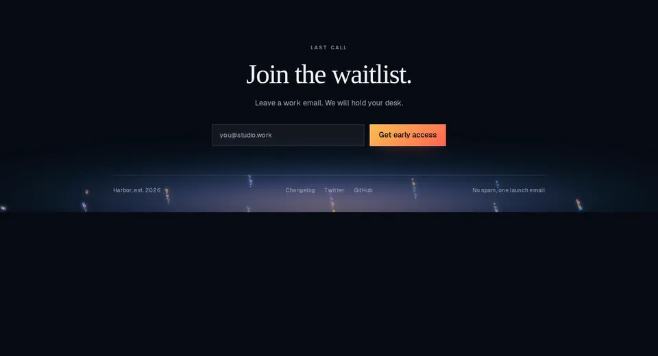
EmberFooterCta
Closing marketing footer with a waitlist form, serif headline, slim link row, and a token-based ember bed along the baseline.

marketing
FallingText
Marketing headline whose words fall with a physics-like tumble on click, hover, auto, or scroll, with semantic highlights and a static reduced-motion reading.
marketing
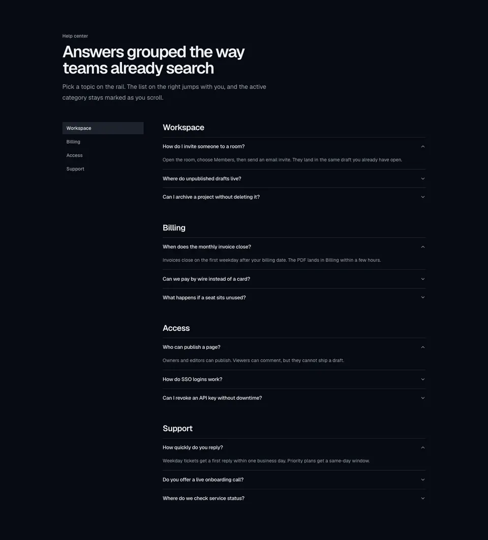
Faq12
Documentation-style FAQ with a category sidebar, per-topic accordions, and scroll-synced active highlighting.
marketing
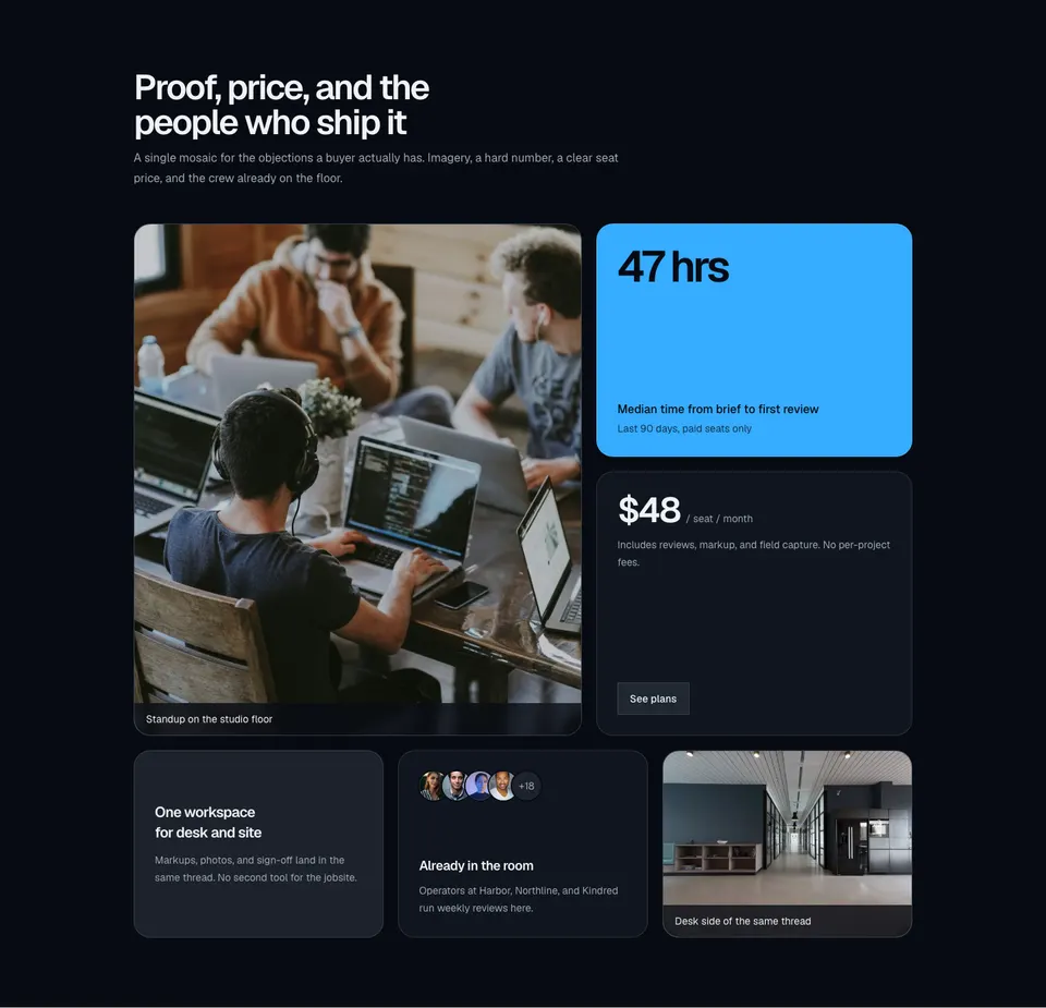
Feature261
Marketing bento mosaic mixing a tall photo, a stat callout, a pricing tile, a short promo, an avatar cluster, and a supporting image.
marketing
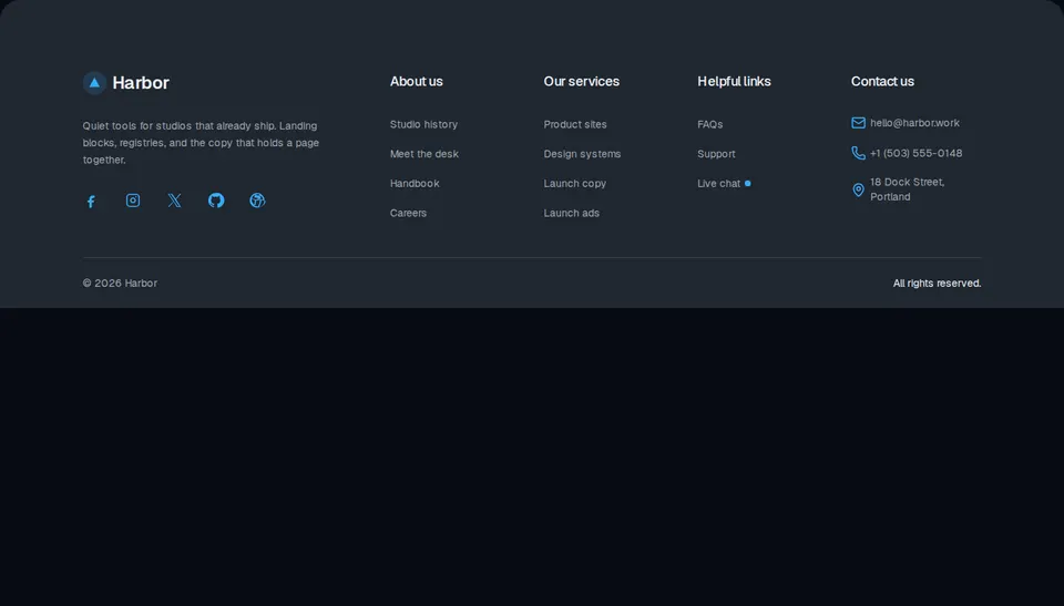
FooterColumn
Site footer with a brand column, about and service links, a live-help row, contact details, and a legal bar.
marketing
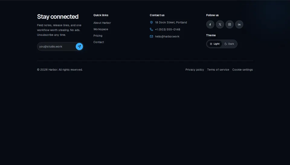
FooterSection
Site footer with a newsletter field, quick links, contact details, social marks, a light/dark toggle, and a legal row.
marketing
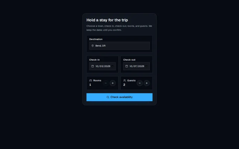
Form
Compact stay-booking card with destination, check-in and check-out dates, room and guest steppers, and a search CTA.
marketing
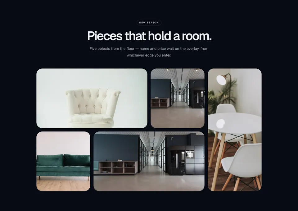
Gallery31
Product bento gallery with a centered kicker, five image tiles, and direction-aware hover overlays for name and price.
marketing
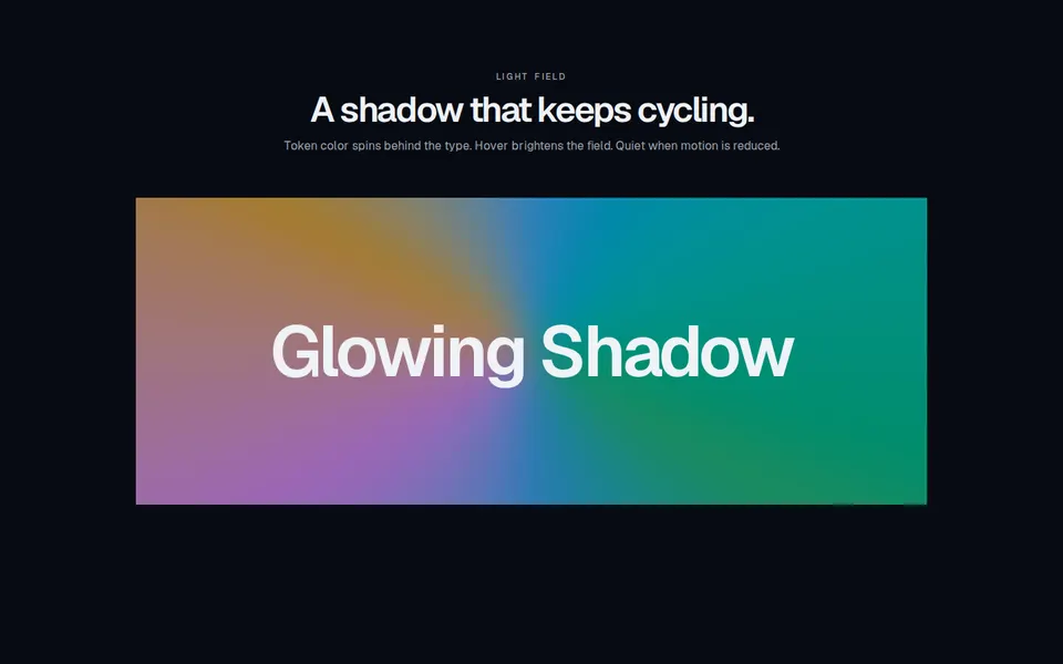
GlowingShadow
Marketing block with a rotating, color-cycling token glow behind display type. Hover brightens blur, opacity, and scale.

marketing
HeroSection5
Cinematic marketing hero with a framed looping video panel, bottom-left offer, a light header, and a logo marquee.
marketing
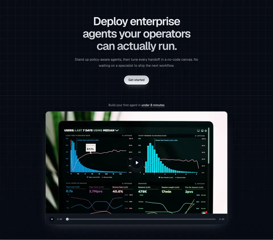
Hero146
Centered AI-agents hero on a square grid wash, with a gradient headline, metallic get-started pill, and a framed video teaser that exposes a play bar and optional presentation embed.

marketing
Hero228
Centered marketing hero with a mixed serif headline, muted supporting copy, and an autoplay fan carousel of portraits with animated tick bars and name crossfades.

marketing
Hero230
Centered marketing hero with a pill kicker, dual pill CTAs, an auto-scrolling logo ticker, and an autoplay filmstrip of raised image cards.

marketing
Hero231
Split marketing hero with left-aligned copy and dual CTAs, a faded logo marquee, and a 3D coverflow of portrait cards.
marketing
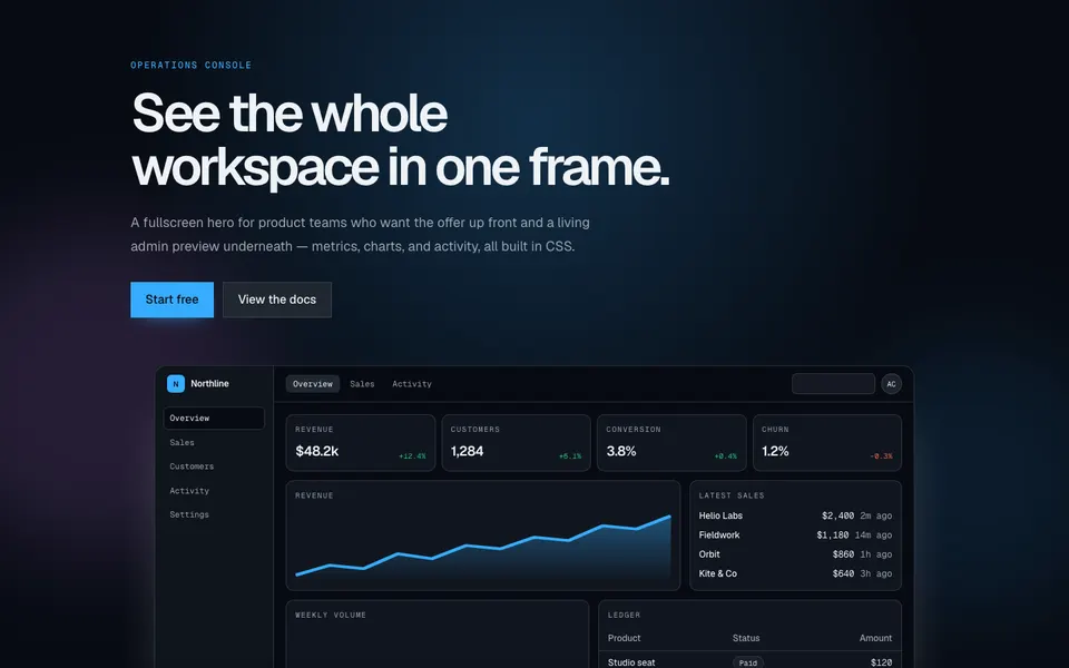
Hero307
Fullscreen marketing hero with an oversized headline, paired CTAs, and a CSS-built admin dashboard that tilts in a 3D perspective scene.
marketing
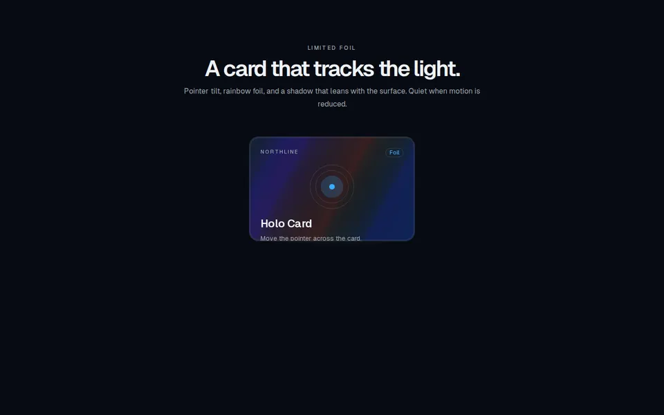
HoloCard
Marketing block with holographic trading cards: pointer-driven 3D tilt, token rainbow foil, and a contact shadow that leans with the surface.
marketing
InputModal
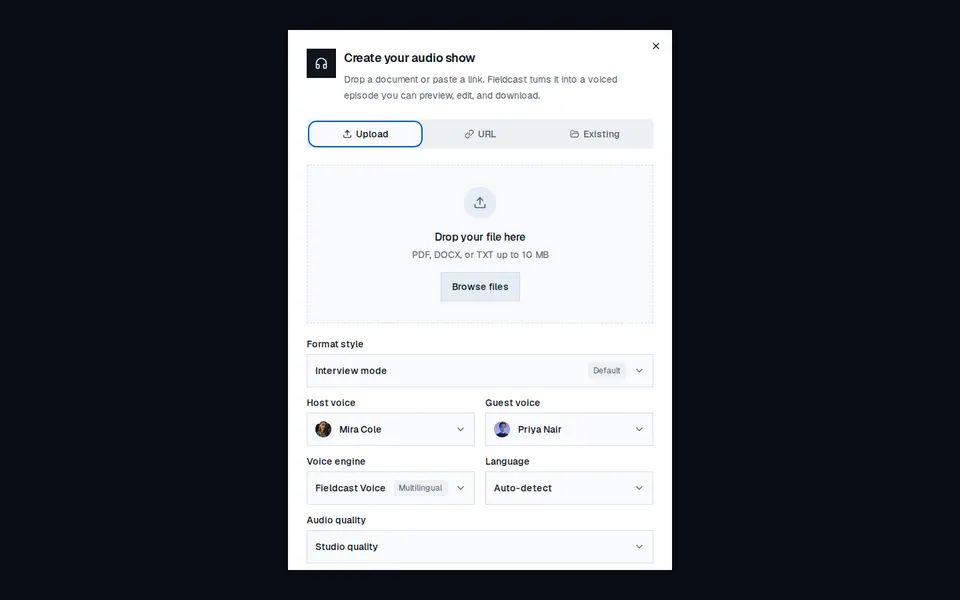
Marketing dialog for turning a file, URL, or saved source into a voiced audio show, with format and voice controls.
marketing
LiquidMetalButton
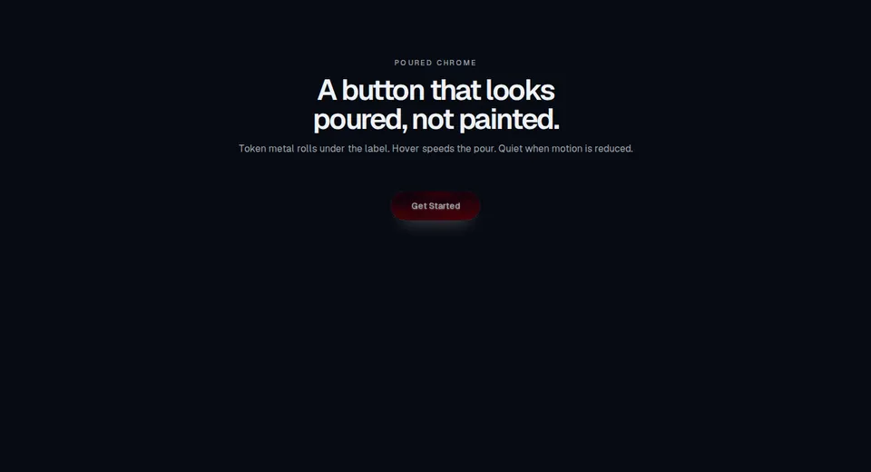
Marketing CTA block with a liquid-metal pill, token chrome field, glowing rim, and hover pour. Still when motion is reduced.

marketing
MenuVertical
Stacked large-type marketing navigation that slides an arrow in and optionally skews labels on hover.
marketing
MotionImageRevealSlider
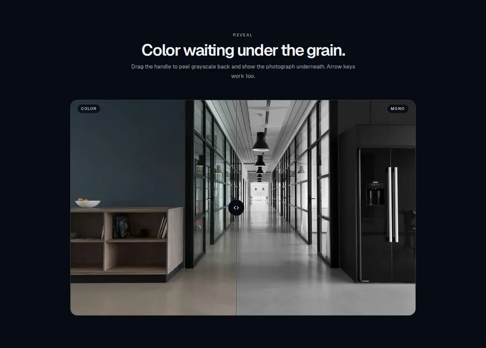
Marketing still with a draggable rail that reveals a color photograph from a grayscale overlay, or compares two images.

marketing
MotionLoadingProgressBar
Marketing loading capsule whose fill springs toward discrete progress jumps, still when motion is reduced.
marketing
NavbarWithAnimatedMegaDropdown
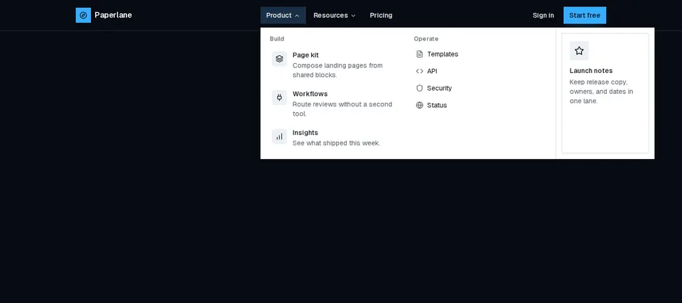
Marketing header with animated desktop mega menus, a primary CTA, and a slide-in overlay for small screens.
marketing
PricingCalendar
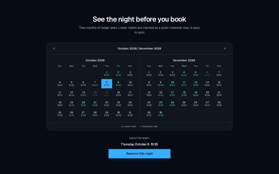
Two-month booking calendar that shows a nightly rate on each day and highlights lower-priced nights.
marketing
Pricing28
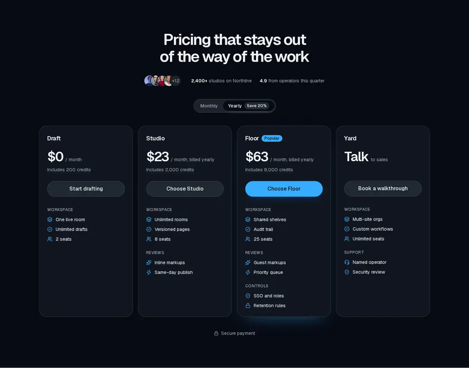
Four-plan pricing section with avatar social proof, monthly/yearly billing tabs, tooltips, and grouped feature lists.
marketing
ProductQuickView4
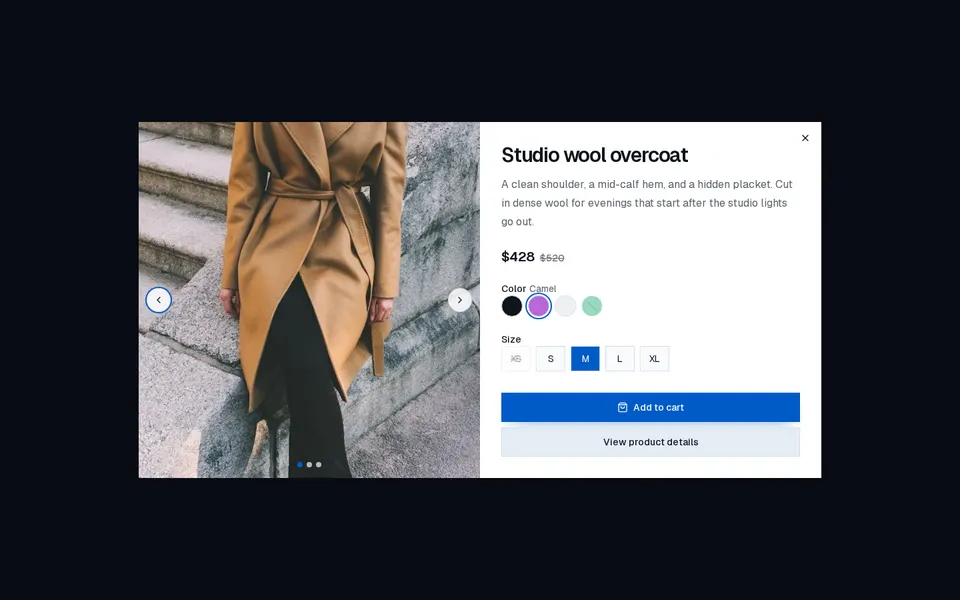
Product quick-view dialog with an image carousel, optional price and color groups, size or format options, and a primary action plus details link.

marketing
Projects11
Masonry project photo wall in CSS columns — twelve unframed images that rise into view on scroll and lift with a brightness overlay on hover.
marketing
Projects13
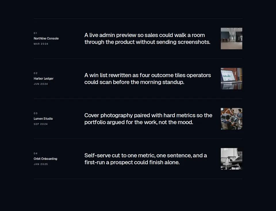
Editorial project index: numbered rows with title, launch date, large description, and a small thumbnail, separated by hairline borders. Optional per-row hrefs render as title text links.
marketing
Projects16
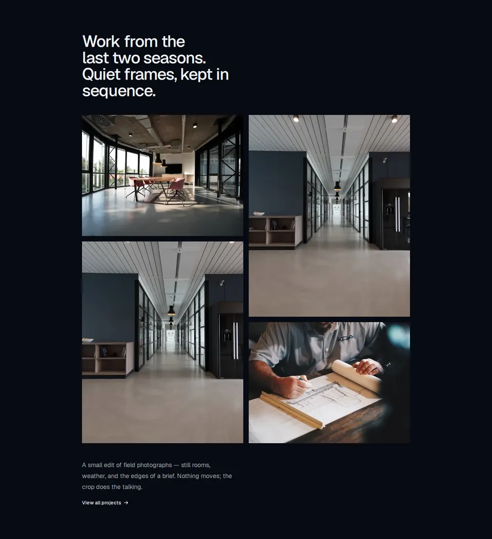
Editorial four-image gallery with a medium-weight heading, a two-column staggered 4:3 and 4:5 photo grid, optional captions with text-link destinations, and a link action beneath a short paragraph. Extra images are not rendered.

marketing
RandomLetterSwap
Horizontal marketing navigation whose link labels shuffle glyphs in a random vertical swap on hover.
marketing
RideBookingForm
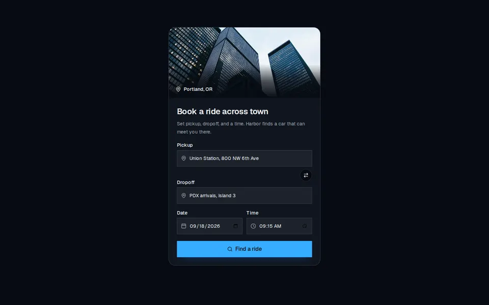
Marketing booking card with a city photo, pickup and dropoff fields, date and time, and a search CTA.
marketing
Scanner
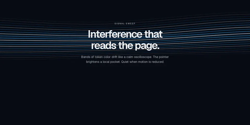
Marketing canvas of interference bands that sweep like an oscilloscope, tinted with semantic tokens and still when motion is reduced.

marketing
ShapeGrid
Marketing canvas of drifting outlined tiles — square, hexagon, circle, or triangle — that fill on hover and rest when motion is reduced.
marketing
SplashCursor
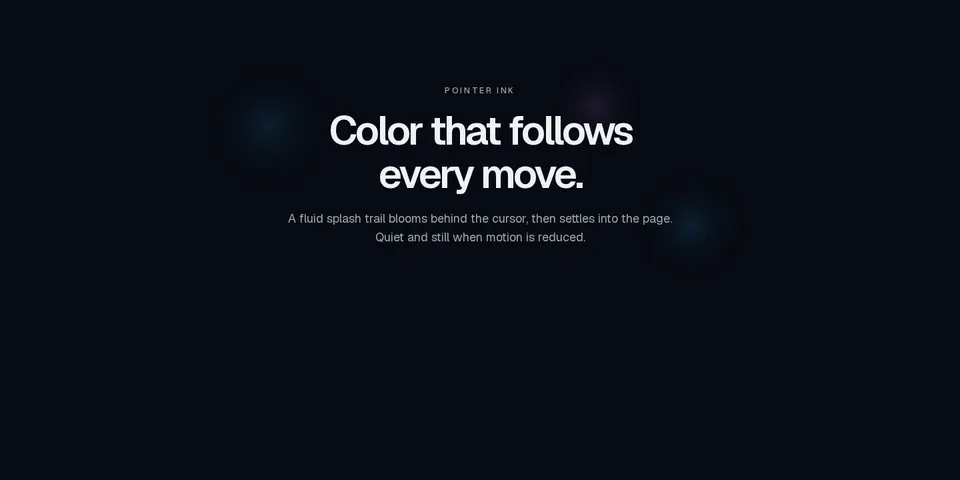
Marketing canvas that trails ink splashes behind the pointer, mixing semantic token colors and staying still when motion is reduced.
marketing
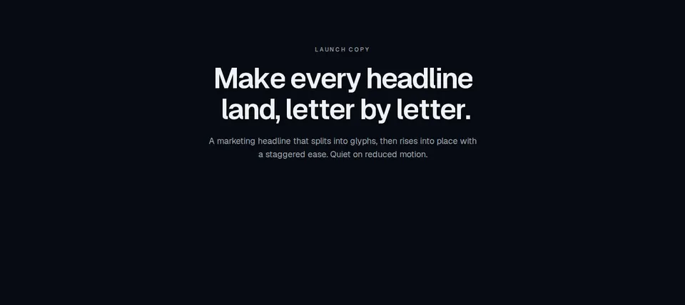
SplitText
Marketing headline that splits into characters or words and staggers each unit into view, honoring prefers-reduced-motion.
marketing
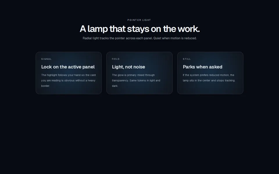
SpotlightCard
Marketing feature cards with a radial spotlight that tracks the pointer, using semantic tokens in light and dark.

marketing
SterlingGateKineticNavigation
Full-screen kinetic navigation that reveals a typography-heavy overlay from a focused header, with ripple hover on destinations.
marketing
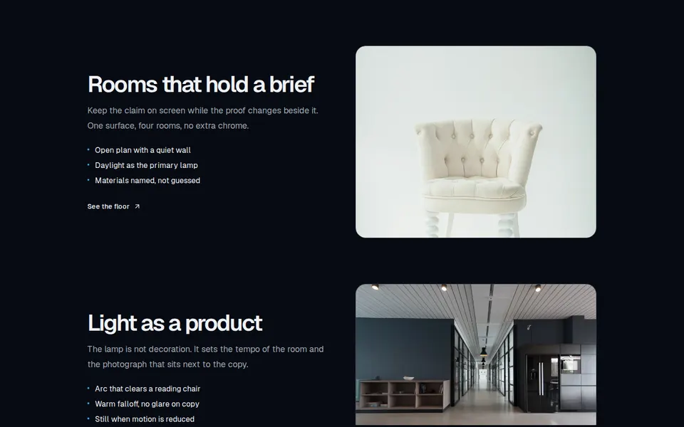
StickyContentWrapper
Split-screen marketing tour that pins a viewport while copy steps through headings, lists, and a CTA and the paired image scales and swaps.
marketing
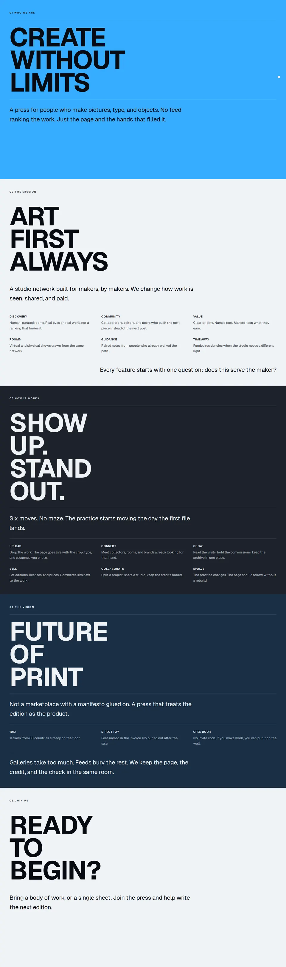
StoryScroll
Full-viewport marketing chapters that pin and stack on scroll, with huge type, hairlines, and semantic tone surfaces.
marketing
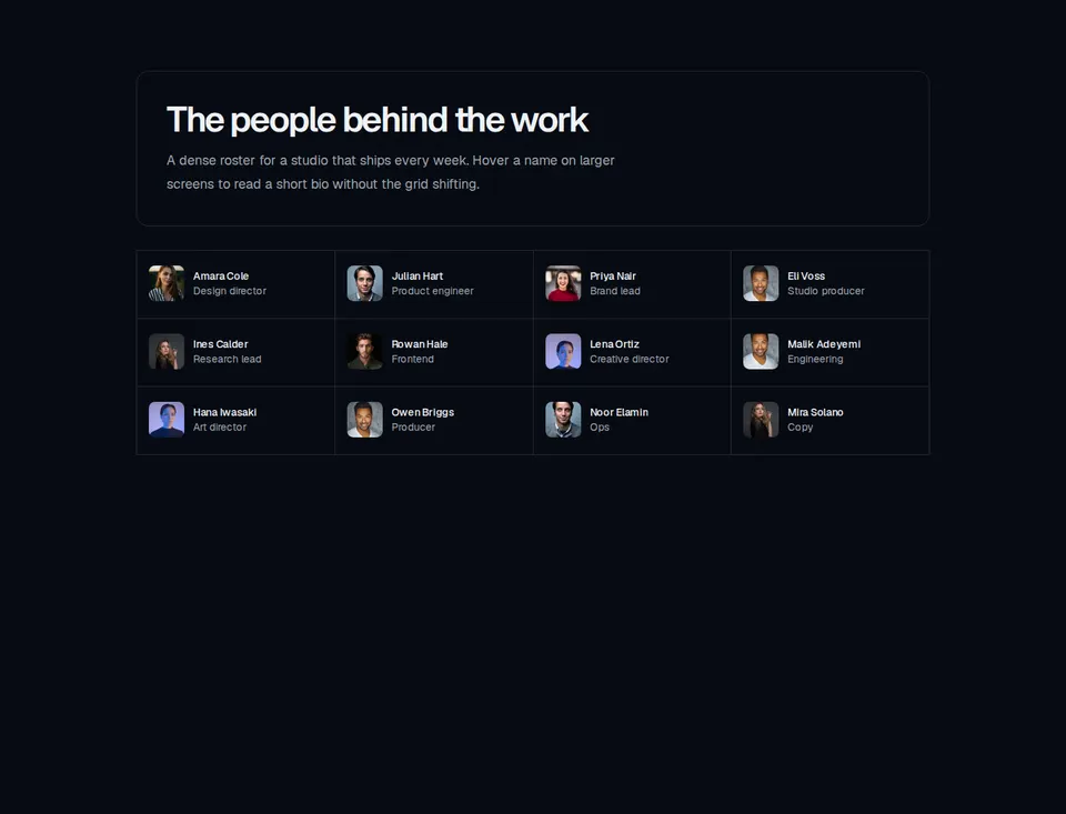
Team11
Bordered team header above a dense member grid that reveals a highlighted bio card on hover and keyboard focus from medium screens up.

marketing
Team14
Split hiring section with a bordered statement panel, ghost CTA, and a row of tall member portraits that becomes a looping carousel on small screens.

marketing
Team17
Documentary team block with a 3:4 portrait grid, flowing alumni and collaborator name lists, and a two-column culture band.
marketing
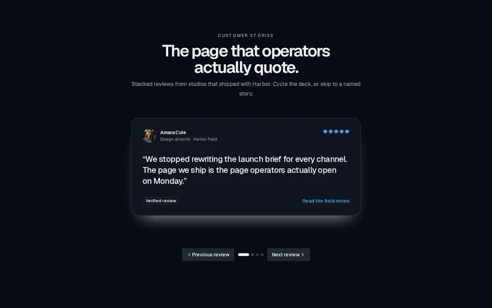
Testimonial
Marketing social-proof block with stacked quote cards, star ratings, avatars, and a grid layout that shows every review at once.
marketing
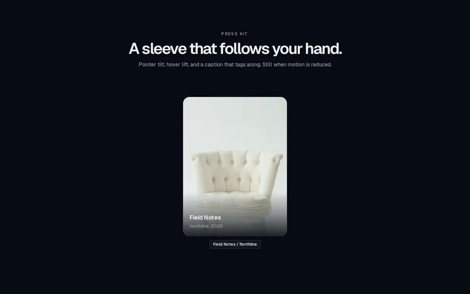
TiltedCard
Marketing media card that tilts and lifts toward the pointer, with an overlay title and a caption that follows the cursor.

marketing
TubelightNavbar
Floating pill navigation with a sliding active highlight and a primary-token tubelight glow on the current item.
marketing
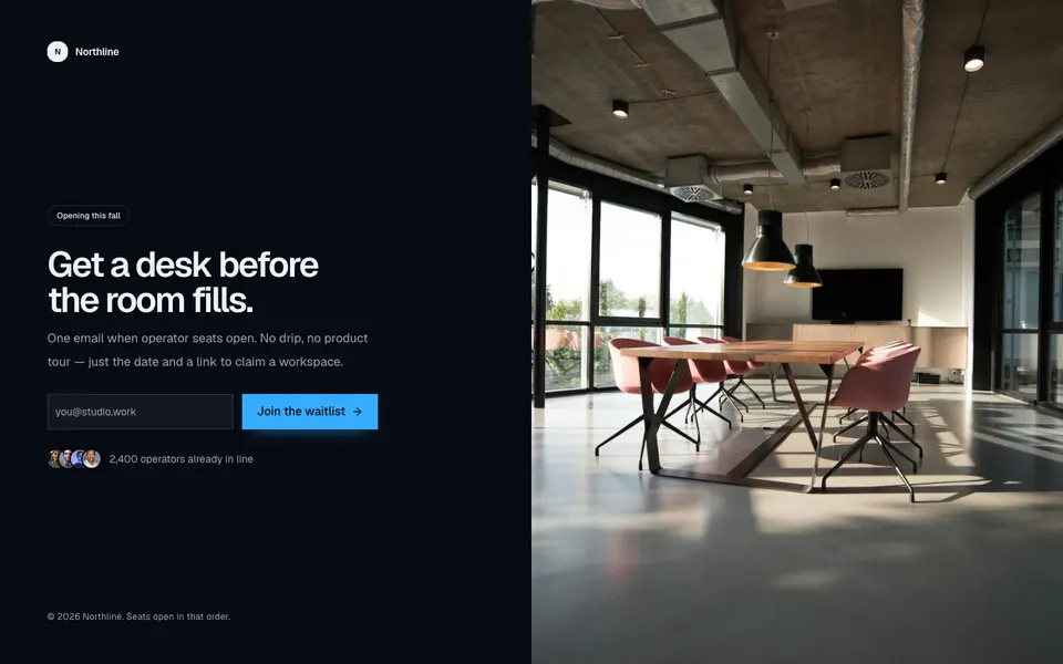
Waitlist3
Split coming-soon waitlist with a company mark, launch badge, email form, overlapping avatars, copyright, and a full-height photo.
dashboard
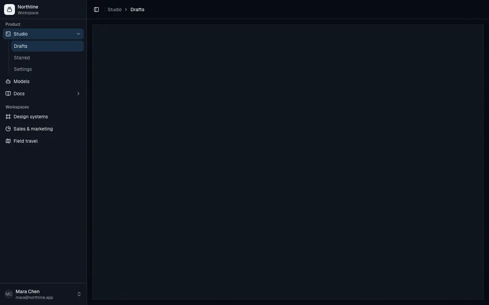
ApplicationShell1
Collapsible application shell with grouped sidebar navigation, nested submenus, user footer, and a breadcrumb header.
dashboard
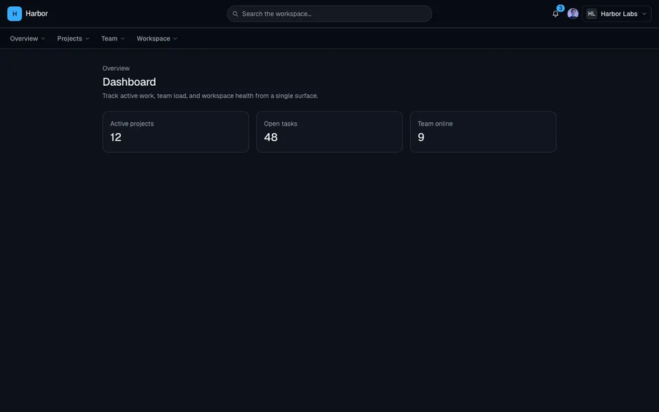
ApplicationShell13
Top navigation dashboard shell with search, org and user menus, dropdown nav groups, a mobile drawer, and a bottom bar.
dashboard
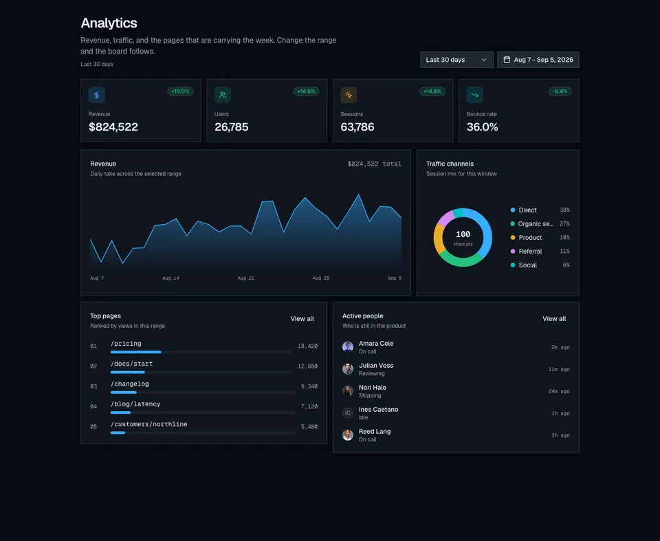
ChartGroup14
Analytics bento dashboard with date presets, a custom range calendar, KPI cards, a revenue area chart, traffic donut, top pages, and active people.
dashboard
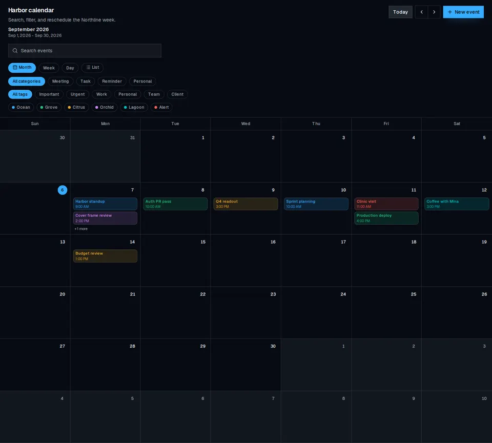
EventManager
Calendar event manager with month, week, day, and list views, search, and tag filters.

dashboard
ForgotPassword2
Split password-recovery screen with a left-aligned email form and a full-height photograph on large screens.
dashboard
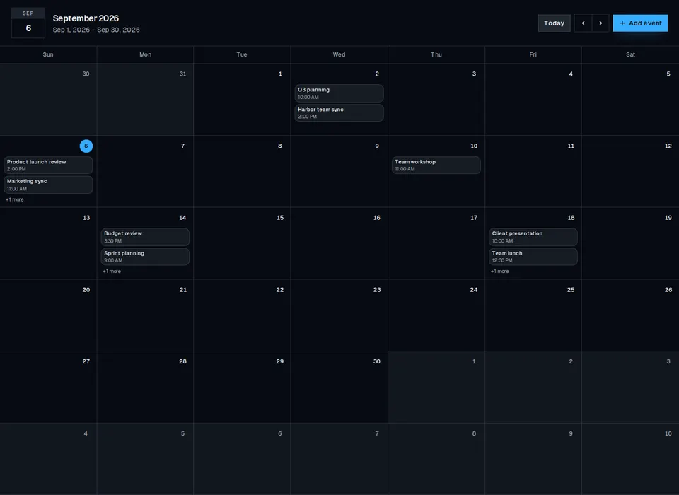
FullscreenCalendar
Fullscreen month calendar with day cells, event lists, and today / month navigation.
dashboard
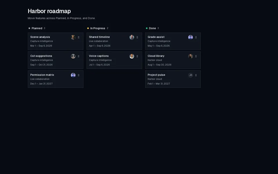
Kanban
Compact status kanban for roadmap features with owners, initiatives, and date ranges.
dashboard
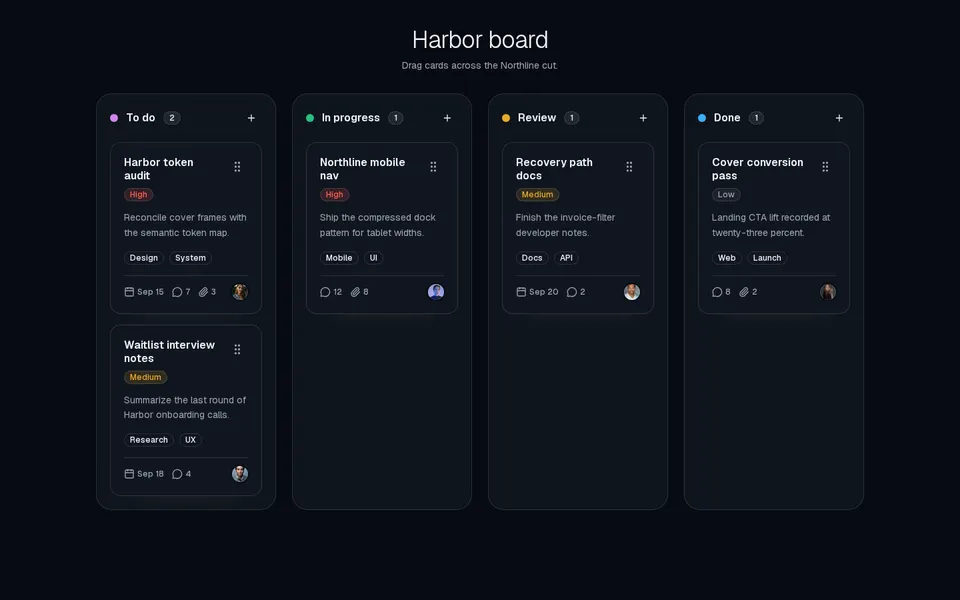
KanbanBoard
Drag-and-drop kanban board with priority cards, assignees, and column counts.
dashboard
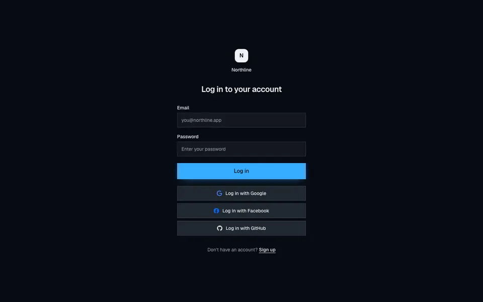
Login4
Centered borderless login with email, password, and full-width Google, Facebook, and GitHub buttons.
dashboard
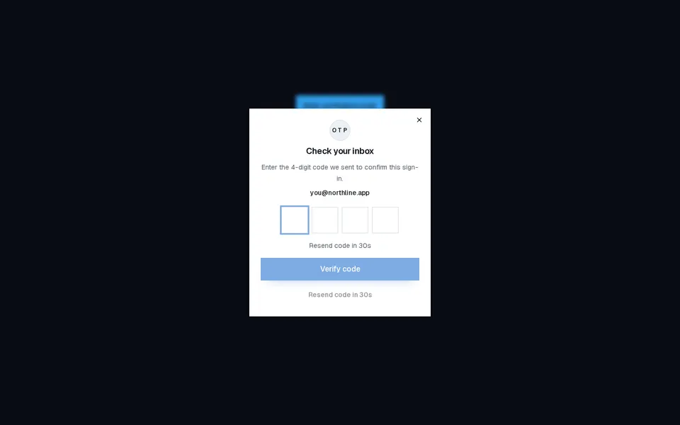
OtpDialog
Compact OTP verification dialog with four digit slots, resend countdown, and success or error feedback.
dashboard
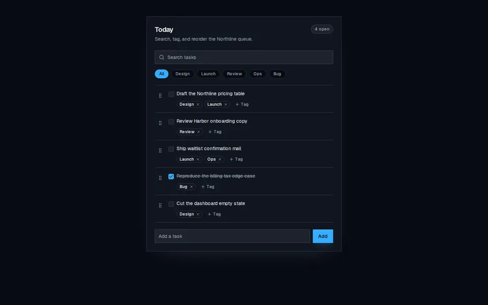
Todo9
Searchable todo list with tag filters, per-task tag editing, and keyboard-friendly reorder.
dashboard
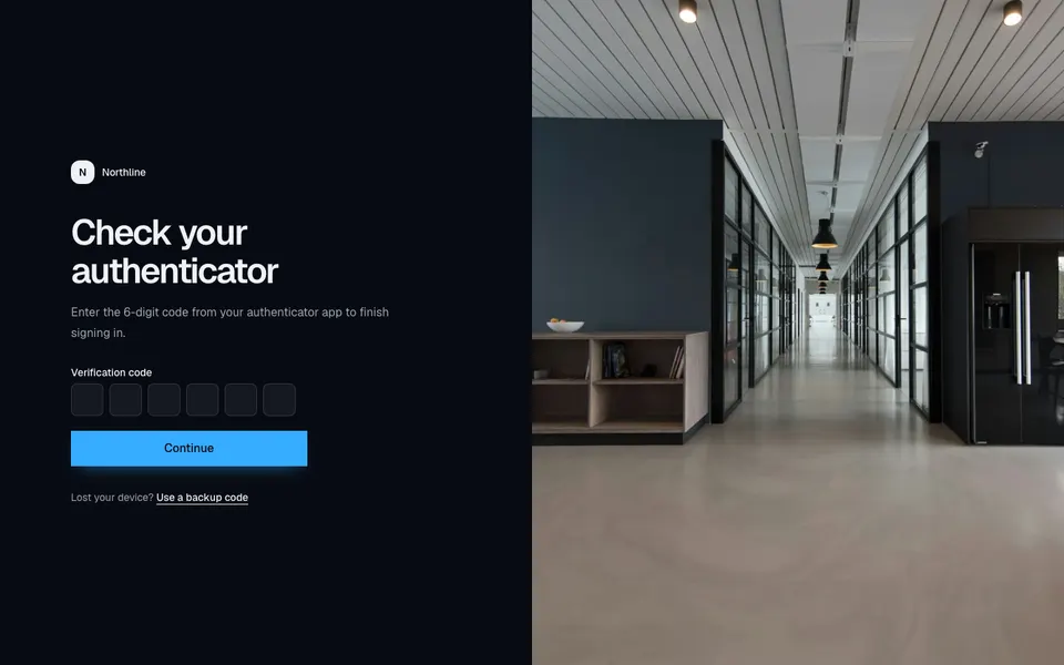
TwoFactor2
Split two-factor screen with a compact six-digit code form and a full-height photograph on large screens.
dashboard
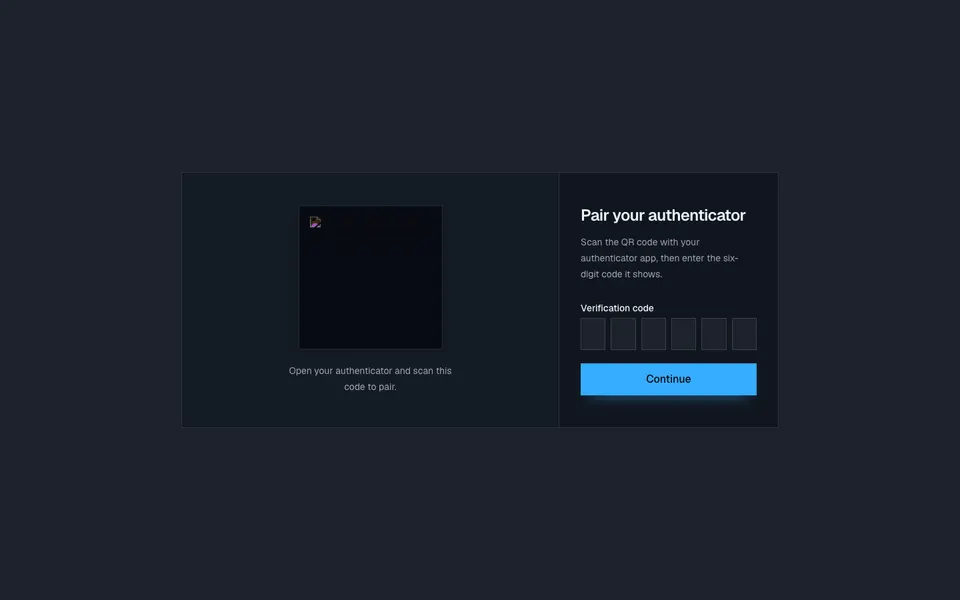
TwoFactor5
Two-column authenticator pairing card with a scannable QR plate and a six-digit verification form.
dashboard
VerifyEmail1
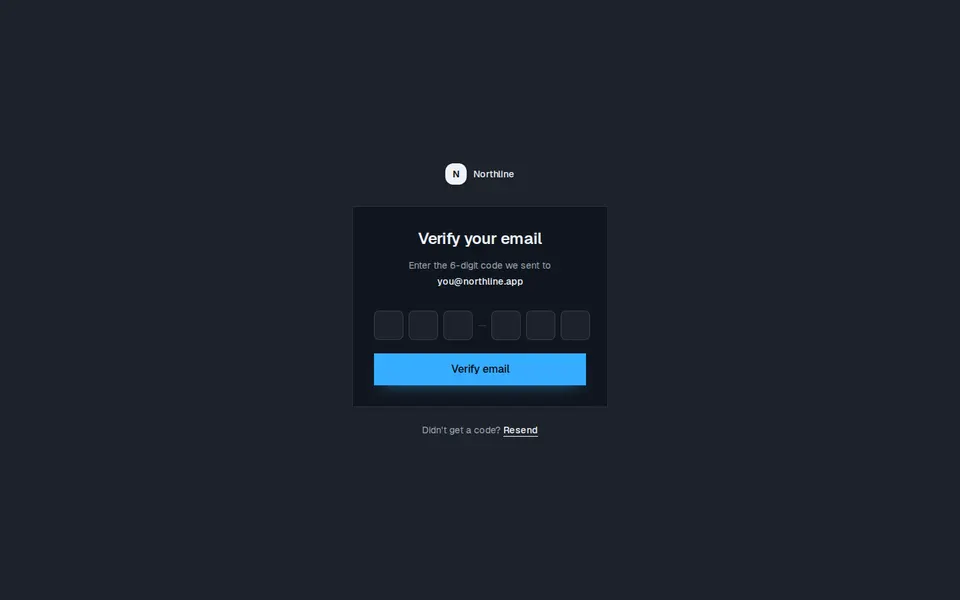
Centered email verification card with a six-digit code, destination address, and a resend link under the panel.