 JabKit
ShopAnimatedButton
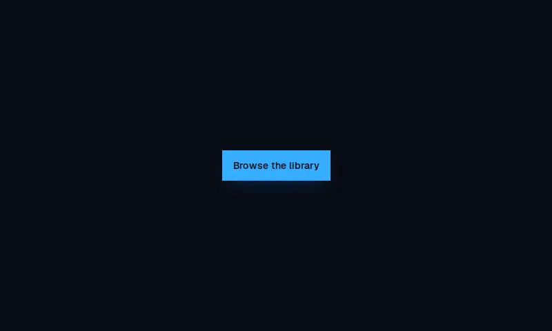
1.0.0Pill Explore/CTA control whose label and arrow slide on hover, matching the Mugsys Mugs shopping layout.
Component data
- ID
- shop-animated-button
- Category
- atoms
- Version
- 1.0.0
- Added
- 2026-09-17
- Type
- component
- Keyboard nav
- Yes
- Reduced motion
- Yes
buttonctashopmotionatom
Dependencies
- @radix-ui/react-slot
- lucide-react
- clsx
- tailwind-merge
Examples
Default
<>
      <ShopAnimatedButton {...shopAnimatedButtonMocks.default} />
    </>
Variants
<div className="flex flex-wrap items-center gap-3 bg-background p-8 text-foreground">
      <ShopAnimatedButton {...shopAnimatedButtonMocks.default} />
      <ShopAnimatedButton {...shopAnimatedButtonMocks.alternate} />
    </div>