 JabKit
component
AverageSwan
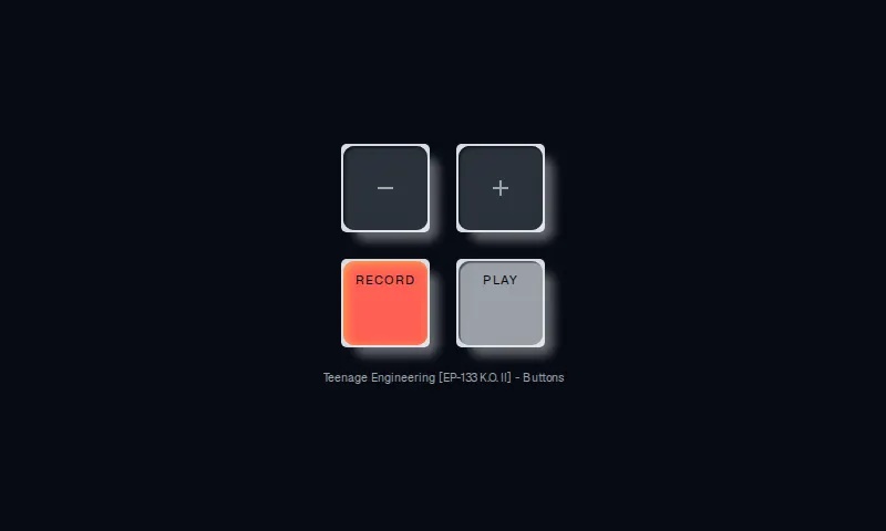
A four-key sampler pad with square chassis wells, inset 10px-radius keys, and a hard press-in shadow.
8 results
Interface primitives
1–8 of 8
component
A four-key sampler pad with square chassis wells, inset 10px-radius keys, and a hard press-in shadow.
component
A semantic, accessible action button with primary, secondary, ghost, and destructive treatments.
component
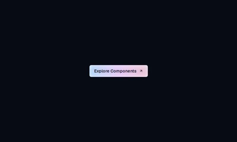
A compact rounded-md CTA with a chart-token indigo-to-pink wash that brightens on hover.

component
A compact analytics card with a token gradient rim, two stats, a seven-bar spark, and a local-radius details action.
component
A 6px-rounded outline CTA whose circular fill sweeps in from the far corner on hover.
component
Pill Explore/CTA control whose label and arrow slide on hover, matching the Mugsys Mugs shopping layout.