 JabKit
component
Marker
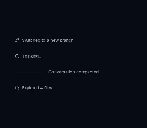
Displays an inline status, system note, bordered row, or labeled separator in a conversation.
82 results
Component catalogue
49–72 of 82
component
Displays an inline status, system note, bordered row, or labeled separator in a conversation.
component
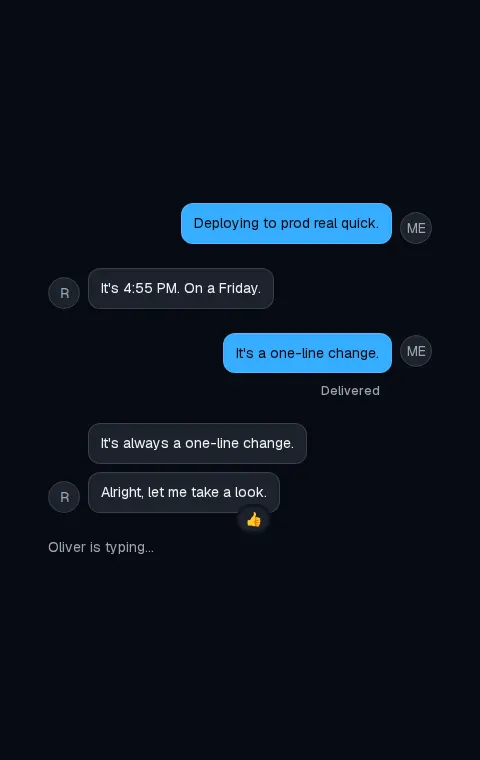
Lays out a conversation row with optional avatar, header, footer, and start or end alignment.
component
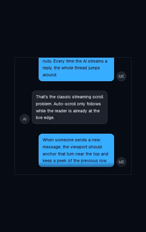
A chat transcript scroller that anchors turns, follows streamed replies, and preserves the reader's place.
component
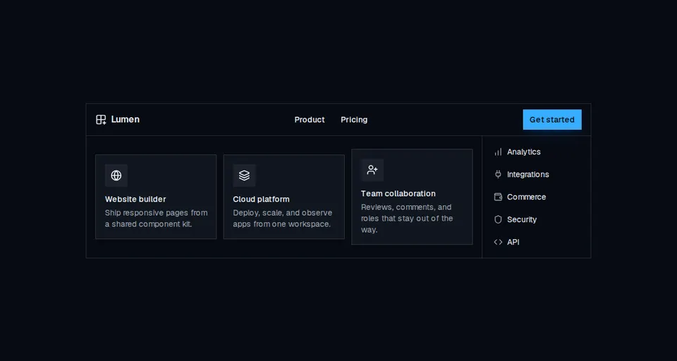
Accessible site navigation with desktop mega menus, compact link lists, and a mobile disclosure drawer.
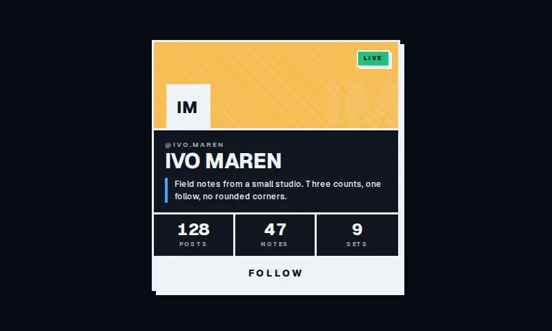
component
A square neo-brutalist profile plate: striped header, hard offset shadow, three counts, and a full-width follow.
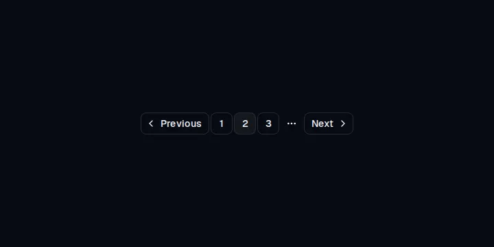
component
Page navigation with previous, next, numbered links, and an ellipsis for long ranges.
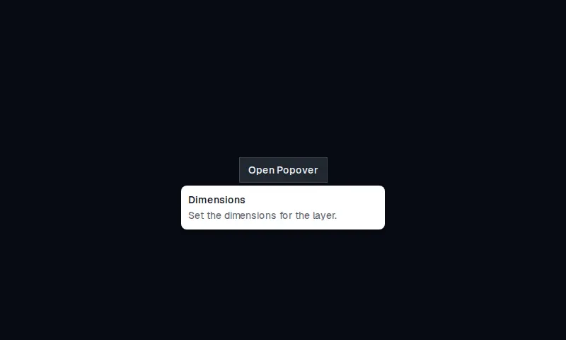

component
A completion bar that shows how far a task has progressed, with optional label and value.
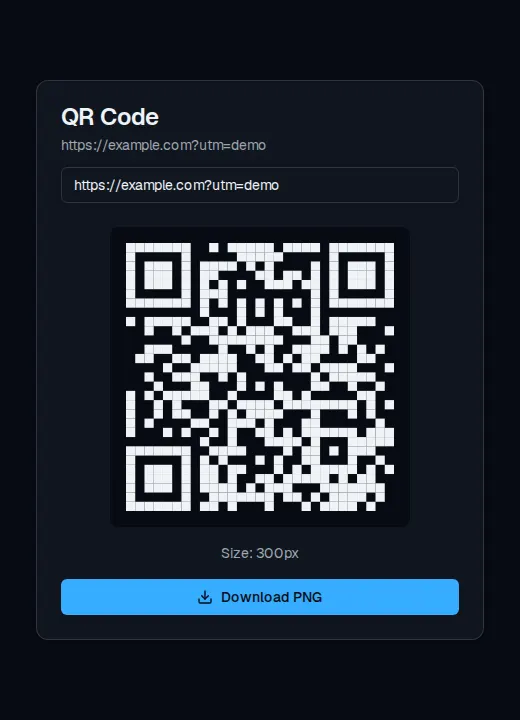
component
Card that encodes a URL or short note into a live QR mark and downloads it as PNG.
component
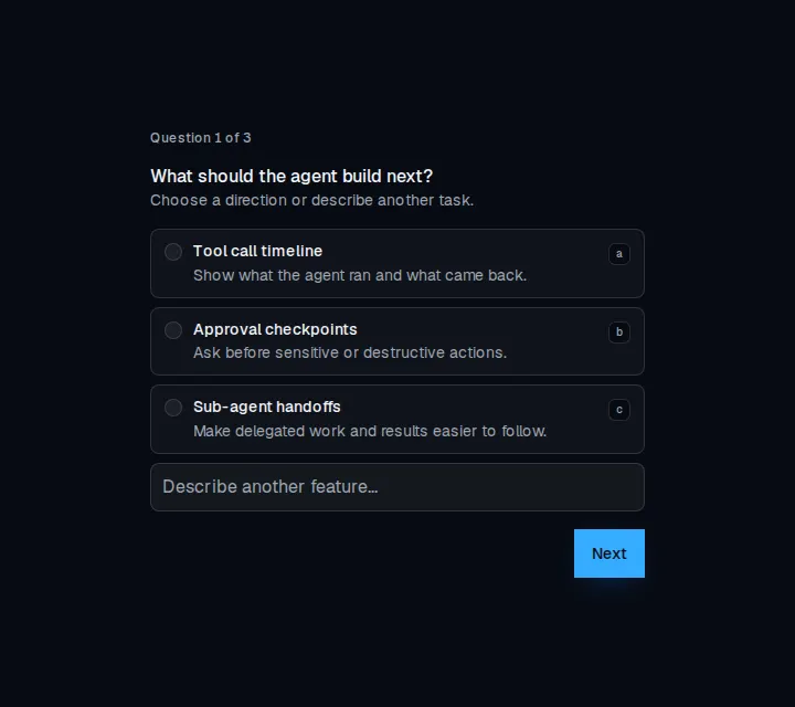
A multi-step questionnaire with single-choice, multiple-choice, freeform, and skippable questions.
component
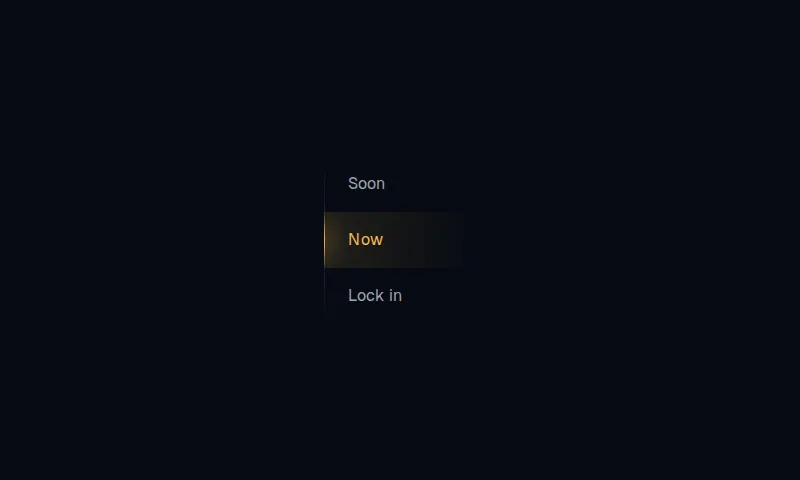
Vertical radio stack with a 10px clip and a glowing rail that slides to the checked option.

component
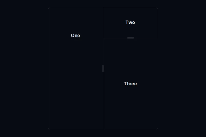
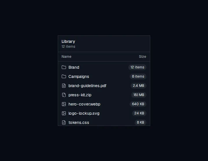
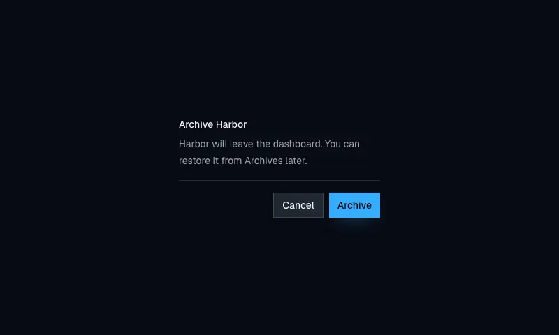
A focusable overflow region with token-styled scrollbars for clipped lists and panels.
component
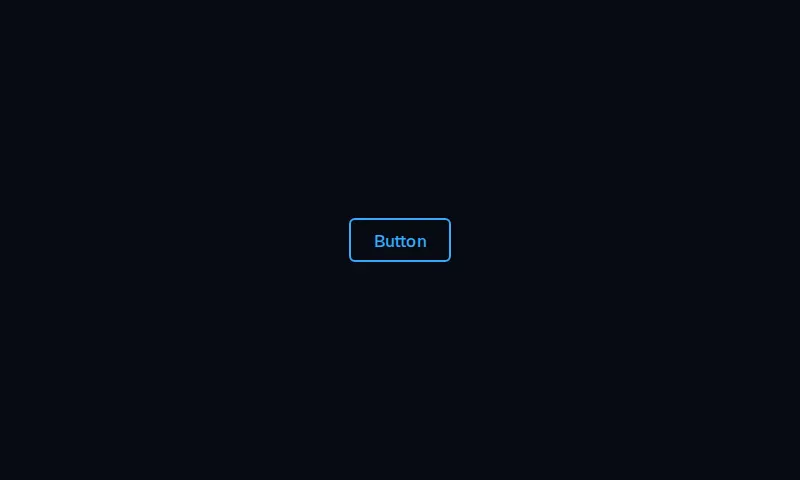
A 6px-rounded outline CTA whose circular fill sweeps in from the far corner on hover.
component
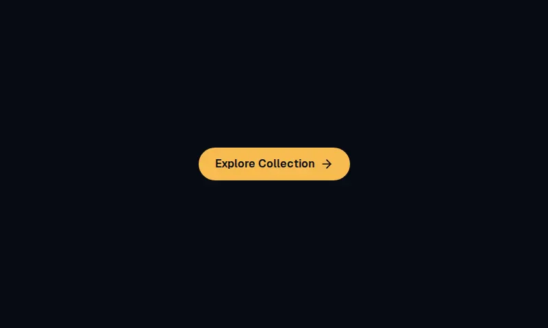
Pill Explore/CTA control whose label and arrow slide on hover, matching the Mugsys Mugs shopping layout.
component
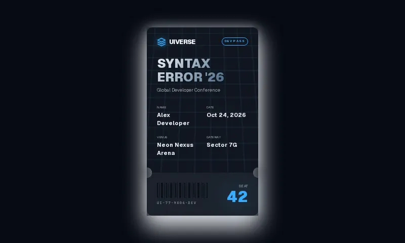
A perforated conference pass with 1em ticket notches, a pill badge, drifting grid, and a 3D hover tilt.
component
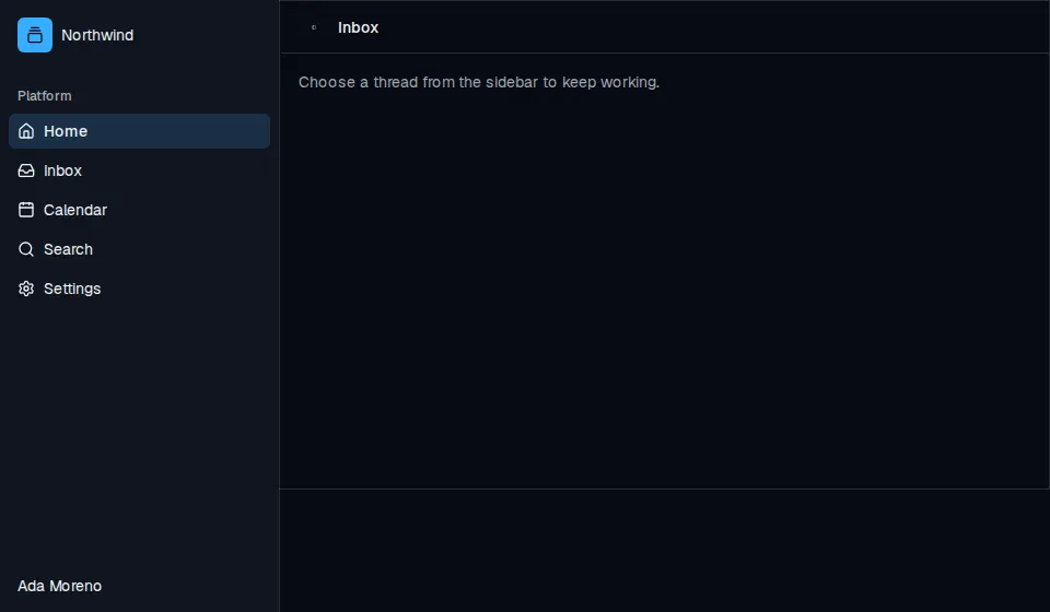
Composable application sidebar with header, groups, menus, rail, and an inset content pane.


component
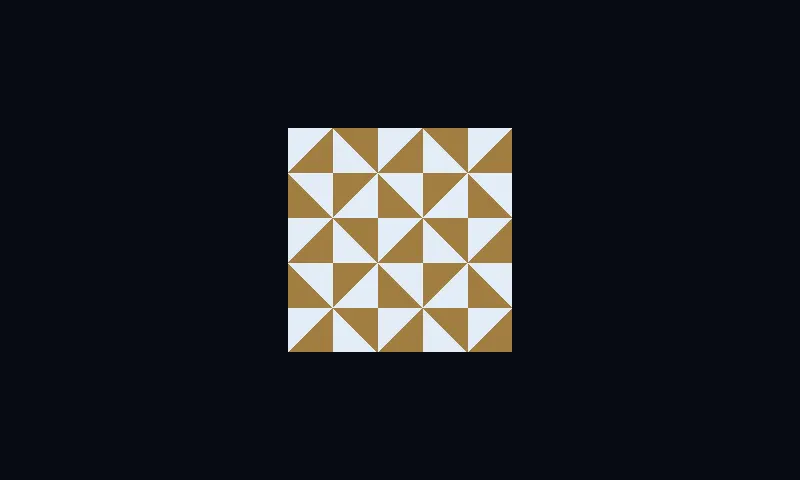
A square dual-tone mosaic field with 45-degree tiles, token-mapped ink and lemon, and an optional slow drift.
component
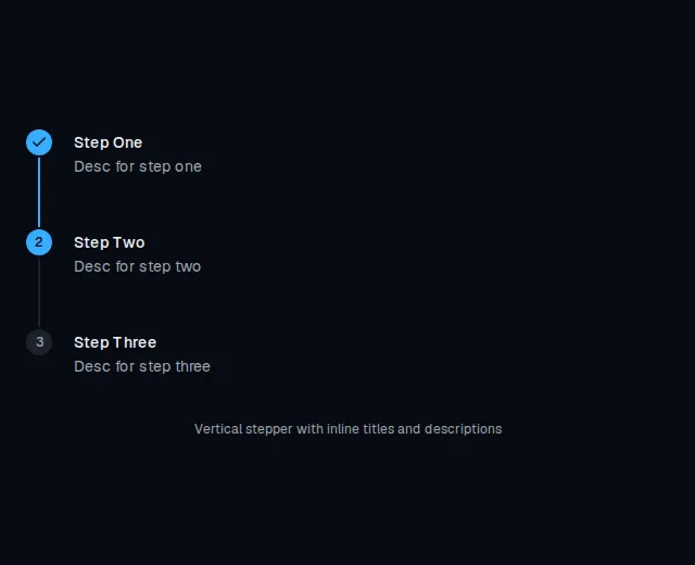
Vertical stepper with numbered pill markers and inline titles plus descriptions.
component
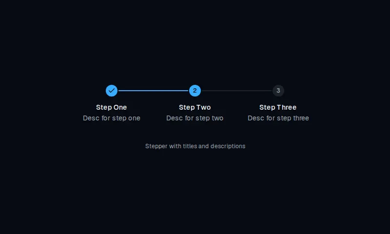
Horizontal stepper with circular markers, titles stacked below, and descriptions.