 JabKit
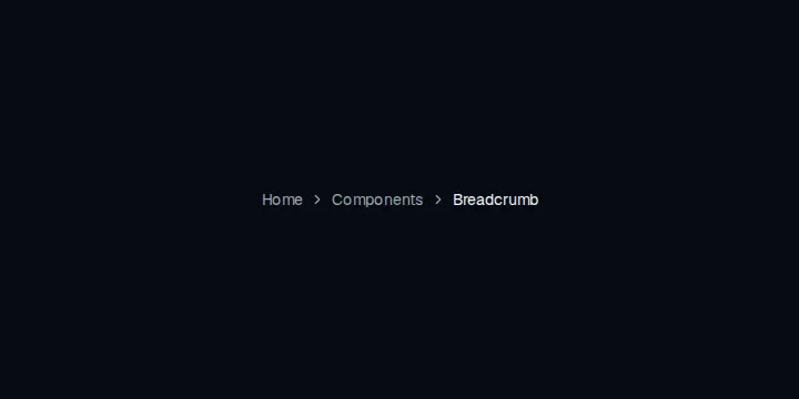
Component library
12 results
Component catalogue
Everything
1–12 of 12
component
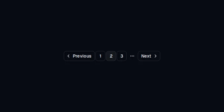
Pagination
Page navigation with previous, next, numbered links, and an ellipsis for long ranges.
component
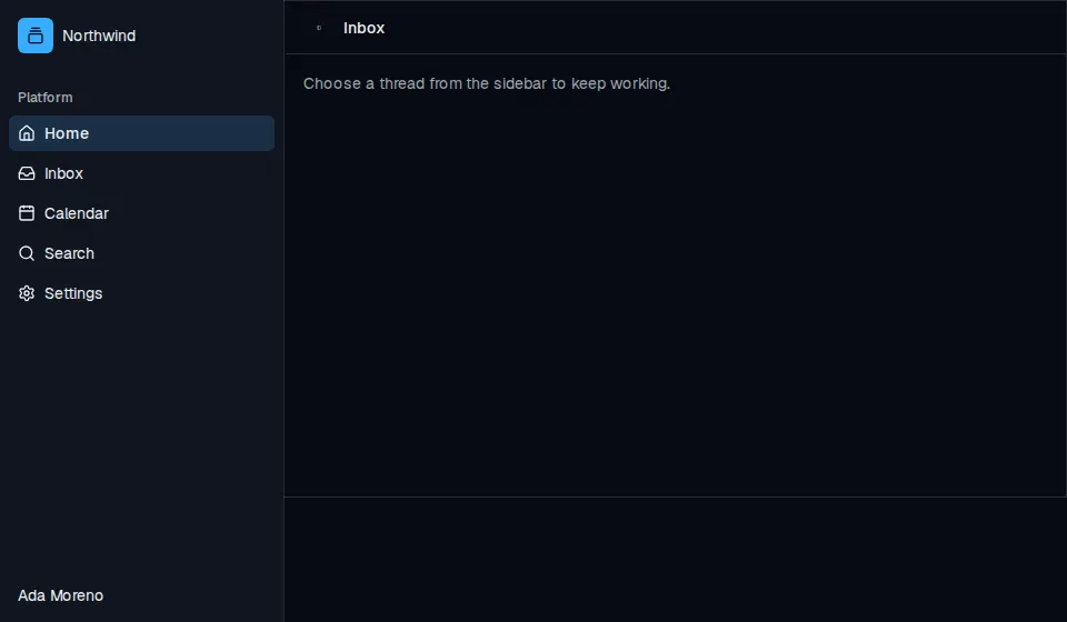
Sidebar
Composable application sidebar with header, groups, menus, rail, and an inset content pane.
component
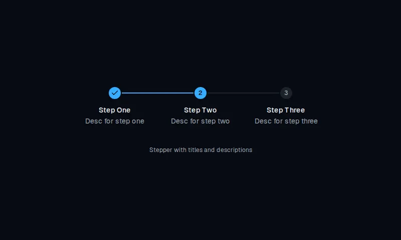
StepperWithTitles
Horizontal stepper with circular markers, titles stacked below, and descriptions.
block
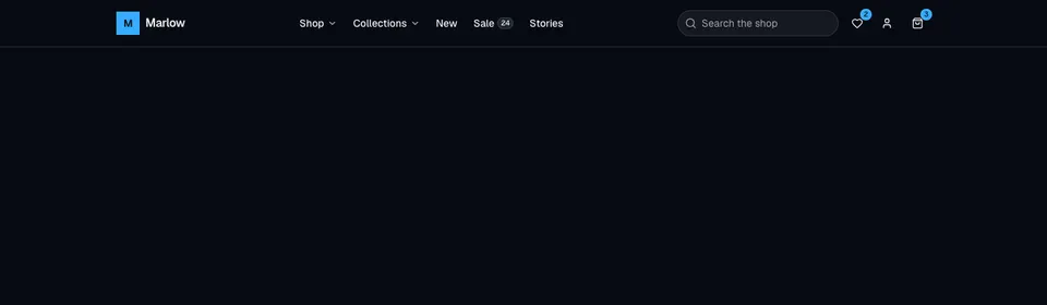
EcommerceNavbar2
Dense storefront header with nested dropdowns, a mega shop panel, search, wishlist and cart badges, account menu, and an accordion mobile sheet.

block
MenuVertical
Stacked large-type marketing navigation that slides an arrow in and optionally skews labels on hover.
block
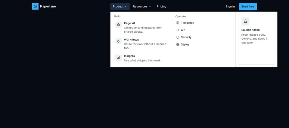
NavbarWithAnimatedMegaDropdown
Marketing header with animated desktop mega menus, a primary CTA, and a slide-in overlay for small screens.
block
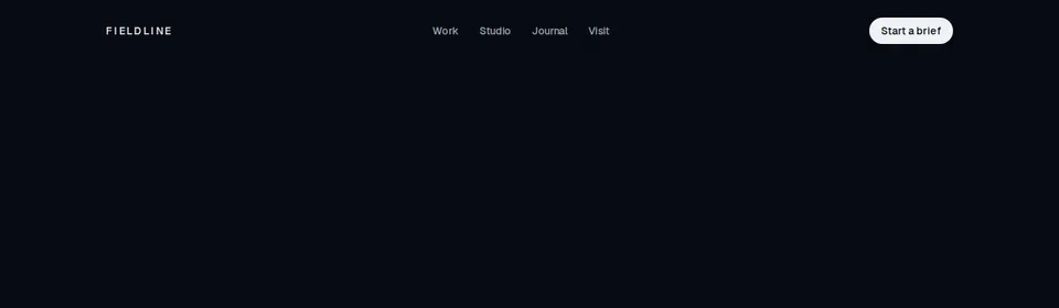
RandomLetterSwap
Horizontal marketing navigation whose link labels shuffle glyphs in a random vertical swap on hover.
block
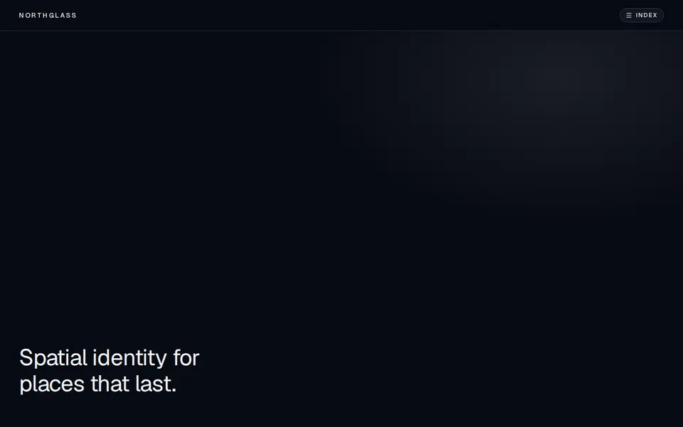
SterlingGateKineticNavigation
Full-screen kinetic navigation that reveals a typography-heavy overlay from a focused header, with ripple hover on destinations.

block
TubelightNavbar
Floating pill navigation with a sliding active highlight and a primary-token tubelight glow on the current item.
block
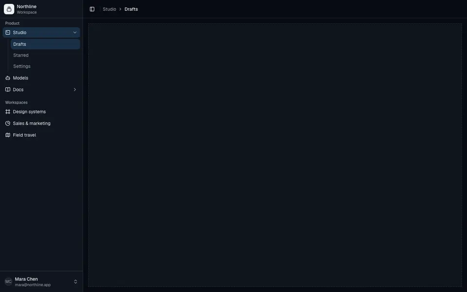
ApplicationShell1
Collapsible application shell with grouped sidebar navigation, nested submenus, user footer, and a breadcrumb header.
block
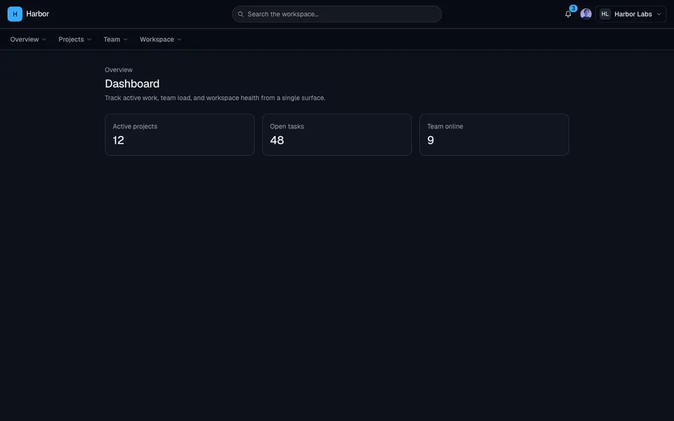
ApplicationShell13
Top navigation dashboard shell with search, org and user menus, dropdown nav groups, a mobile drawer, and a bottom bar.