atoms
Button
A semantic, accessible action button with primary, secondary, ghost, and destructive treatments.
marketing
Cta22
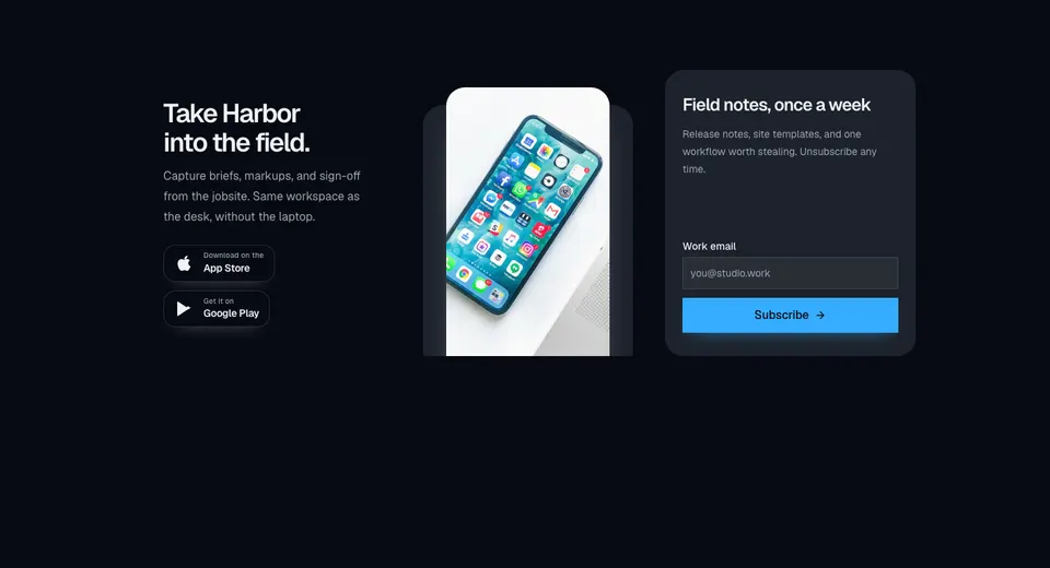
Marketing CTA with a dark app-download panel, store badges, overlapping phone imagery, and a muted newsletter form in a three-column grid.
marketing
EmberFooterCta
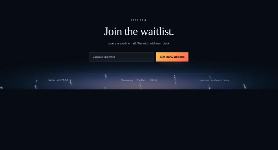
Closing marketing footer with a waitlist form, serif headline, slim link row, and a token-based ember bed along the baseline.
marketing
Form
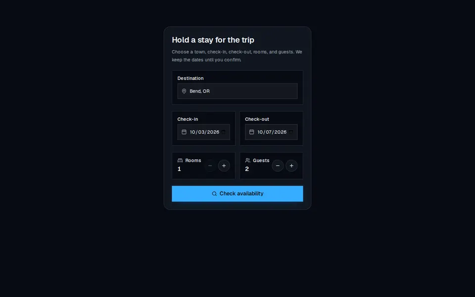
Compact stay-booking card with destination, check-in and check-out dates, room and guest steppers, and a search CTA.
marketing
InputModal
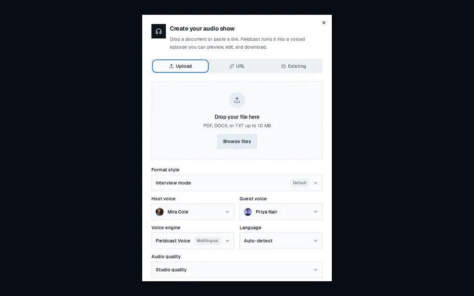
Marketing dialog for turning a file, URL, or saved source into a voiced audio show, with format and voice controls.
marketing
RideBookingForm
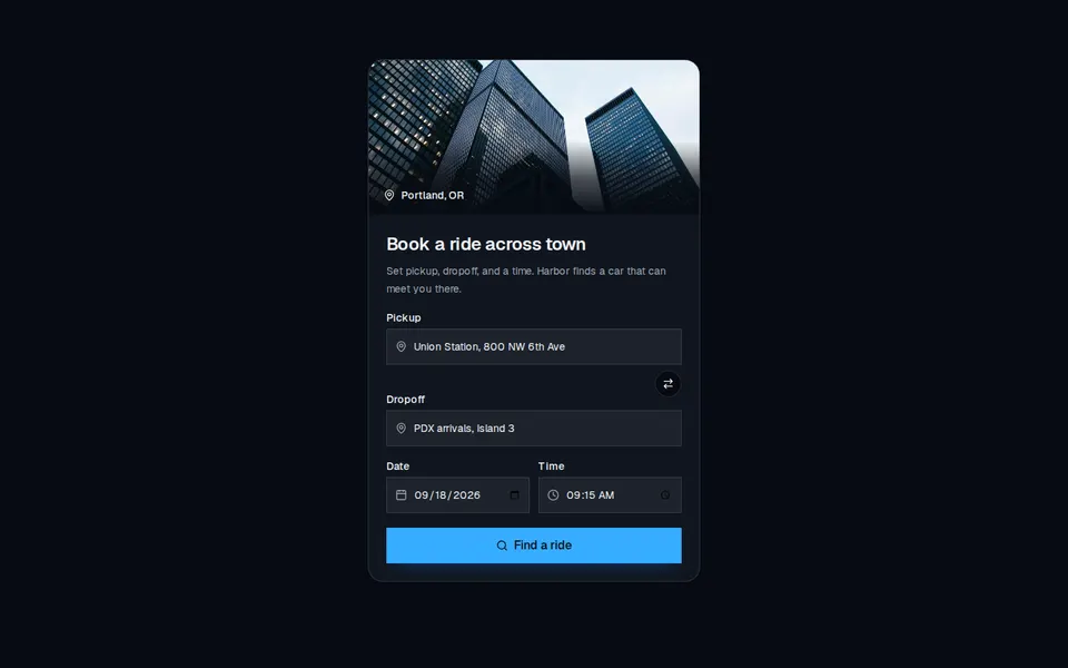
Marketing booking card with a city photo, pickup and dropoff fields, date and time, and a search CTA.
marketing
Waitlist3
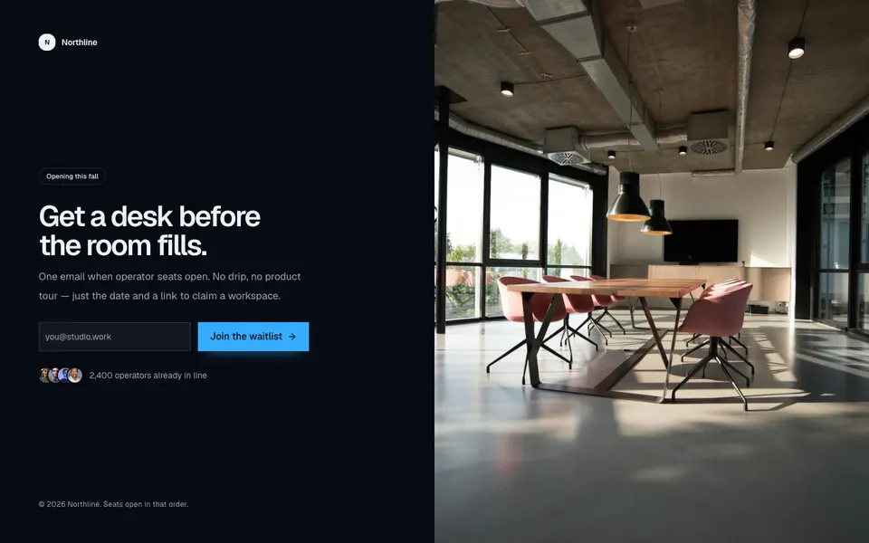
Split coming-soon waitlist with a company mark, launch badge, email form, overlapping avatars, copyright, and a full-height photo.
dashboard
ForgotPassword2
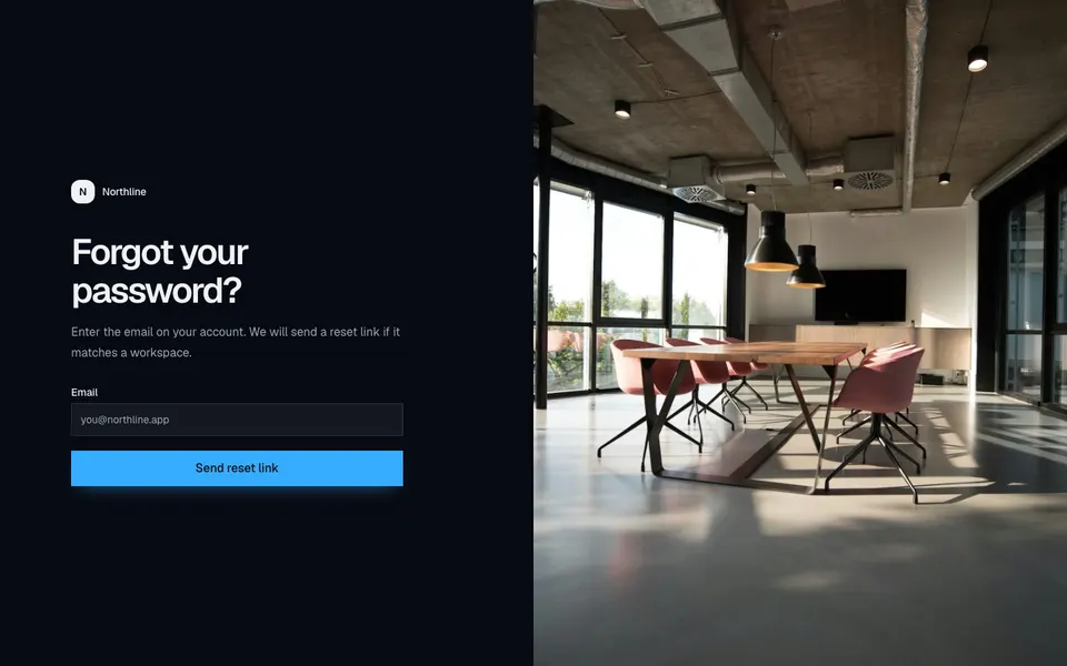
Split password-recovery screen with a left-aligned email form and a full-height photograph on large screens.
dashboard
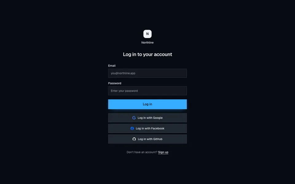
Login4
Centered borderless login with email, password, and full-width Google, Facebook, and GitHub buttons.
dashboard
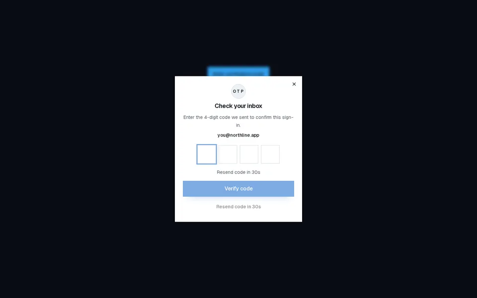
OtpDialog
Compact OTP verification dialog with four digit slots, resend countdown, and success or error feedback.
dashboard
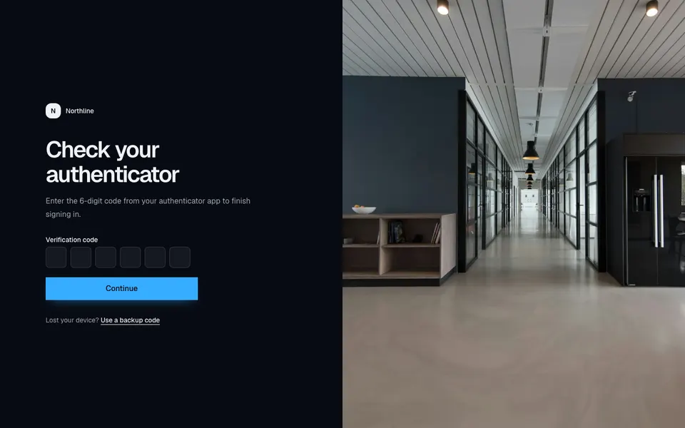
TwoFactor2
Split two-factor screen with a compact six-digit code form and a full-height photograph on large screens.
dashboard
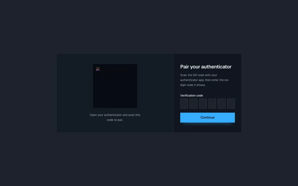
TwoFactor5
Two-column authenticator pairing card with a scannable QR plate and a six-digit verification form.
dashboard
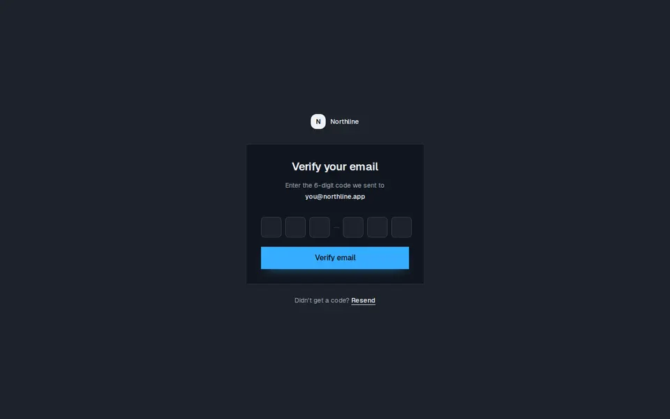
VerifyEmail1
Centered email verification card with a six-digit code, destination address, and a resend link under the panel.