 JabKit
Component library
214 results
Component catalogue
Everything
169–192 of 214

block
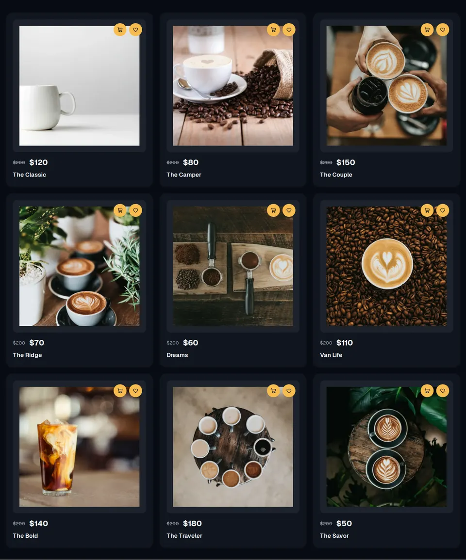
ShopTopNav
Mugsys store chrome with brand mark, four destination links, a sliding Explore CTA, and a compact mobile menu.
block
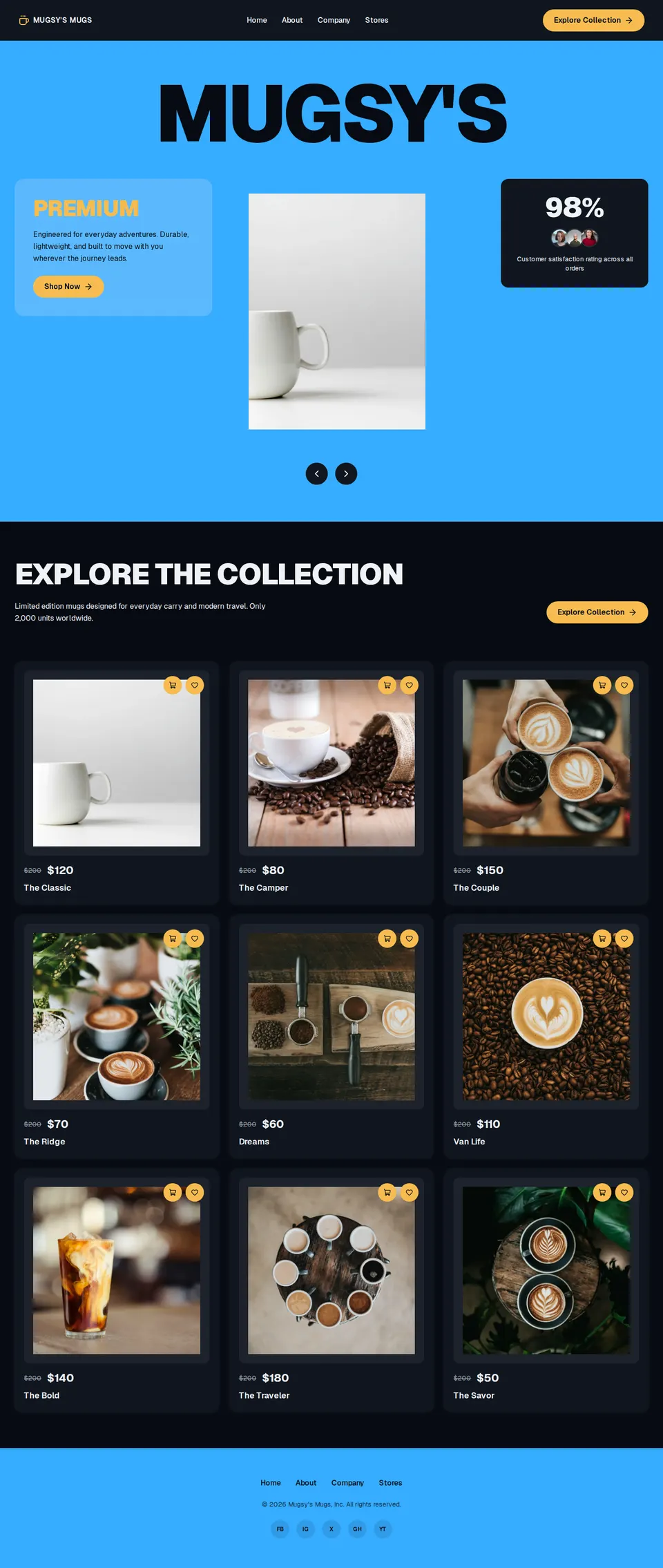
ShoppingLayoutPage
Full Mugsys Mugs shopping layout wiring store nav, collection hero, product grid, and footer chrome.
block
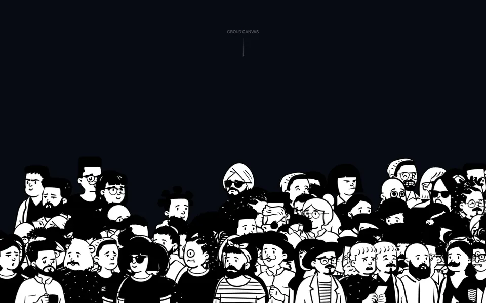
Skiper39
Full-bleed crowd canvas with a centered uppercase label and walking Open Peeps figures along the lower stage.
block
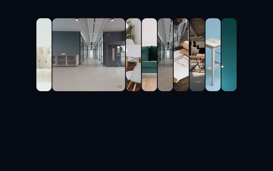
Skiper52
Rounded-3xl hover-expand image rack: idle strips stay 5rem, the active plate opens to 24rem.
block
Skiper67
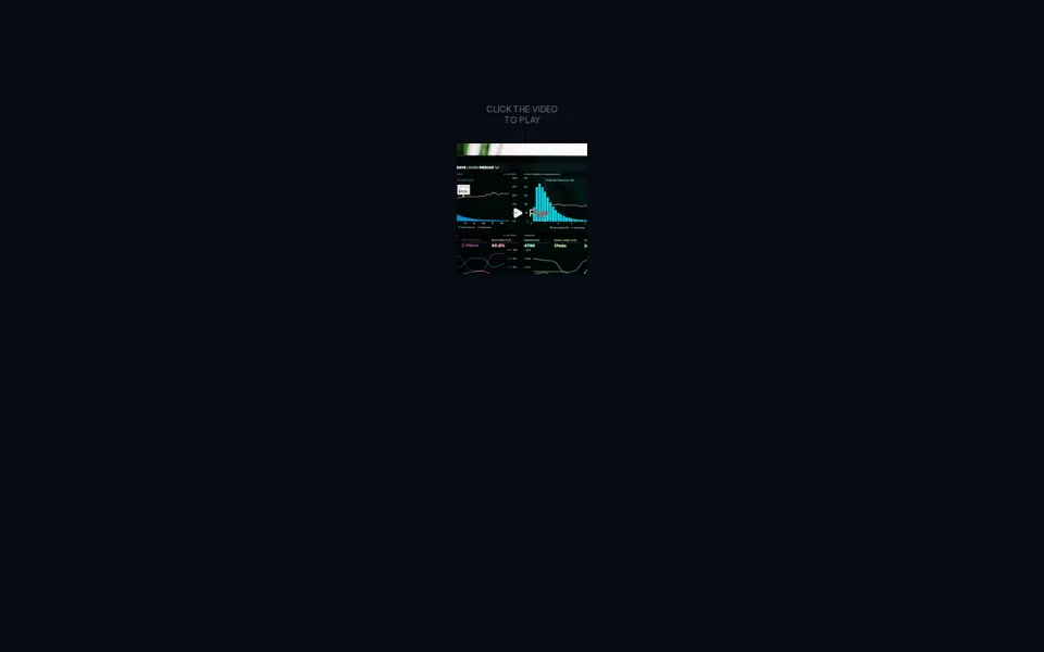
Square looping teaser with a cursor-following Play mark that expands into a full-bleed player overlay.
block
SplashCursor
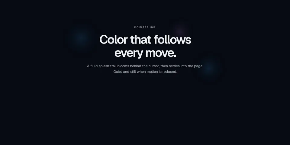
Marketing canvas that trails ink splashes behind the pointer, mixing semantic token colors and staying still when motion is reduced.

block
SplitText
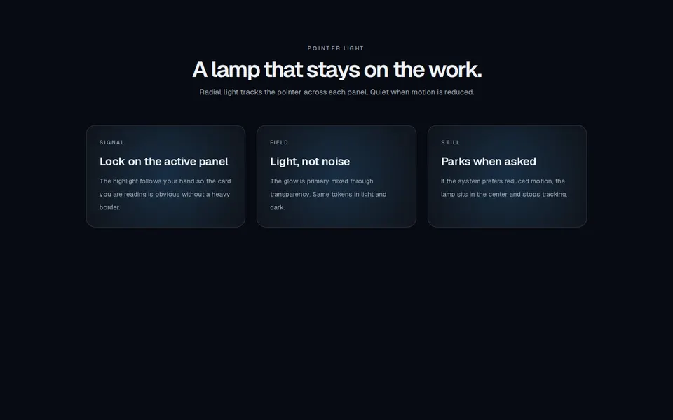
Marketing headline that splits into characters or words and staggers each unit into view, honoring prefers-reduced-motion.
block
SpotlightCard
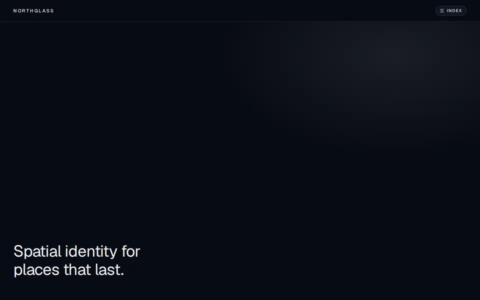
Marketing feature cards with a radial spotlight that tracks the pointer, using semantic tokens in light and dark.
block
SterlingGateKineticNavigation
Full-screen kinetic navigation that reveals a typography-heavy overlay from a focused header, with ripple hover on destinations.
block
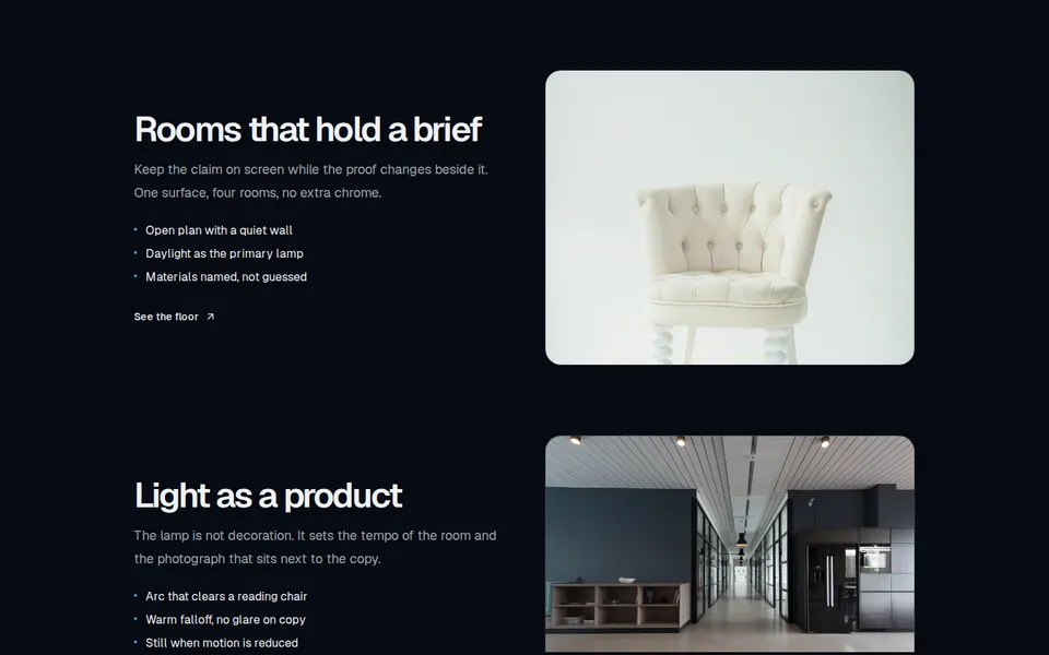
StickyContentWrapper
Split-screen marketing tour that pins a viewport while copy steps through headings, lists, and a CTA and the paired image scales and swaps.
block
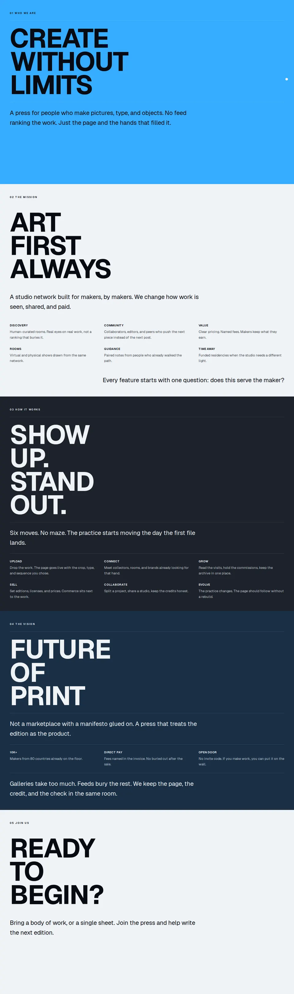
StoryScroll
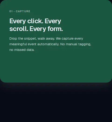
Full-viewport marketing chapters that pin and stack on scroll, with huge type, hairlines, and semantic tone surfaces.
block
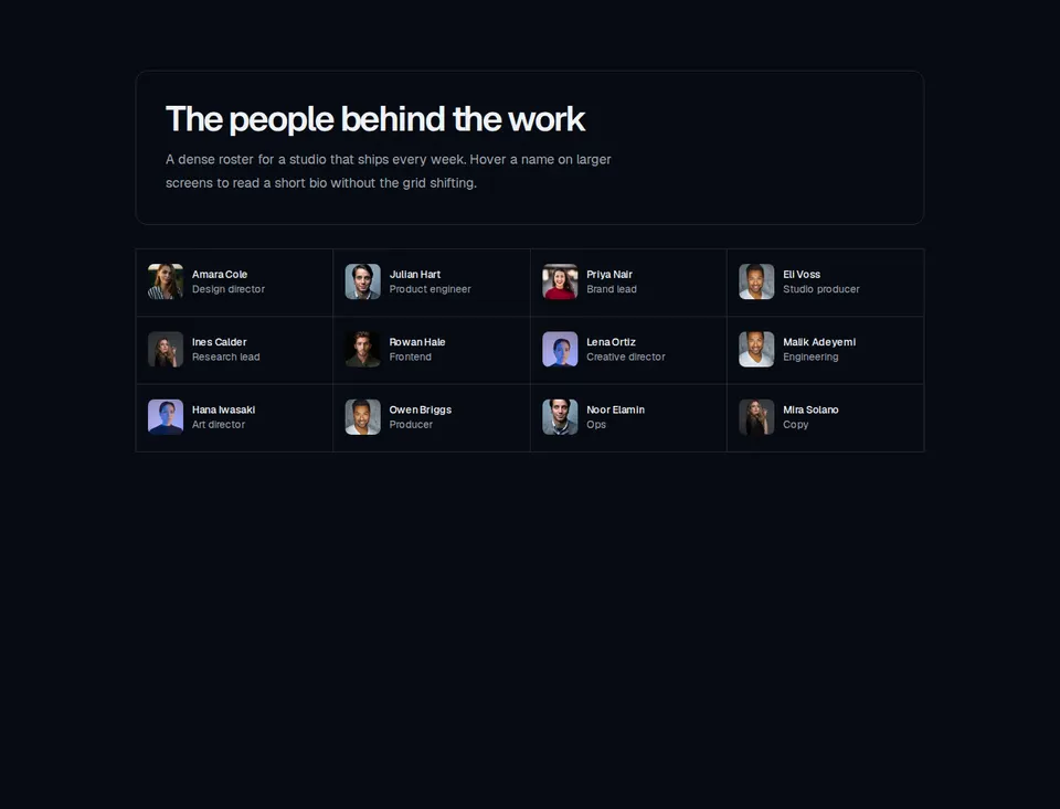
Team11
Bordered team header above a dense member grid that reveals a highlighted bio card on hover and keyboard focus from medium screens up.

block
Team14
Split hiring section with a bordered statement panel, ghost CTA, and a row of tall member portraits that becomes a looping carousel on small screens.

block
Team17
Documentary team block with a 3:4 portrait grid, flowing alumni and collaborator name lists, and a two-column culture band.
block
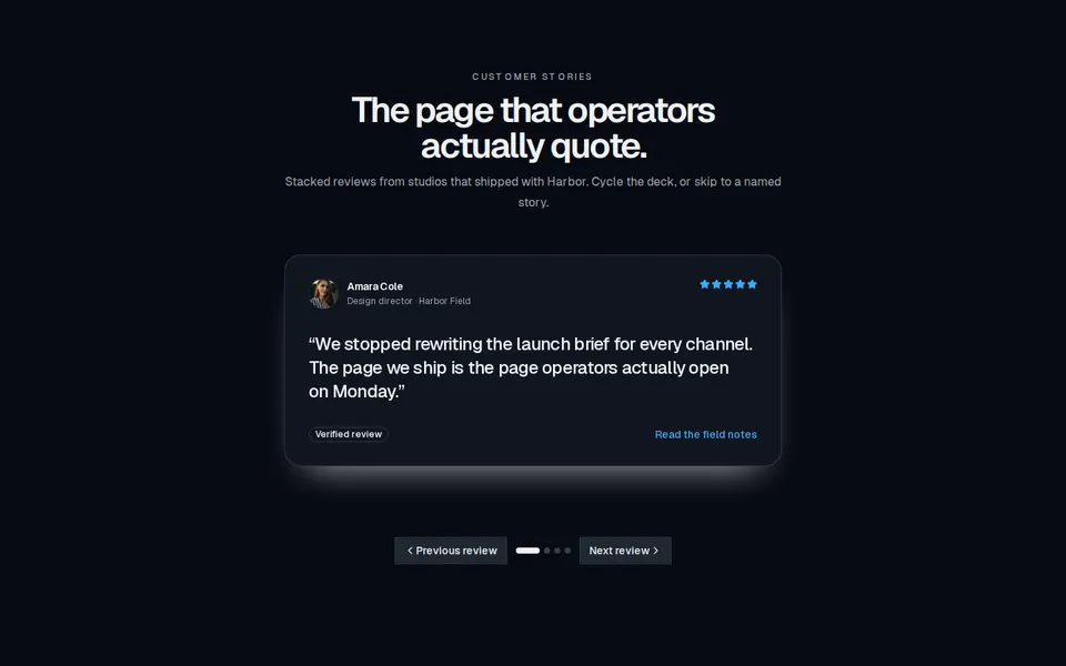
Testimonial
Marketing social-proof block with stacked quote cards, star ratings, avatars, and a grid layout that shows every review at once.
block
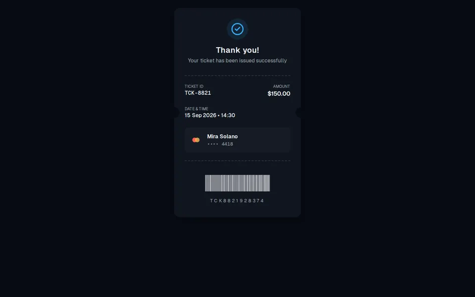
TicketConfirmationCard
Digital receipt-style confirmation with success status, ticket ID, payment details, and barcode.
block
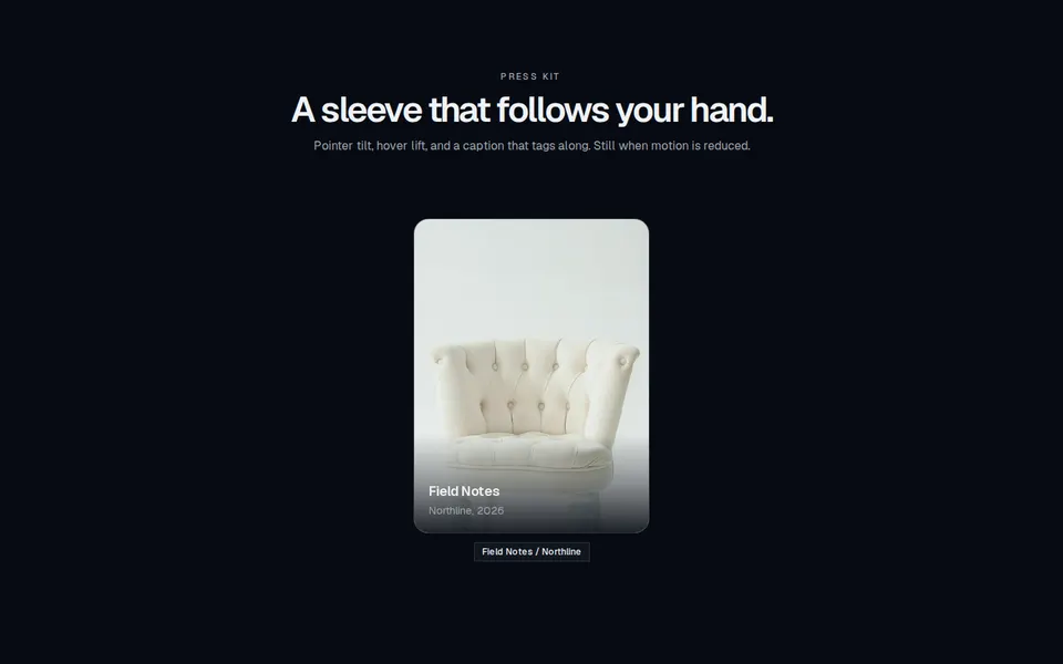
TiltedCard
Marketing media card that tilts and lifts toward the pointer, with an overlay title and a caption that follows the cursor.
block
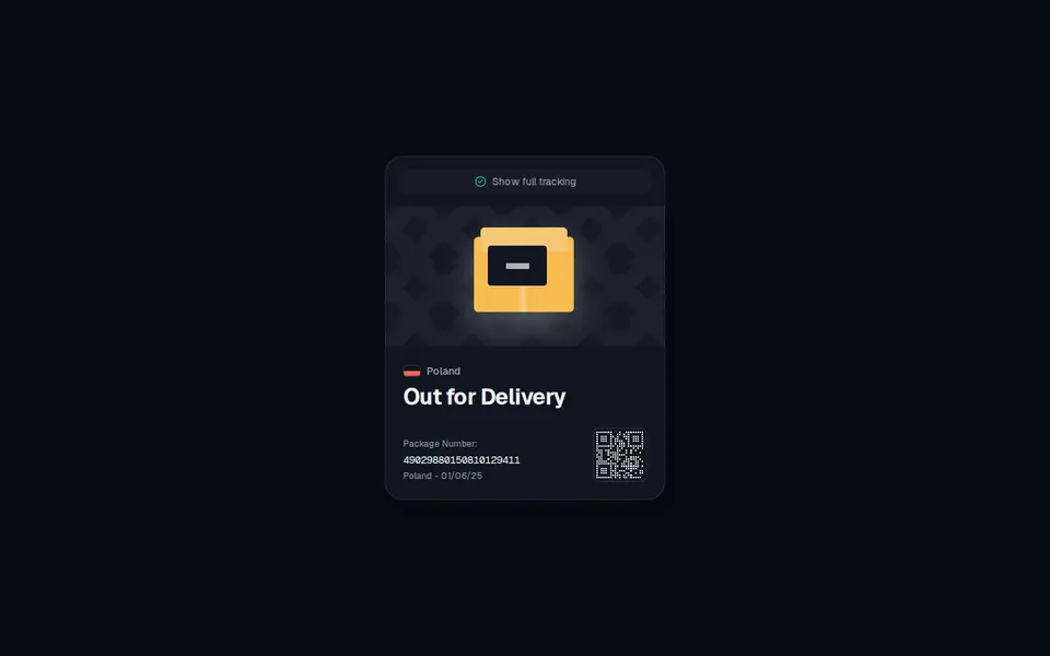
TrackerCard
Compact parcel card with a pill tracking control, conveyor package stage, destination flag, status headline, and a rounded scan mark.
block
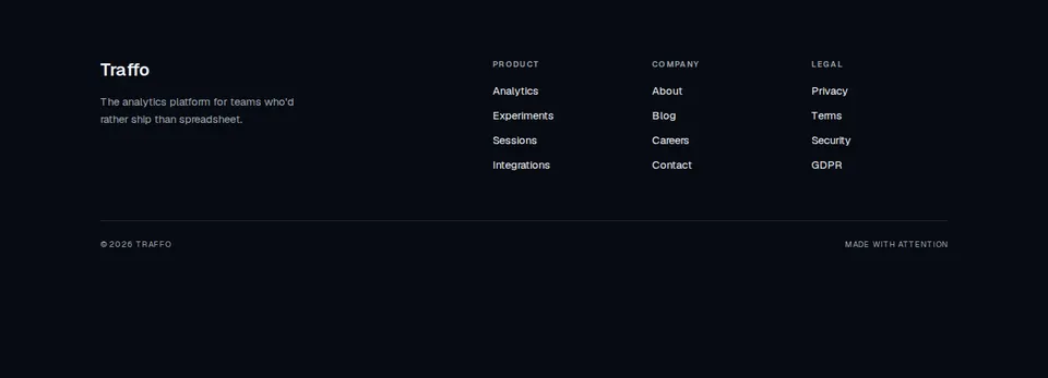
TraffoFooter
Traffo footer with brand blurb, Product/Company/Legal columns, and a quiet bottom bar.

block
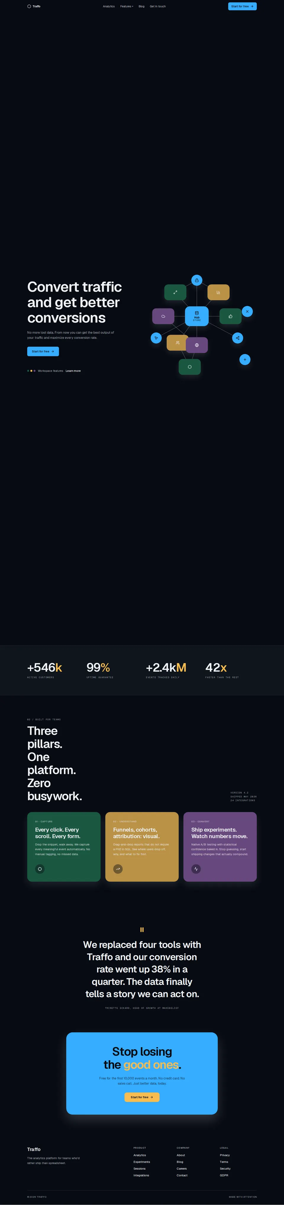
TraffoLandingPage
Full Traffo analytics landing: header, scroll-linked node graph, pillars, and footer.