 JabKit
block
CarouselCards
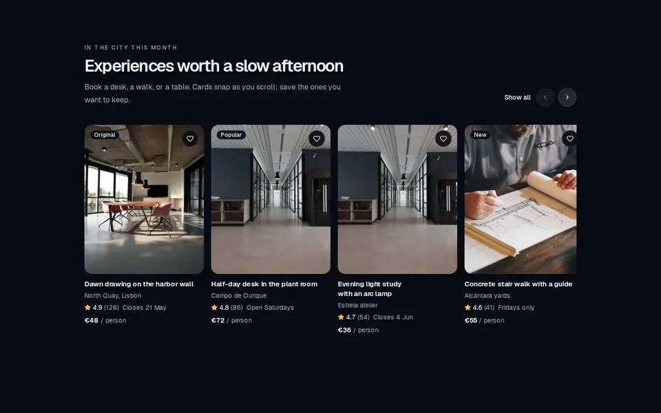
Horizontally scrollable marketing rail of listing cards with image, rating, price, and a favorite control.
214 results
Component catalogue
97–120 of 214
block
Horizontally scrollable marketing rail of listing cards with image, rating, price, and a favorite control.
block
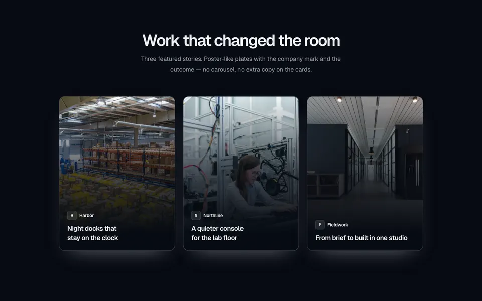
Centered case-study section with a three-column grid of portrait poster cards — full-bleed photography, a bottom gradient, company mark, and title.
block
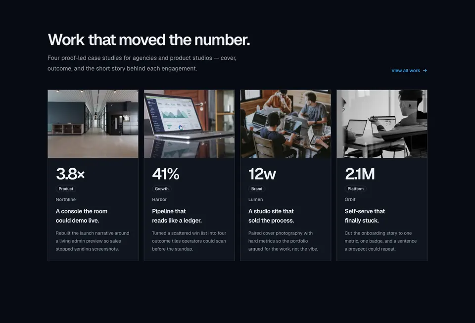
Four-column case-study grid with cover photographs, large outcome metrics, category badges, and short client stories.
block
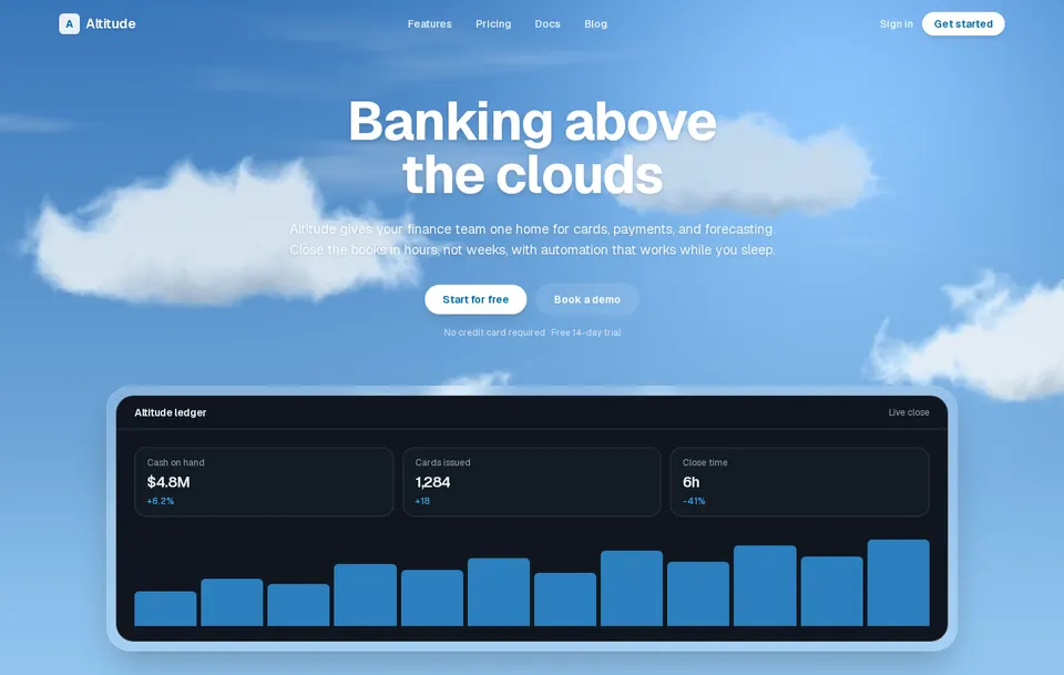
Soft procedural clouds that drift across a sky. Tune speed, count, and colors, then draw any content above the field.
block
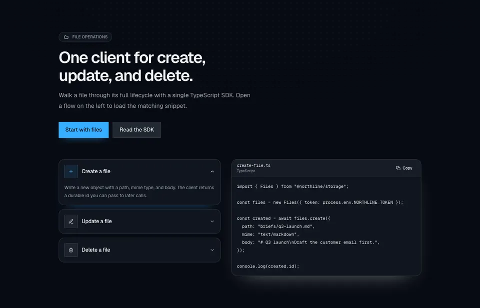
File-ops marketing section with a dotted radial wash, dual CTAs, accordion rows for create/update/delete, and a synced TypeScript snippet with copy.

block
Centered coming-soon page with a live day-hour-minute-second countdown and an email notify form.
block
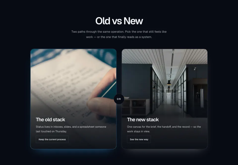
Centered old-versus-new marketing compare with two tall photo cards, bottom scrims, outline actions, and a circular OR chip in the gutter.
block
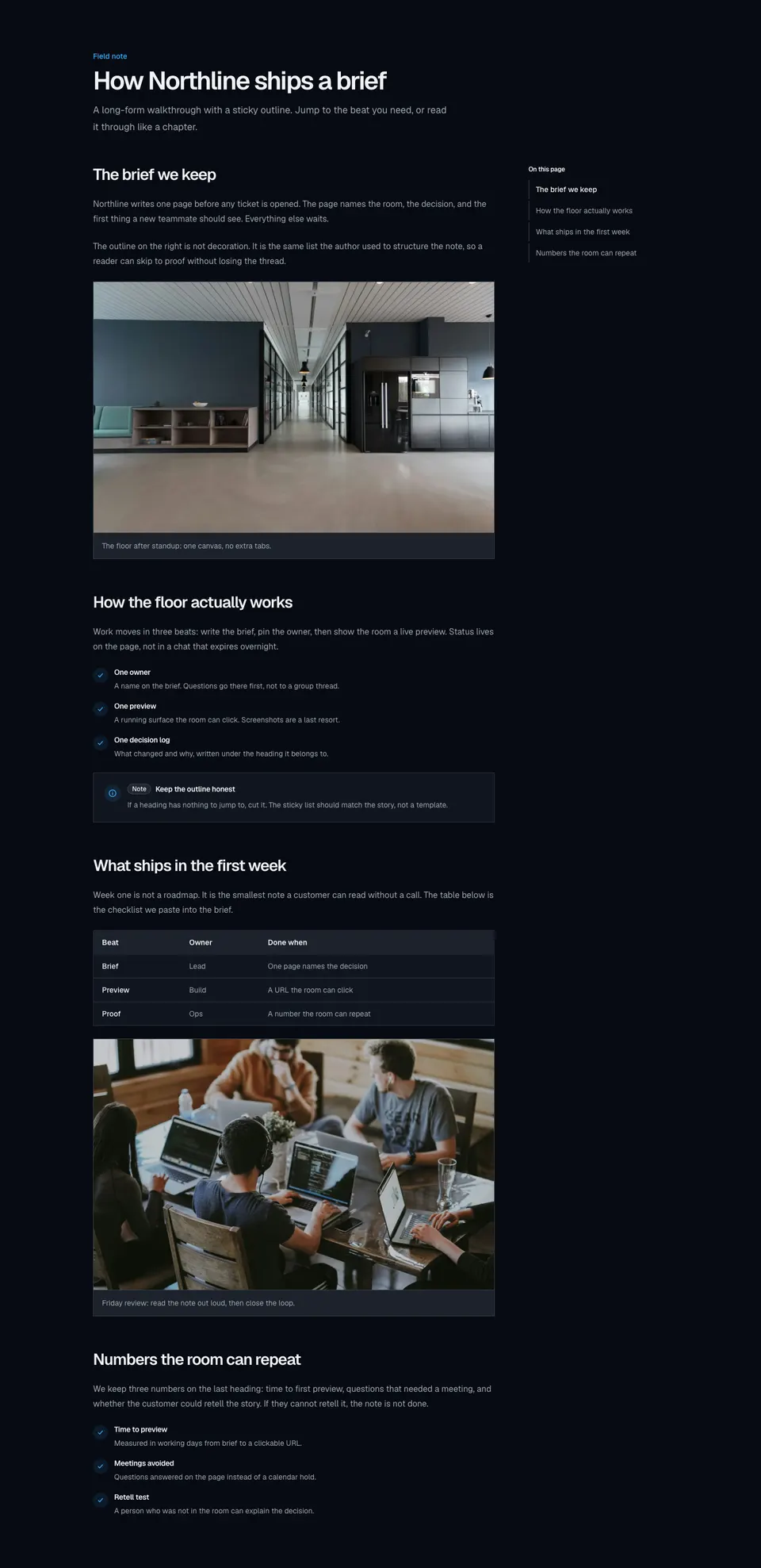
Long-form marketing article with a sticky in-page outline, scroll-linked active sections, and rich body blocks for images, lists, tables, and callouts.
block
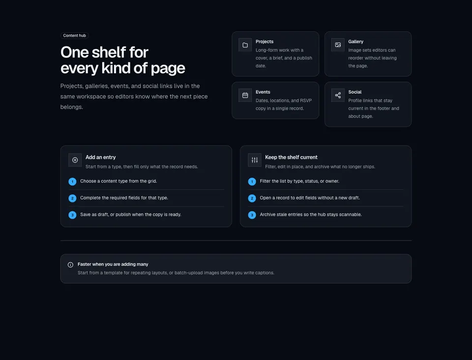
Content-hub explainer with a labeled intro, icon type grid, create and manage how-to panels, and an inline tip alert.
block
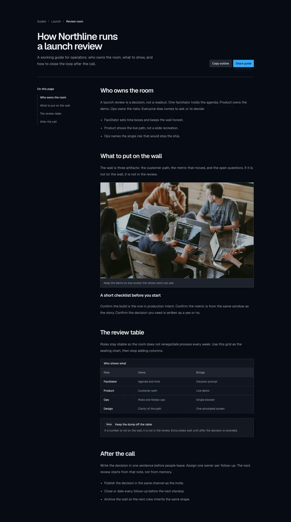
Knowledge-style marketing article with breadcrumbs, headline actions, a sticky topic rail, inline figures, a data table, and a callout.
block
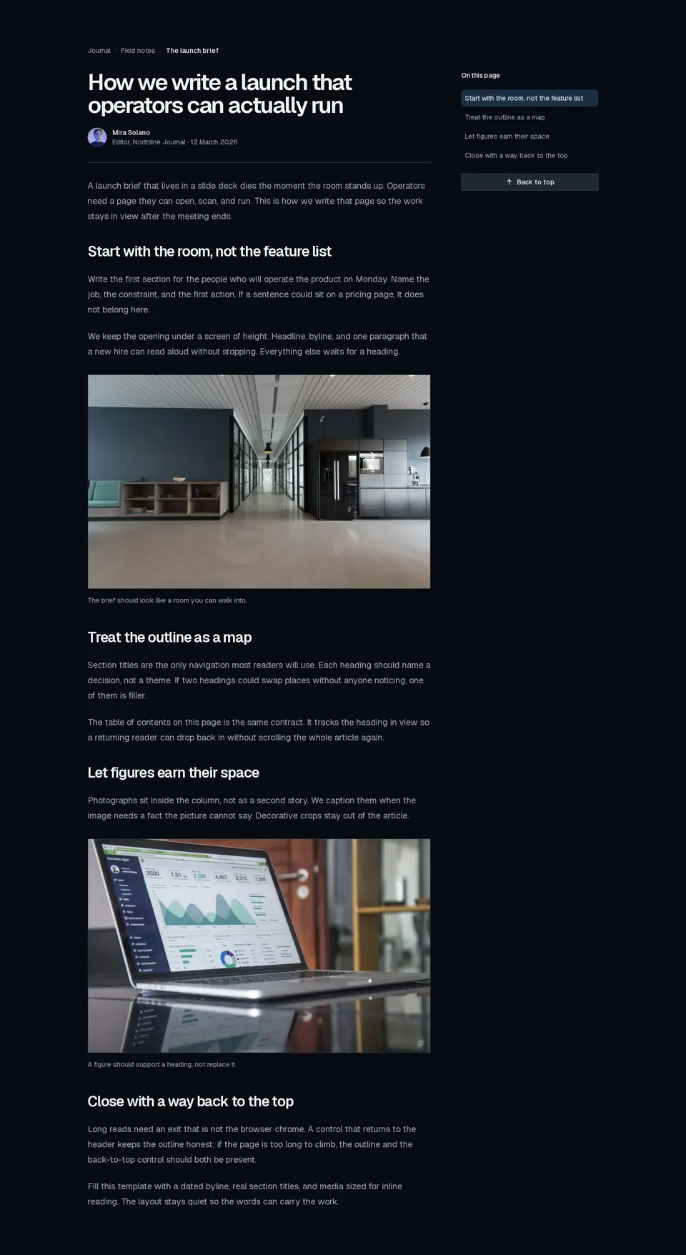
Publication-style long read with breadcrumbs, author byline, inline figures, a scroll-aware table of contents, and a back-to-top control.
block
Marketing proof figure that counts from a start value to a target when it enters view, honoring prefers-reduced-motion.
block
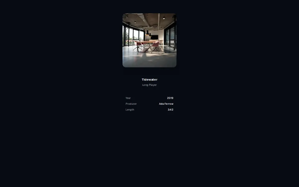
Edge-to-edge rack of square covers with inverse 3D perspective: the centre sits square while neighbours swing their outer edges forward. Drag, flick, or arrow through; the caption follows.
block
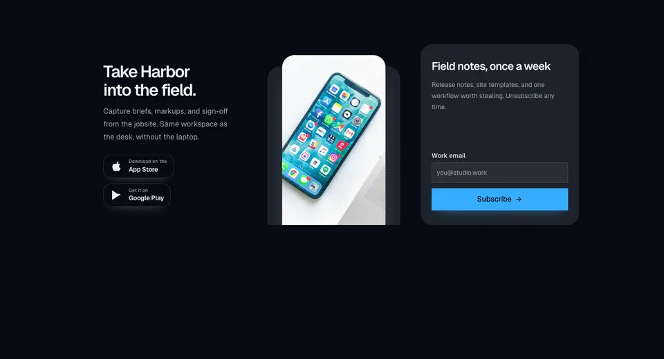
Marketing CTA with a dark app-download panel, store badges, overlapping phone imagery, and a muted newsletter form in a three-column grid.
block
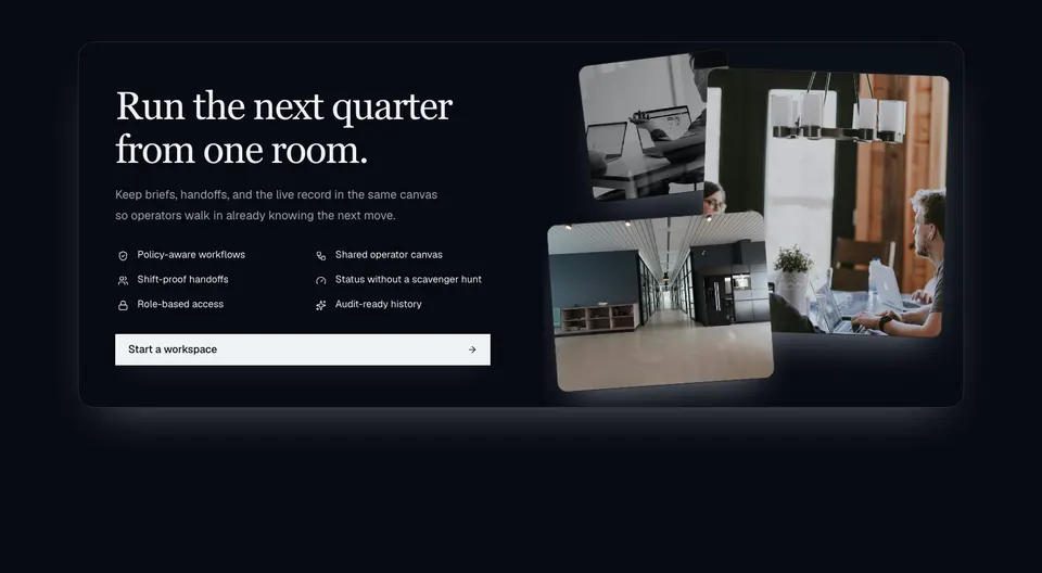
Dark enterprise CTA with a serif headline, two-column icon capability grid, wide action, and a layered photo collage on extra-wide layouts.
block
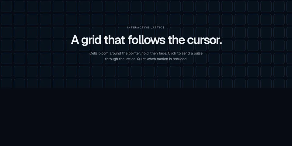
Marketing canvas lattice that lights cells around the cursor with configurable falloff and click pulses, honoring prefers-reduced-motion.

block
Full-viewport fashion hero with synced autoplay campaign slides and a product thumbnail rail.
block
Dense storefront header with nested dropdowns, a mega shop panel, search, wishlist and cart badges, account menu, and an accordion mobile sheet.

block
Animated ember footer with a waitlist form, dark radial canvas bed, slim link row, and success transition.

block
Marketing headline whose words fall with a physics-like tumble on click, hover, auto, or scroll, with semantic highlights and a static reduced-motion reading.

block
Documentation-style FAQ with a category sidebar, per-topic accordions, and scroll-synced active highlighting.
block
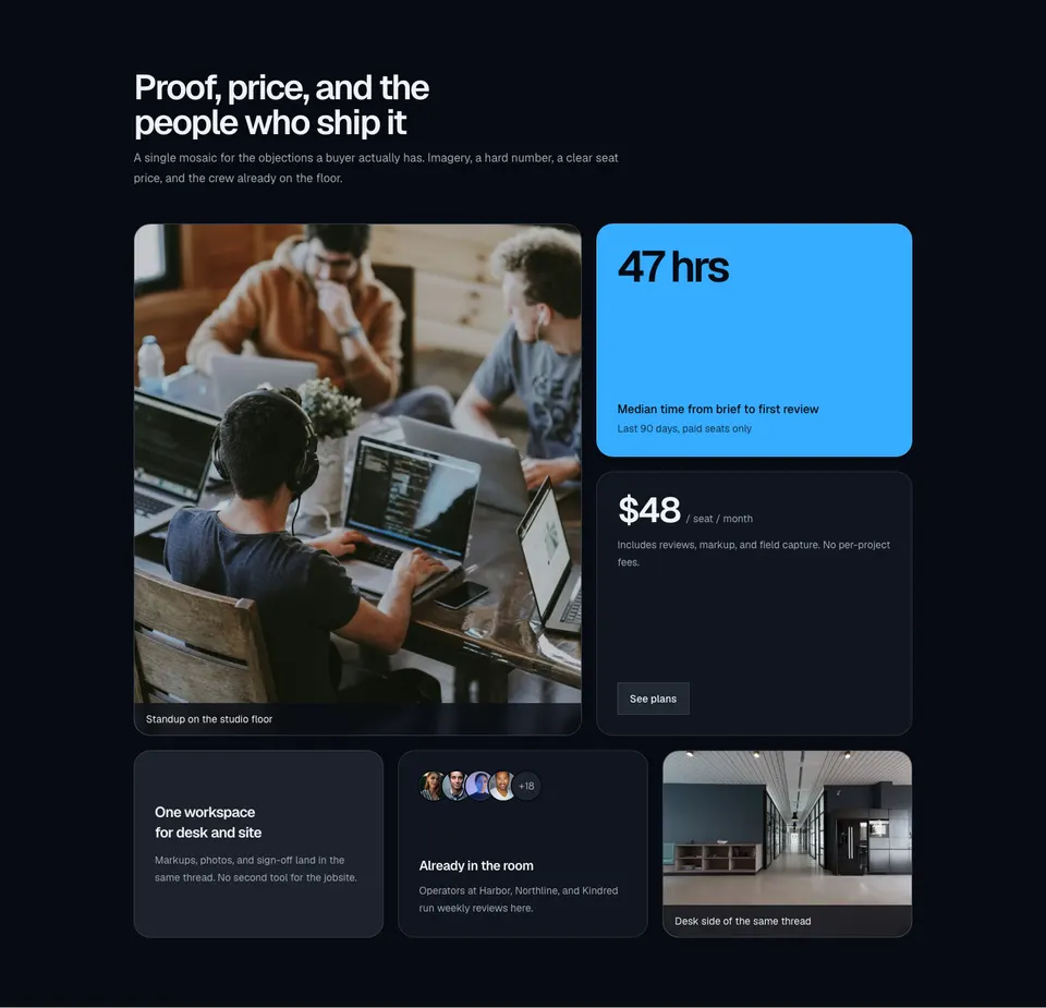
Marketing bento mosaic mixing a tall photo, a stat callout, a pricing tile, a short promo, an avatar cluster, and a supporting image.
block
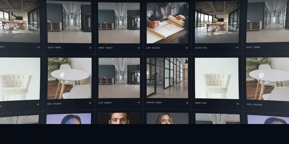
Two-axis editorial image wall that wraps seamlessly and bends as one fisheye surface, with weighted drag, wheel, and arrow navigation.
block
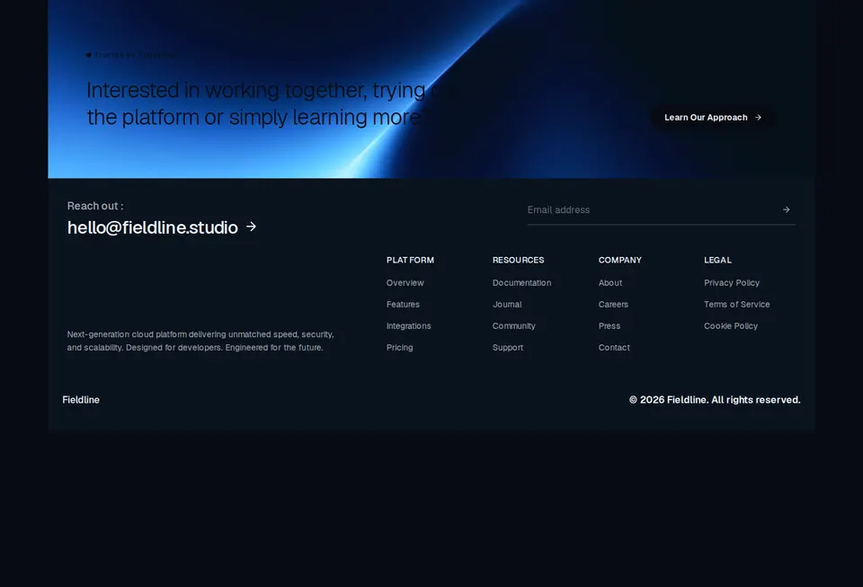
Blush-plate marketing footer with a photographic banner CTA, large email, underline newsletter, and four link columns.