 JabKit

block
AgencyTopbar
Sticky agency chrome with a LAYOUT brand, primary anchors, and a live local-time clock.
23 results
Reusable sections
1–23 of 23
block
Sticky agency chrome with a LAYOUT brand, primary anchors, and a live local-time clock.
block
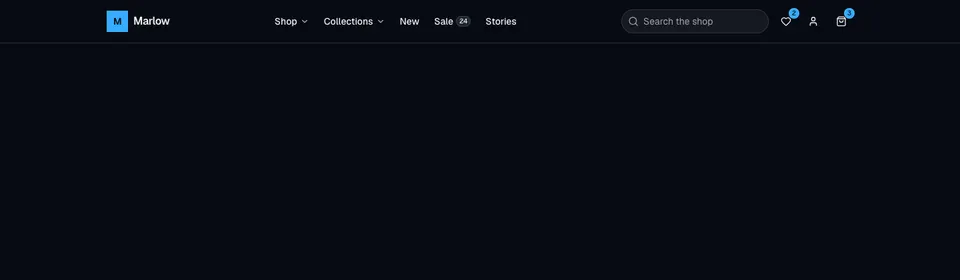
Dense storefront header with nested dropdowns, a mega shop panel, search, wishlist and cart badges, account menu, and an accordion mobile sheet.
block
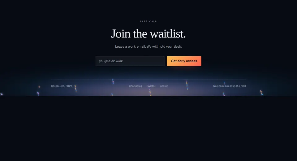
Animated ember footer with a waitlist form, dark radial canvas bed, slim link row, and success transition.
block
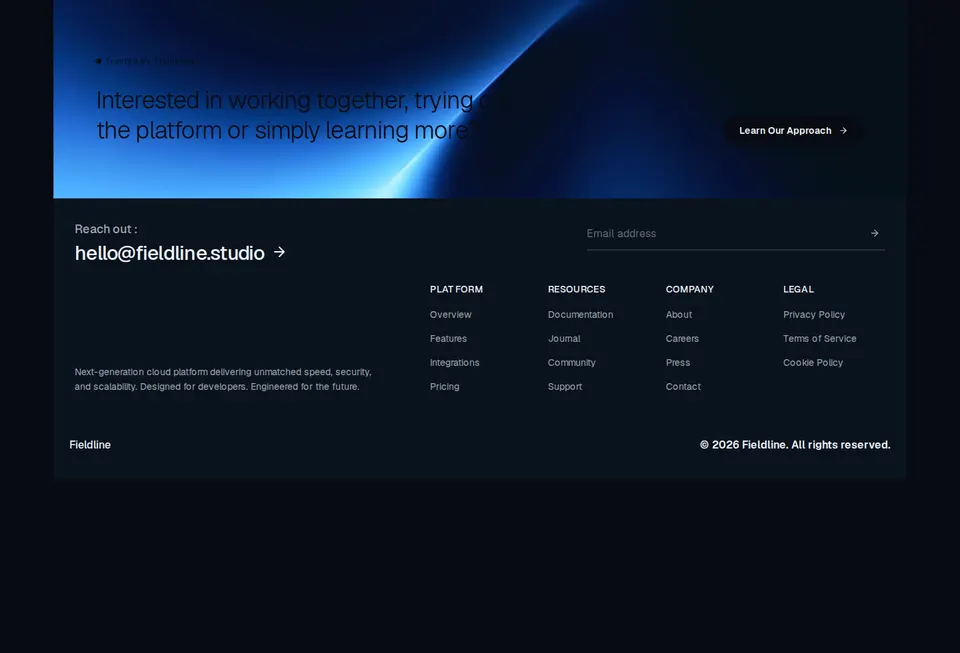
Blush-plate marketing footer with a photographic banner CTA, large email, underline newsletter, and four link columns.
block
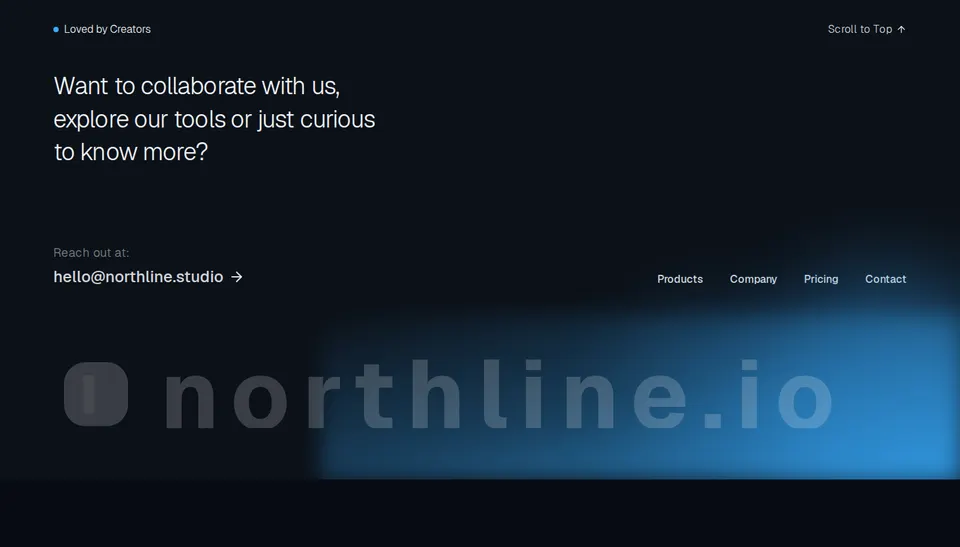
Dark closing footer with a live badge, light headline, email CTA, text nav, and a stretched wordmark over a primary glow.
block
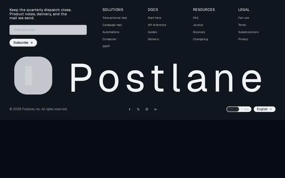
Dark editorial footer with newsletter capture, compact link columns, oversized brand lockup, socials, theme pills, and a language control.
block
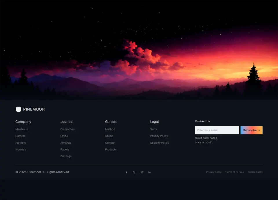
Cinematic landscape footer with a fading wide hero, four link columns, a sharp newsletter capture, socials, and legal links.
block
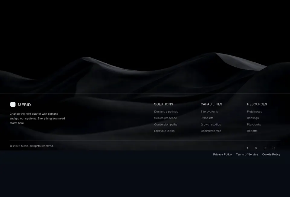
Cinematic landscape footer with a faded giant wordmark, three link columns, socials, and legal links over a photographic close.
block
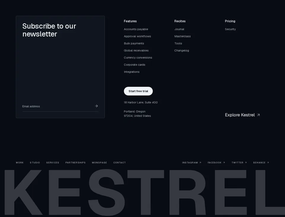
Full-viewport agency footer with a newsletter card, pill trial CTA, three link columns, uppercase utility links, and an oversized muted wordmark.
block
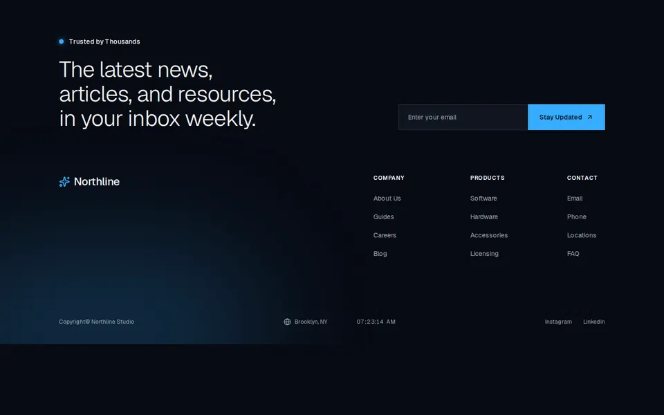
Dark dotted-grid footer with a square newsletter join, status badge, three uppercase link columns, and a location time strip.
block
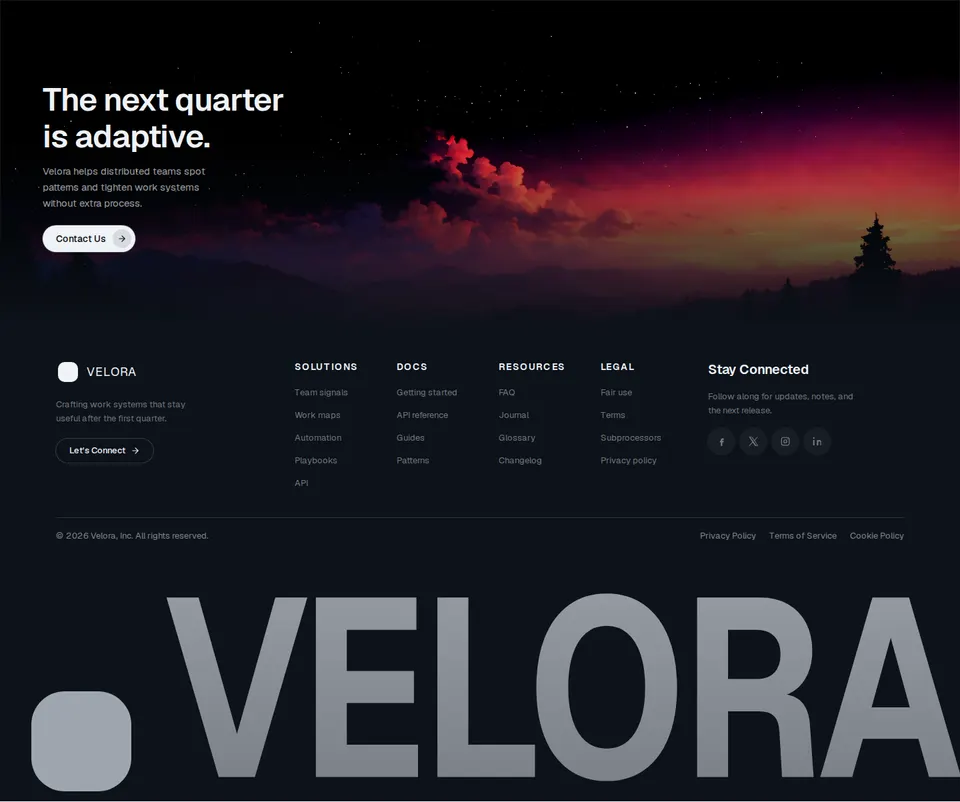
Cinematic landscape footer with a hero CTA, four-column nav, circular socials, and a slammed giant wordmark.
block
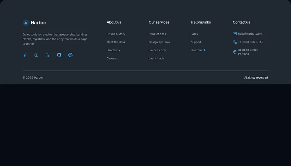
Site footer with a brand column, about and service links, a live-help row, contact details, and a legal bar.
block
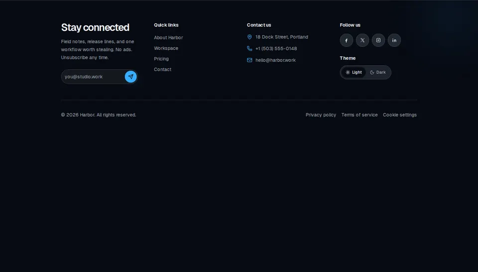
Site footer with a newsletter field, quick links, contact details, social marks, a light/dark toggle, and a legal row.

block
Stacked large-type marketing navigation that slides an arrow in and optionally skews labels on hover.
block
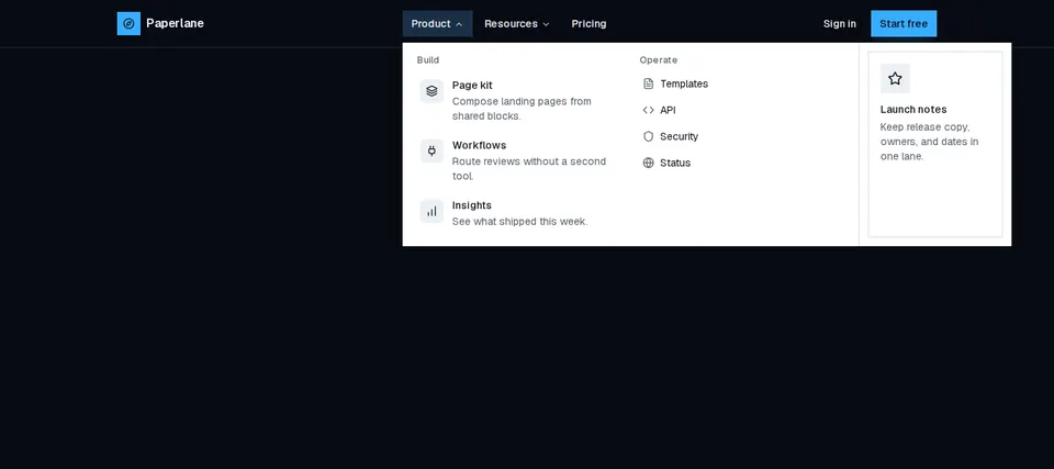
Marketing header with animated desktop mega menus, a primary CTA, and a slide-in overlay for small screens.

block
Horizontal marketing navigation whose link labels shuffle glyphs in a random vertical swap on hover.

block
Mugsys store chrome with brand mark, four destination links, a sliding Explore CTA, and a compact mobile menu.
block
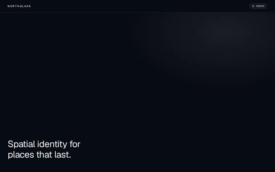
Full-screen kinetic navigation that reveals a typography-heavy overlay from a focused header, with ripple hover on destinations.
block
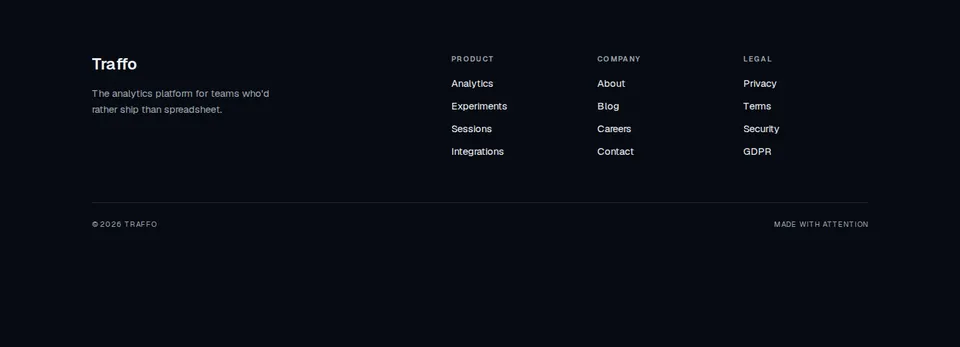
Traffo footer with brand blurb, Product/Company/Legal columns, and a quiet bottom bar.


block
Floating pill navigation with a sliding active highlight and a primary-token tubelight glow on the current item.
block
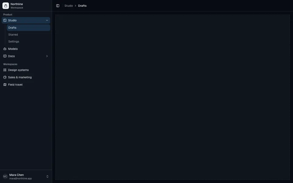
Collapsible application shell with grouped sidebar navigation, nested submenus, user footer, and a breadcrumb header.
block
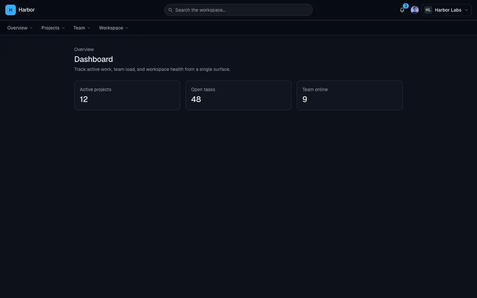
Top navigation dashboard shell with search, org and user menus, dropdown nav groups, a mobile drawer, and a bottom bar.