 JabKit
component
Button
A semantic, accessible action button with primary, secondary, ghost, and destructive treatments.
20 results
Interface primitives
1–20 of 20
component
A semantic, accessible action button with primary, secondary, ghost, and destructive treatments.
component
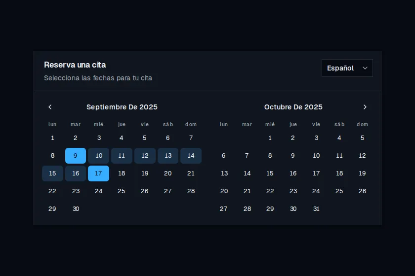
Two-month appointment calendar with a language switcher that localizes copy, weekdays, and month titles.
component
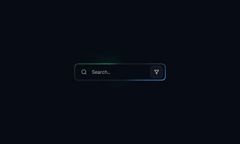
A 301px by 56px search field with layered conic borders, a filter affordance, and focus glow.
component
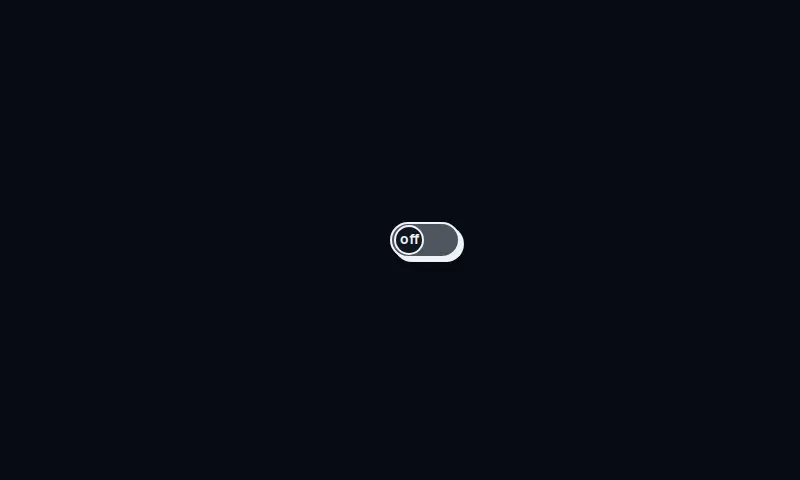
A 70 by 36 neo-brutalist on/off switch: 100px pill track, 2px ink border, 4px offset shadow, and a labeled thumb that slides the well.
component
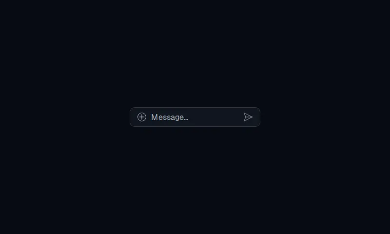
A 40px, 10px-radius message bar with a plus-circle attach control, a 200px field, and a paper-plane send mark.
component
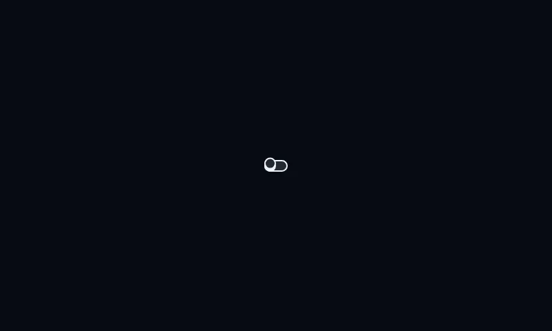
A compact outlined switch with a 1em pill track and a circular thumb that lifts on hover and slides when on.
component
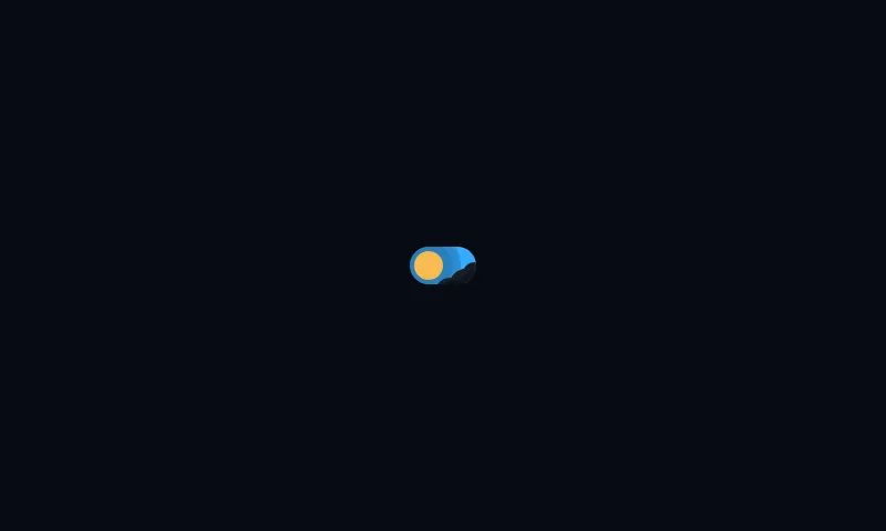
A 60×34 pill day-to-night checkbox: sun, halo rays, and drifting clouds slide into a cratered moon and four-point stars.
component
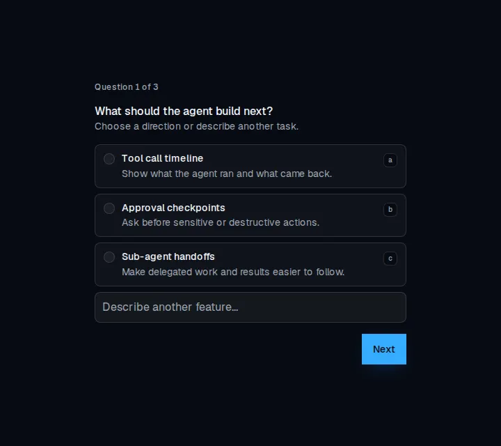
A multi-step questionnaire with single-choice, multiple-choice, freeform, and skippable questions.
component
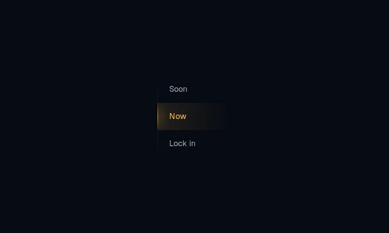
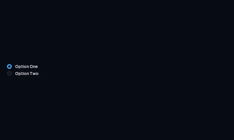
Vertical radio stack with a 10px clip and a glowing rail that slides to the checked option.
component
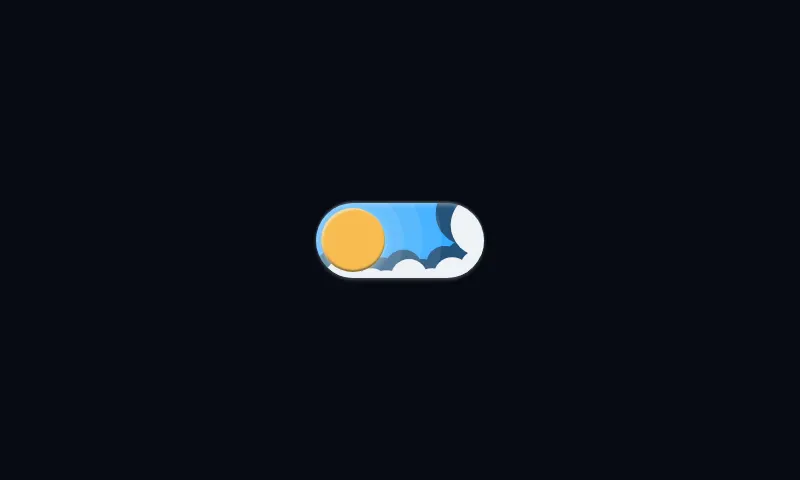
A pill day-to-night switch whose sun slides into a cratered moon while clouds drop and stars rise.
component
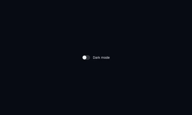
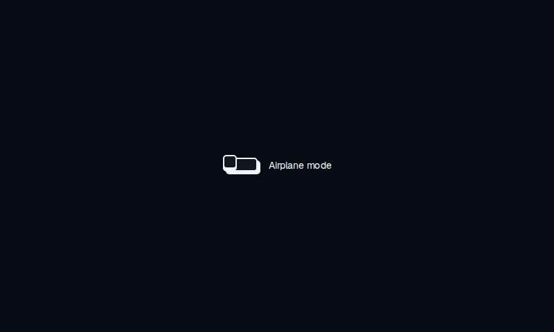
A compact neo-brutalist switch with a 5px-radius track, hard offset shadow, and a matching square knob.
component
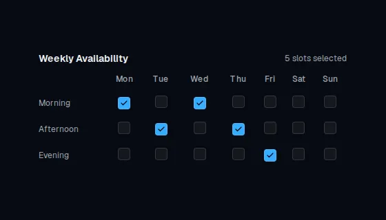
Weekly availability grid with a checkbox for each day and time slot, plus a live selected-count.
component
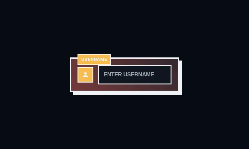
A square brutalist 3D username field: hard offset shadow, warning plaque, and a native text input that lifts on hover.