 JabKit
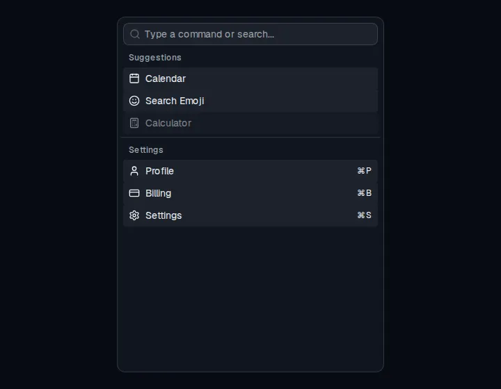
component
Command
Command menu for search and quick actions, with groups, shortcuts, and an optional dialog palette.
75 results
Interface primitives
25–48 of 75
component
Command menu for search and quick actions, with groups, shortcuts, and an optional dialog palette.
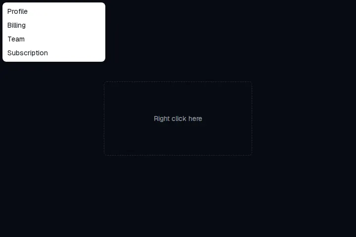
component
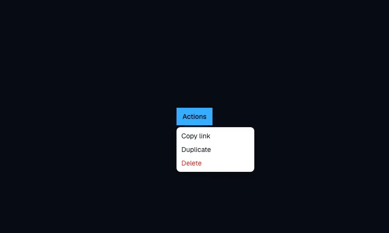
Right-click menu of contextual actions, with groups, shortcuts, nested menus, and selection items.
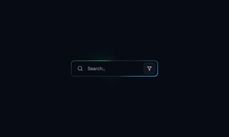
component
A 301px by 56px search field with layered conic borders, a filter affordance, and focus glow.
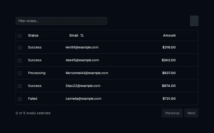

component
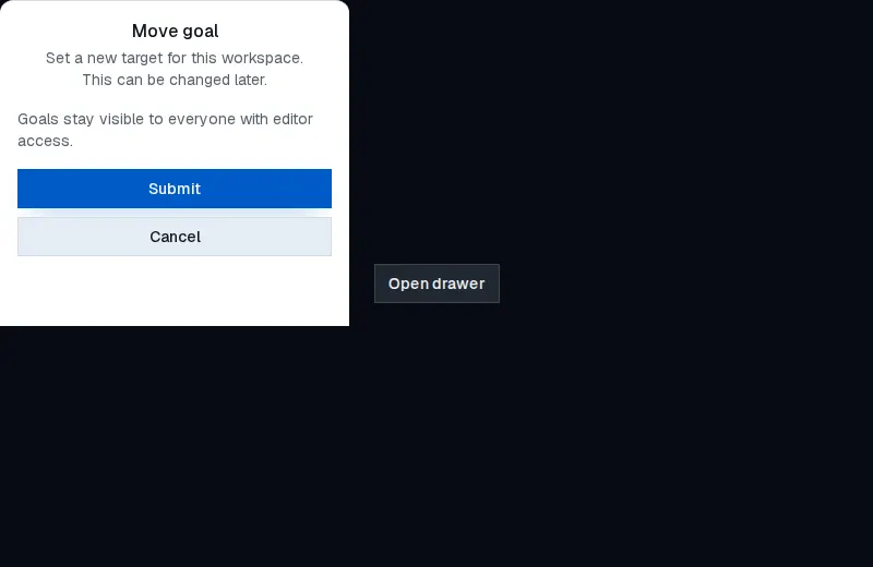
Accessible modal dialog with trigger, overlay, header, description, and footer composed on Base UI.
component
Accessible swipeable drawer with trigger, overlay, header, description, and footer composed on Base UI.
component
A 70 by 36 neo-brutalist on/off switch: 100px pill track, 2px ink border, 4px offset shadow, and a labeled thumb that slides the well.
component
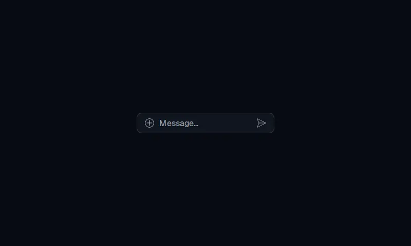
A 40px, 10px-radius message bar with a plus-circle attach control, a 200px field, and a paper-plane send mark.

component
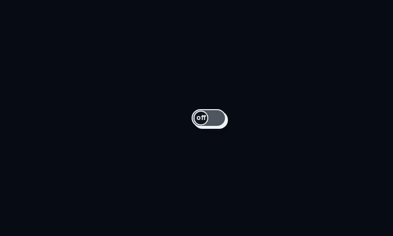
A compact outlined switch with a 1em pill track and a circular thumb that lifts on hover and slides when on.
component
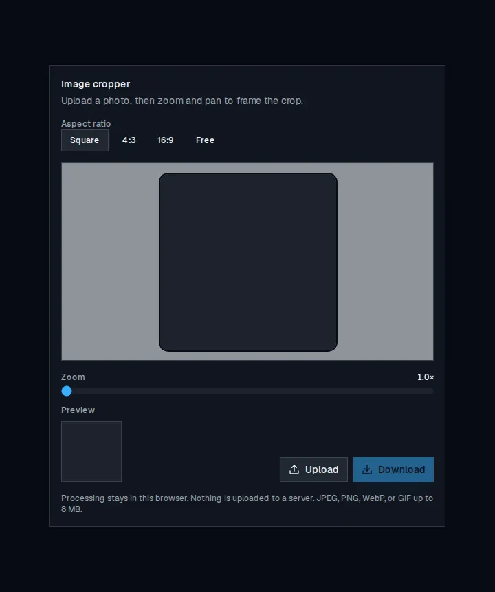
Upload a photo, zoom and pan to frame a crop, then preview and download the result.
component
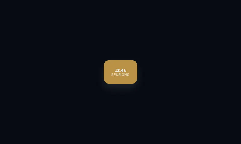
Single data node for a Traffo-style constellation: label, value, and idle or active state.

component
A 60×34 pill day-to-night checkbox: sun, halo rays, and drifting clouds slide into a cratered moon and four-point stars.
component
A 3D split-flap word where each glyph tilts back while its echo flips up in a staggered spring wave.
component
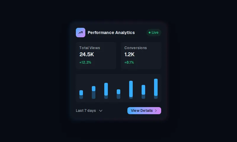
A compact analytics card with a token gradient rim, two stats, a seven-bar spark, and a local-radius details action.
component
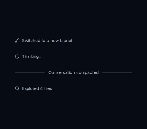
Displays an inline status, system note, bordered row, or labeled separator in a conversation.
component
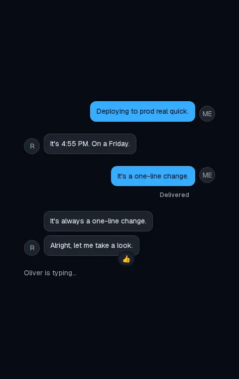
Lays out a conversation row with optional avatar, header, footer, and start or end alignment.
component
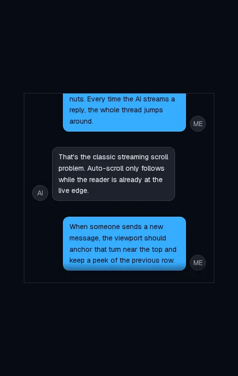
A chat transcript scroller that anchors turns, follows streamed replies, and preserves the reader's place.
component
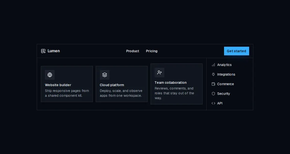
Accessible site navigation with desktop mega menus, compact link lists, and a mobile disclosure drawer.
component
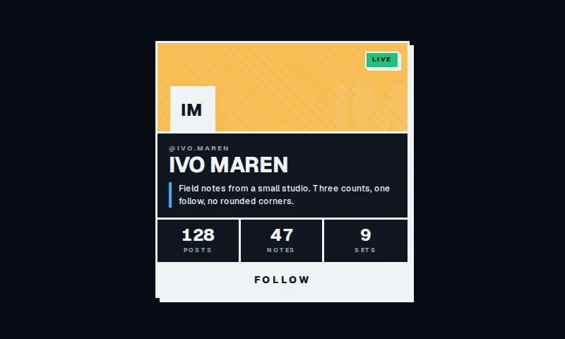
A square neo-brutalist profile plate: striped header, hard offset shadow, three counts, and a full-width follow.