 JabKit
component
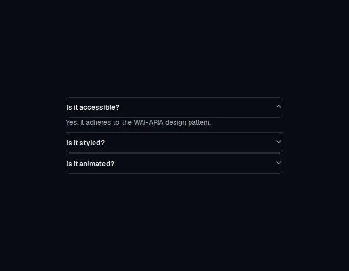
Accordion
Vertically stacked headings that reveal and hide related content, with single or multiple open items.
75 results
Interface primitives
1–24 of 75
component
Vertically stacked headings that reveal and hide related content, with single or multiple open items.
component
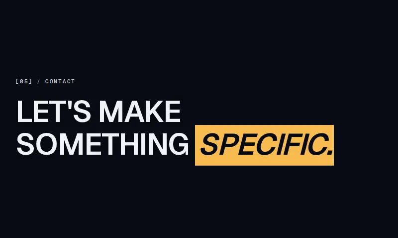
Numbered agency section label in the [05] / Contact pattern, with optional title and emphasis highlight.
component
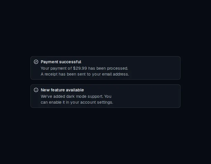
Inline callout for user attention with default and destructive variants, title, description, and an optional action.

component
A modal that interrupts the page to confirm a destructive or high-impact action before it proceeds.

component
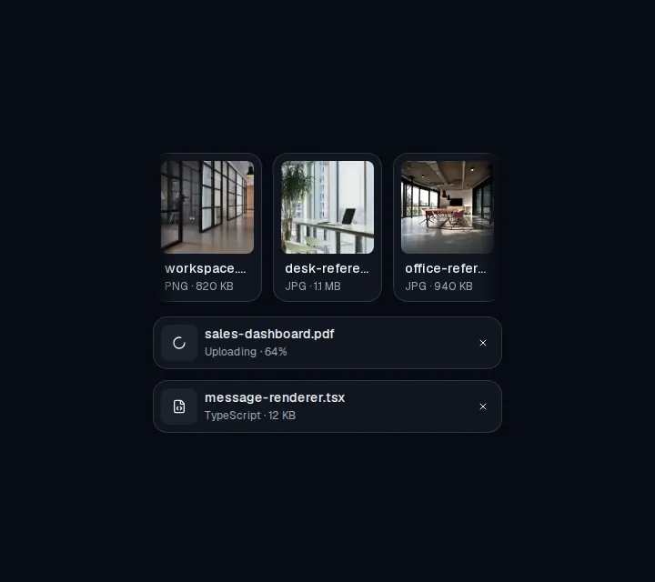
Displays a file or image attachment with media, metadata, upload state, and actions.


component
Circular identity avatar with a static offset outline and a verification check badge.
component
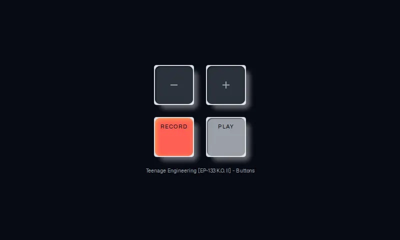
A four-key sampler pad with square chassis wells, inset 10px-radius keys, and a hard press-in shadow.
component
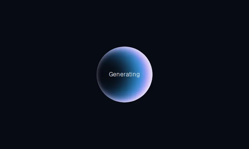
A circular generating indicator with staggered letter pulses and a rotating inset-shadow highlight.
component
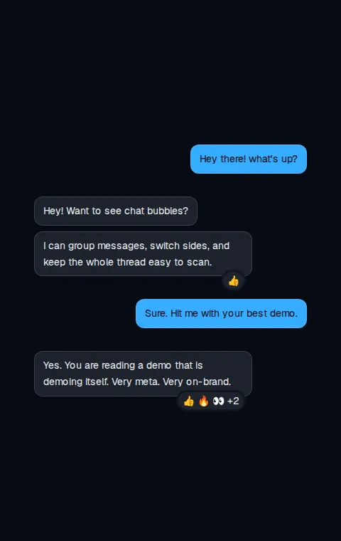
Displays conversational content in a message bubble with variants, alignment, grouping, and reactions.
component
A semantic, accessible action button with primary, secondary, ghost, and destructive treatments.
component
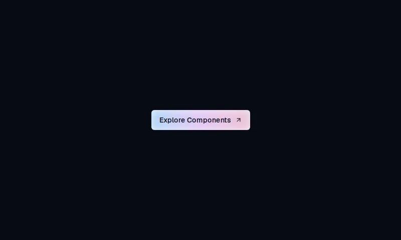
A compact rounded-md CTA with a chart-token indigo-to-pink wash that brightens on hover.
component
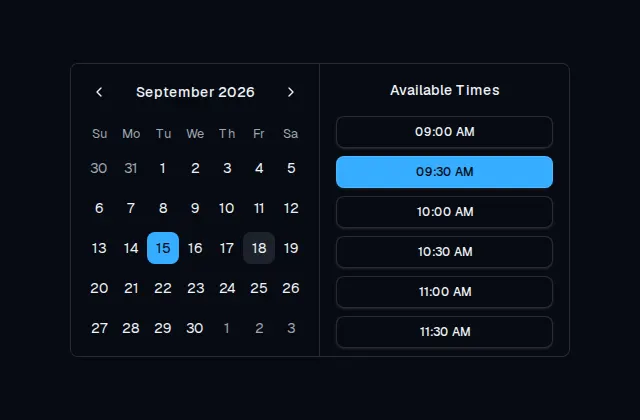
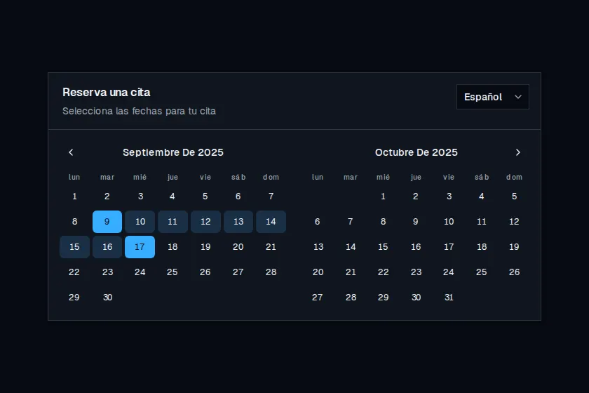
Two-month appointment calendar with a language switcher that localizes copy, weekdays, and month titles.

component
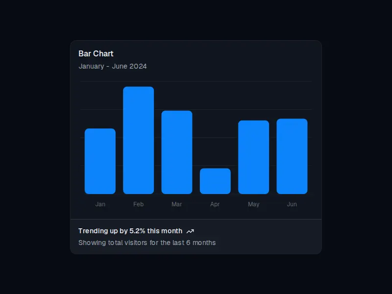
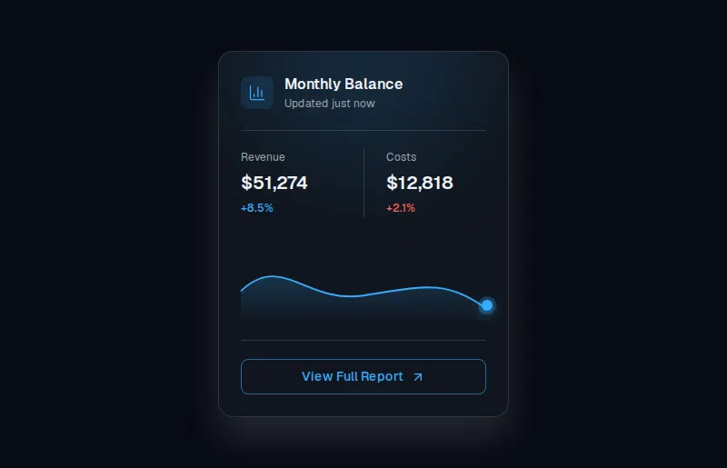
A compact dark balance card with revenue metrics, an aurora chart, and a report action.
component
Autocomplete input with a filterable list of suggestions, including multi-select chips.