 JabKit
block
PricingCalendar
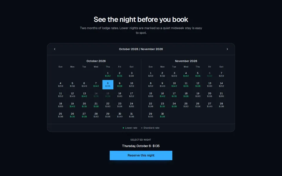
Two-month DayPicker-style calendar with a nightly price on each day and a lower-rate highlight.
113 results
Component catalogue
73–96 of 113
block
Two-month DayPicker-style calendar with a nightly price on each day and a lower-rate highlight.
block
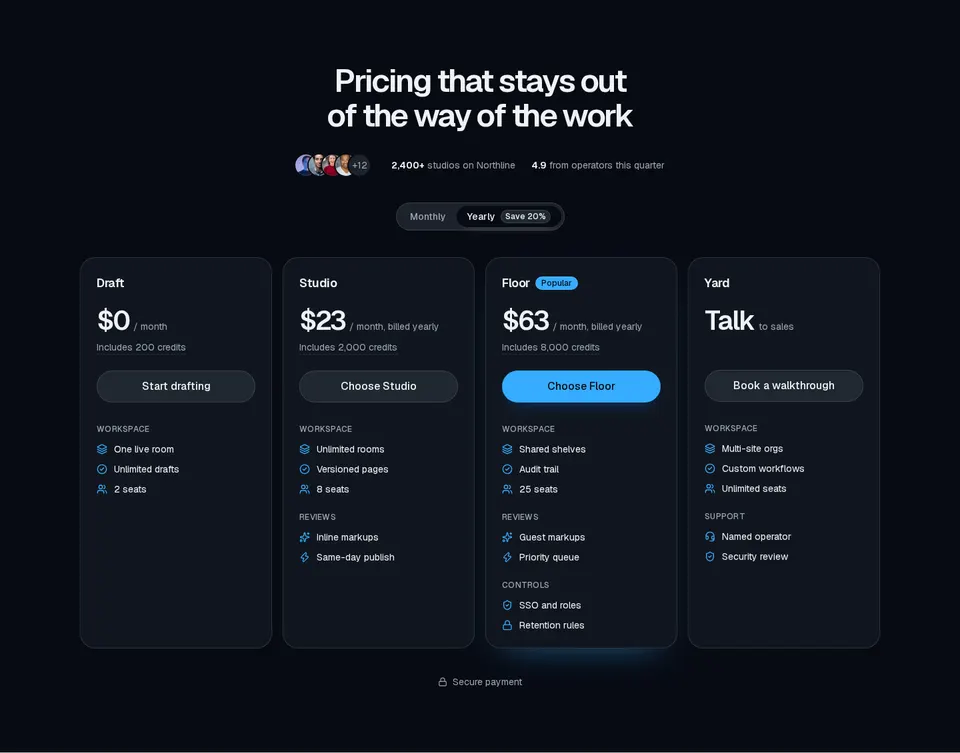
Four-plan pricing section with avatar social proof, monthly/yearly billing tabs, tooltips, and grouped feature lists.
block
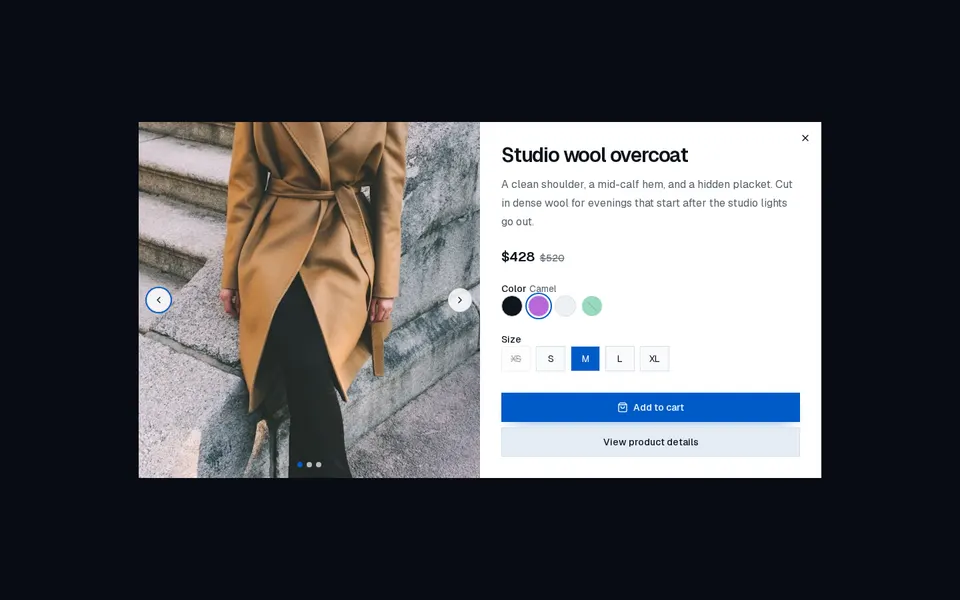
Product quick-view dialog with an image carousel, optional price and color groups, size or format options, and a primary action plus details link.
block
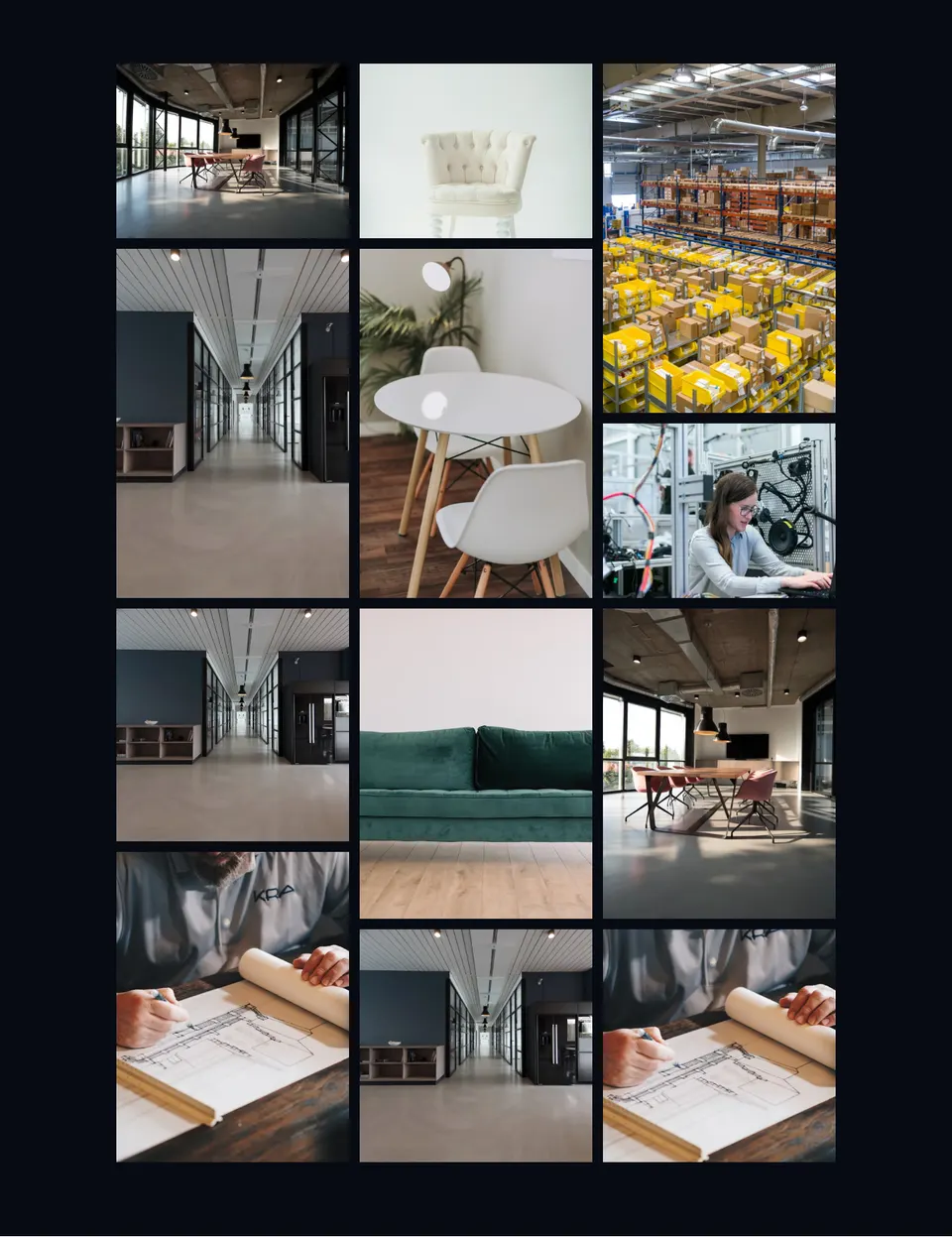
Masonry project photo wall in CSS columns — twelve unframed images that rise into view on scroll and lift with a brightness overlay on hover.
block
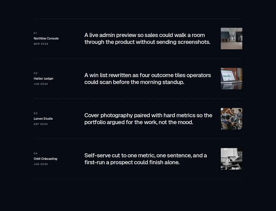
Editorial project index: numbered rows with title, launch date, large description, and a small thumbnail, separated by hairline borders. Optional per-row hrefs render as title text links.
block
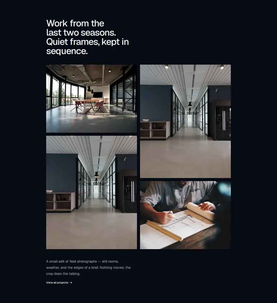
Editorial four-image gallery with a medium-weight heading, a two-column staggered 4:3 and 4:5 photo grid, optional captions with text-link destinations, and a link action beneath a short paragraph. Extra images are not rendered.

block
Horizontal marketing navigation whose link labels shuffle glyphs in a random vertical swap on hover.
block
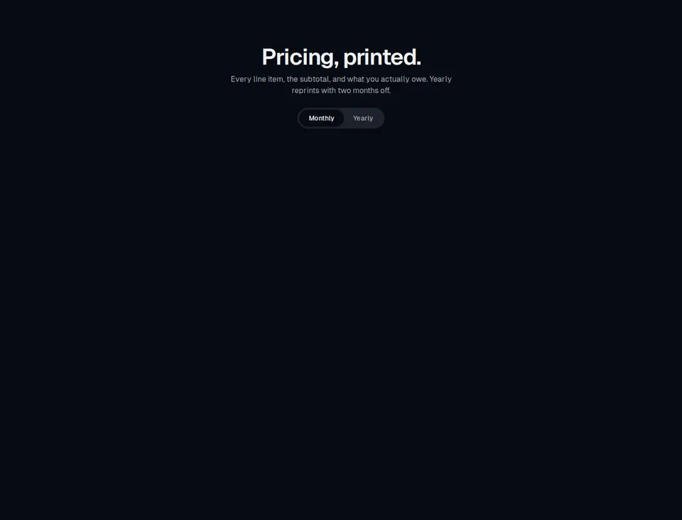
Pricing section that prints each plan as a thermal receipt with a monospace ledger, yearly discount, barcode, and serrated edges.
block
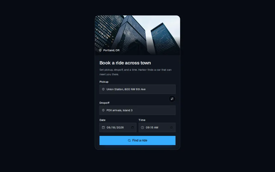
Two-column mobility booking block with a city line, oversized headline, connected pickup and dropoff fields, Today and Now chips, and a price CTA.
block
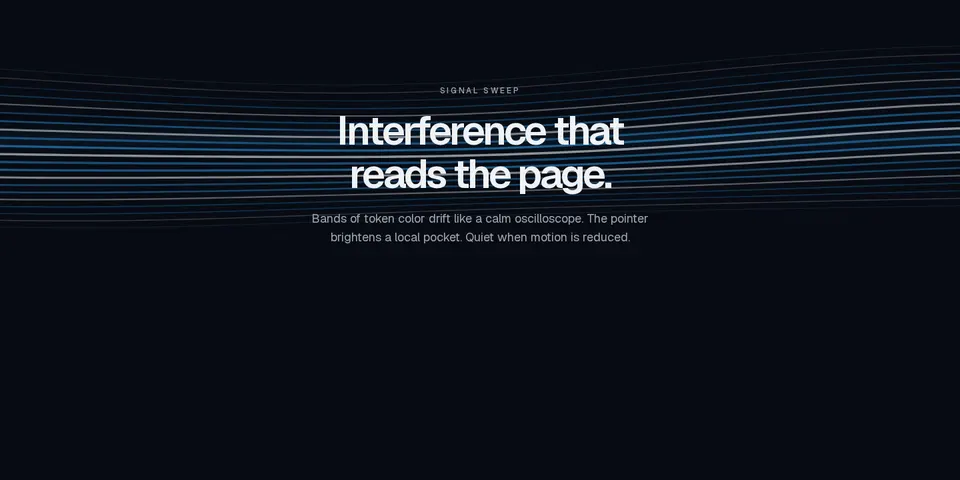
Marketing canvas of interference bands that sweep like an oscilloscope, tinted with semantic tokens and still when motion is reduced.

block
Two opposing display-type rows that crawl sideways and surge when the page is scrolled.

block
Marketing canvas of drifting outlined tiles — square, hexagon, circle, or triangle — that fill on hover and rest when motion is reduced.
block
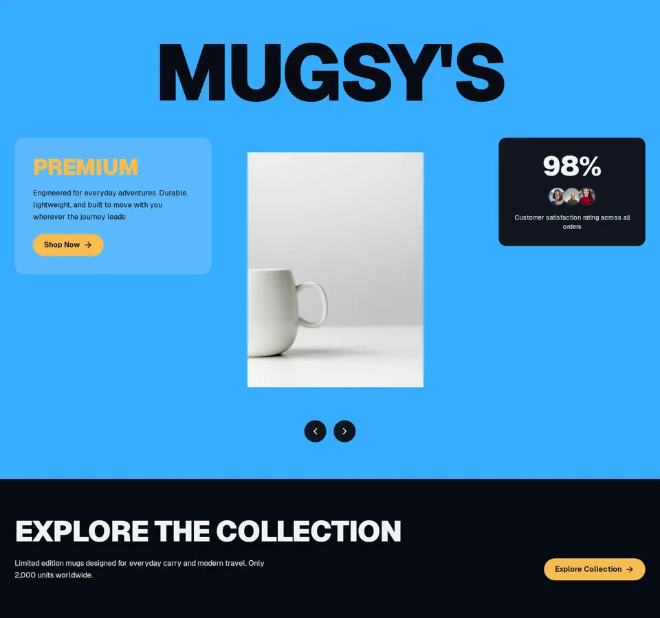
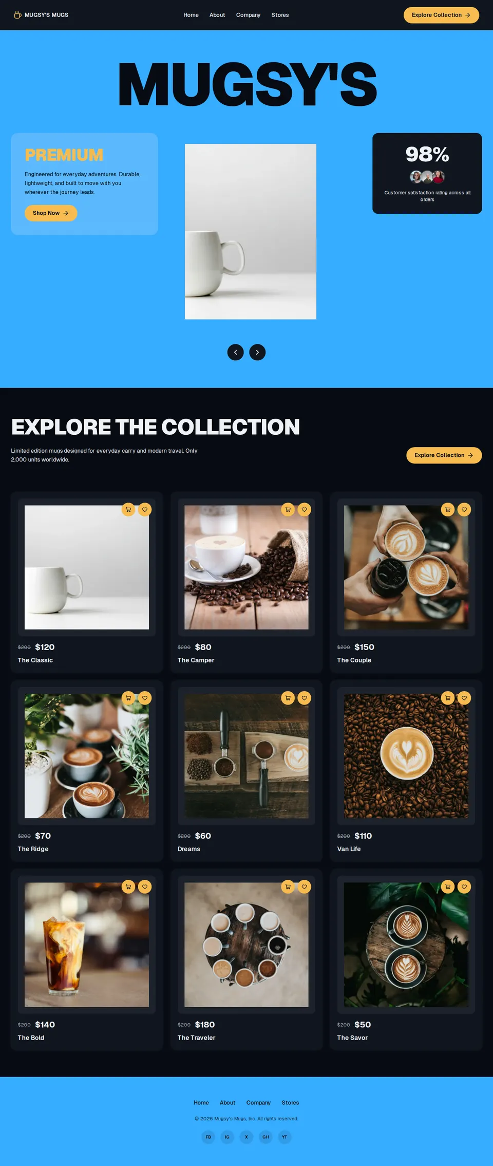
Mugsys collection hero with oversized brand type, premium copy, satisfaction badge, and an Explore the Collection CTA.
block
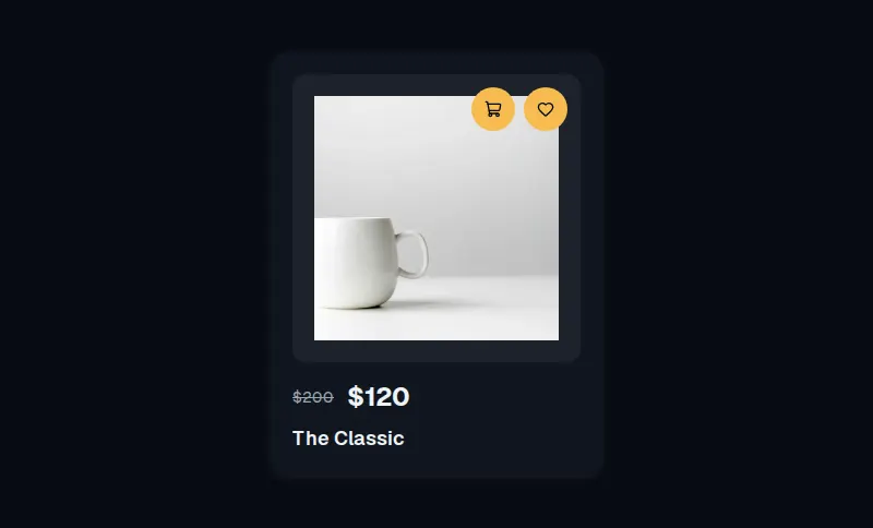
Mugsys-style product tile with a 16px card, square photo, compare-at price, and circular cart and favorite actions.

block
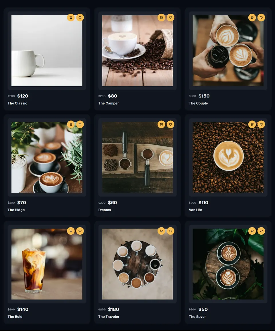
Mugsys store chrome with brand mark, four destination links, a sliding Explore CTA, and a compact mobile menu.
block
Full Mugsys Mugs shopping layout wiring store nav, collection hero, product grid, and footer chrome.
block
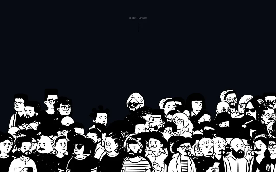
Full-bleed crowd canvas with a centered uppercase label and walking Open Peeps figures along the lower stage.
block
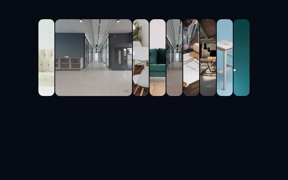
Rounded-3xl hover-expand image rack: idle strips stay 5rem, the active plate opens to 24rem.
block
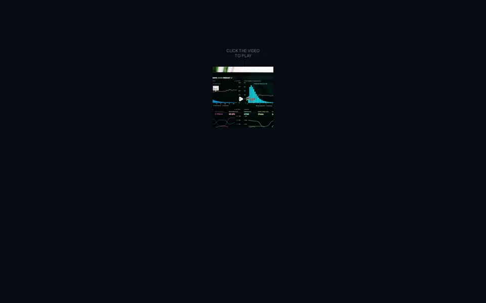
Square looping teaser with a cursor-following Play mark that expands into a full-bleed player overlay.
block
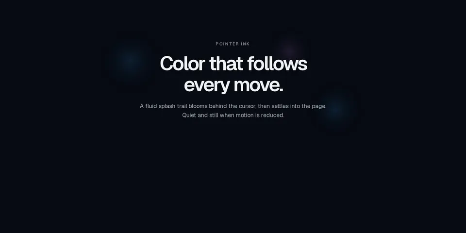
Marketing canvas that trails ink splashes behind the pointer, mixing semantic token colors and staying still when motion is reduced.
block
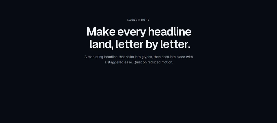
Marketing headline that splits into characters or words and staggers each unit into view, honoring prefers-reduced-motion.
block
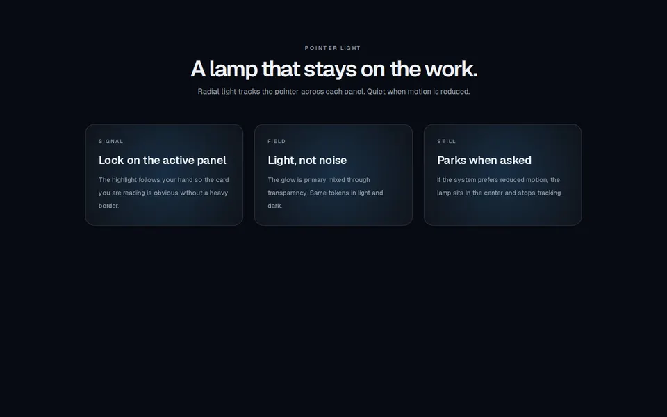
Marketing feature cards with a radial spotlight that tracks the pointer, using semantic tokens in light and dark.
block
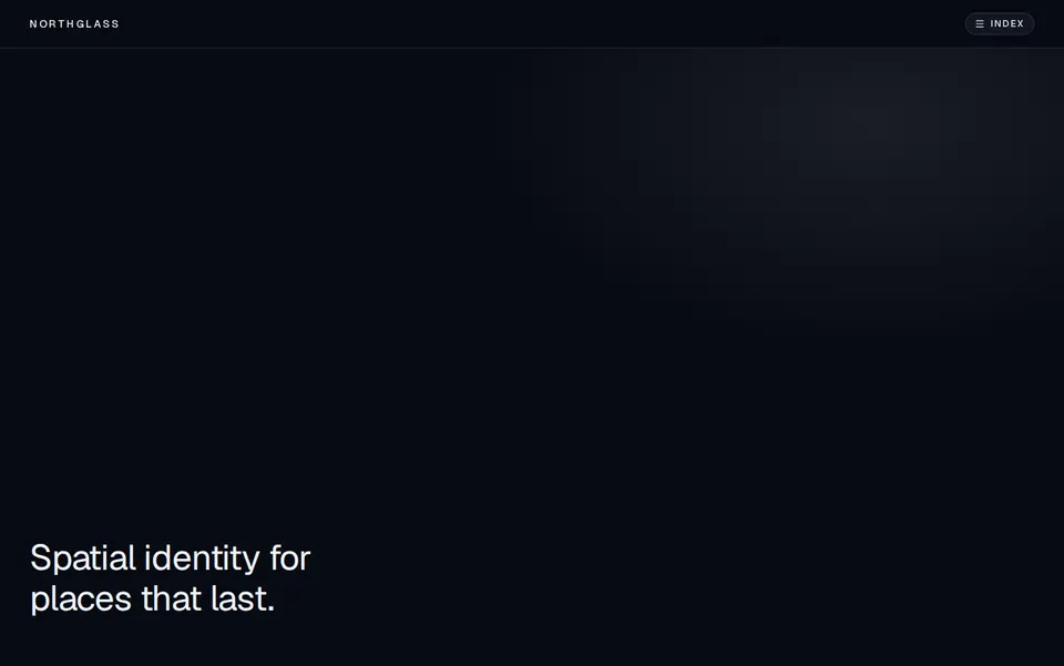
Full-screen kinetic navigation that reveals a typography-heavy overlay from a focused header, with ripple hover on destinations.