 JabKit
block
About11
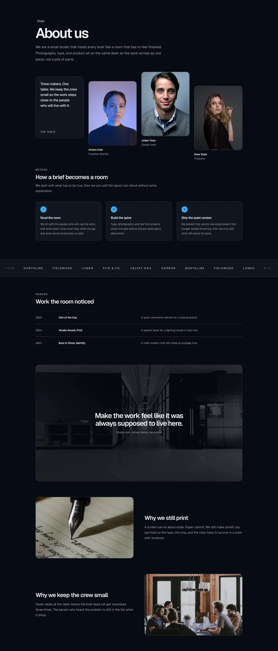
Creative-studio about block with staggered team photos, a process grid, logo marquee, honors table, quote overlay, and two motivation plates.
113 results
Component catalogue
1–24 of 113
block
Creative-studio about block with staggered team photos, a process grid, logo marquee, honors table, quote overlay, and two motivation plates.
block
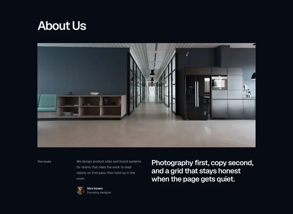
Six-column about block with a large headline, full-width hero image, labeled intro, inline avatar profile, and a philosophy statement.
block
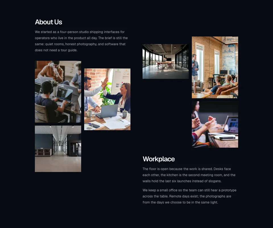
Two-column about section with story copy, a staggered workplace photo grid, and an offset second column of images and paragraphs.
block
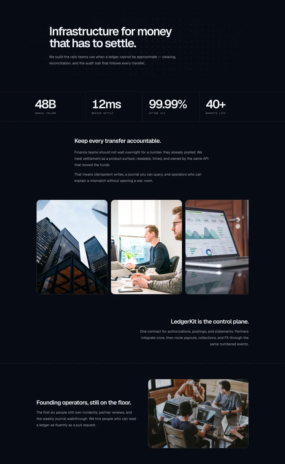
Fintech about section with a plus-sign field, bordered stats, mission copy, a snap image carousel, a right-aligned product note, and a founding-team plate.
block
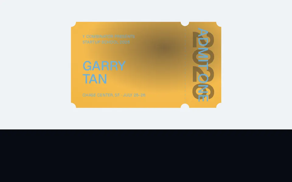
Notched event ticket with a perforated admit-one stub, dithered stock, pointer tilt, and a glare that tracks the pointer.
block
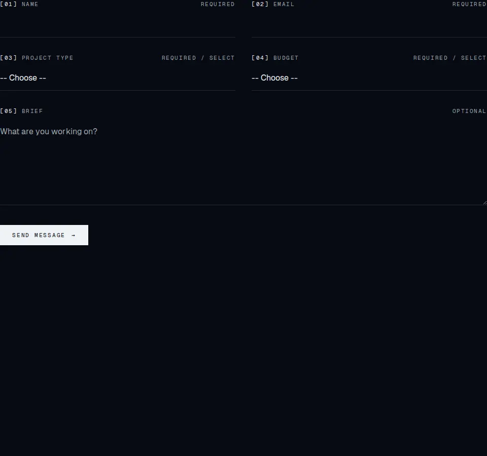
Agency contact form with numbered fields, project and budget selects, and inline validation UX.
block
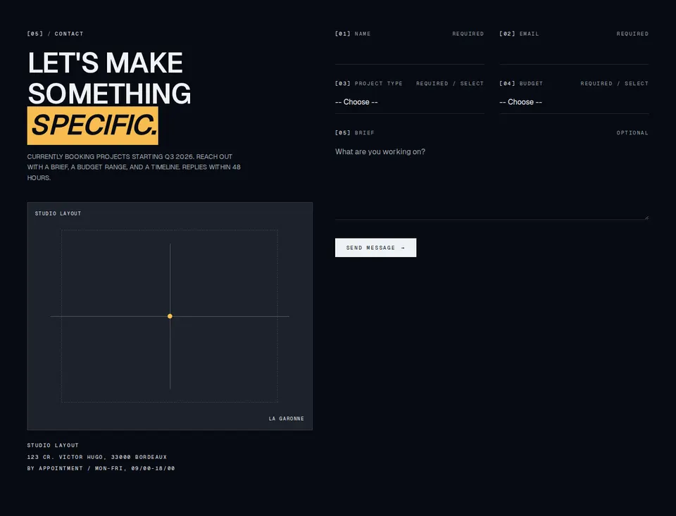
Contact head, studio meta, schematic map, and the agency inquiry form in one section.
block
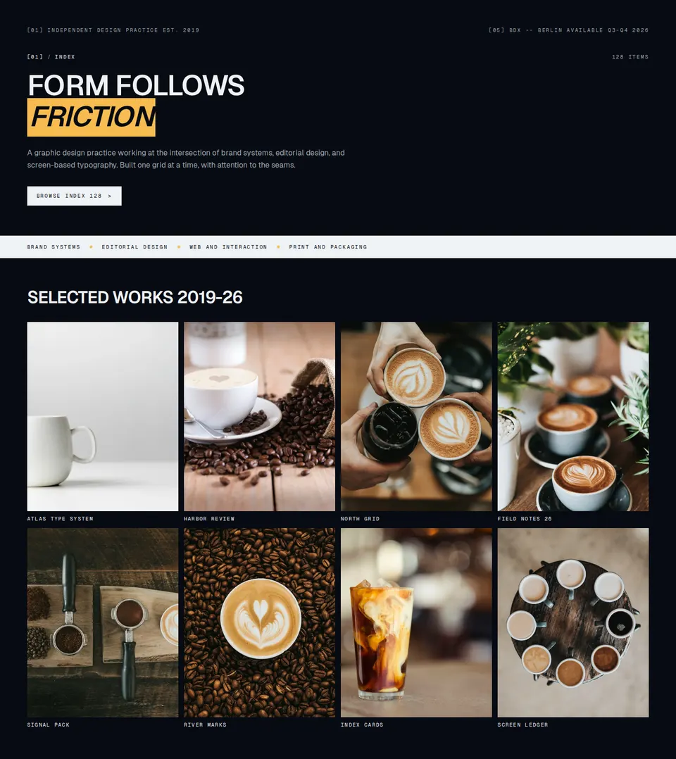
Agency index intro with numbered heading, manifesto copy, category strip, and selected-work grid.
block
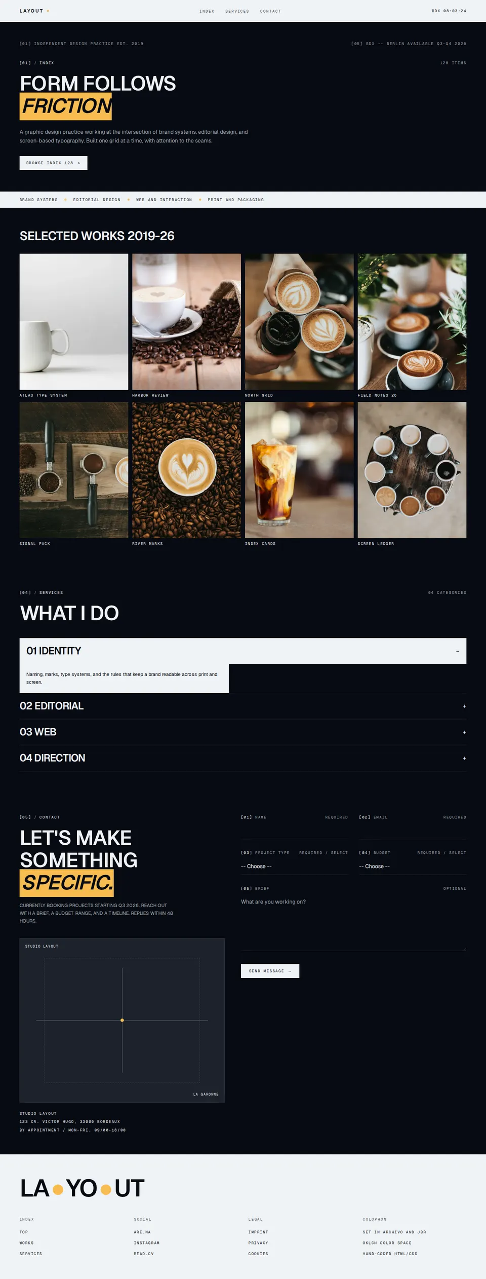
Full LAYOUT agency page wiring topbar, index, services, contact form, and footer chrome.
block
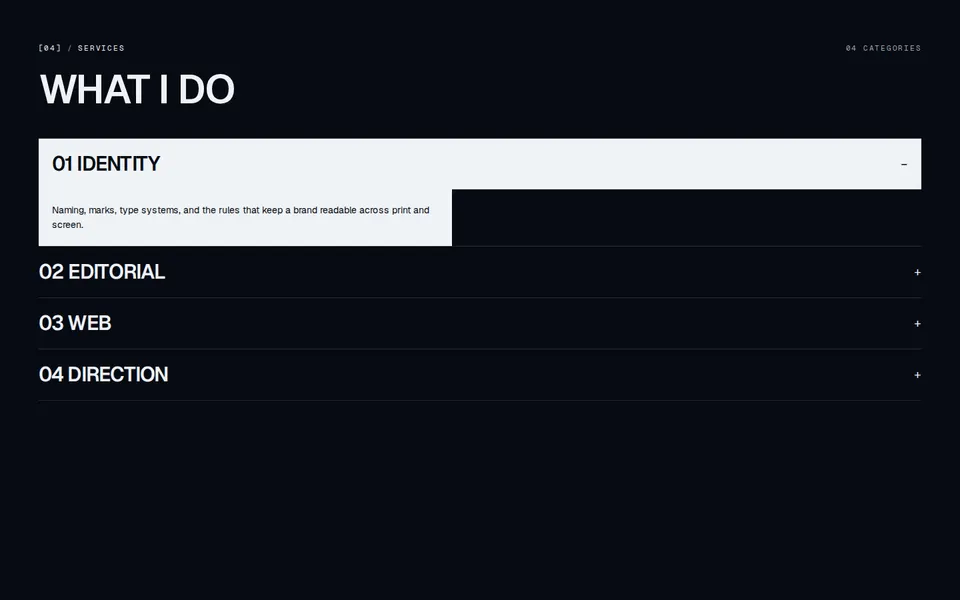
Numbered agency services block with a What I do heading and expandable practice categories.

block
Sticky agency chrome with a LAYOUT brand, primary anchors, and a live local-time clock.

block
Slim launch bar with clipped primary blooms, a small-radius glass CTA, and a dismiss control.
block
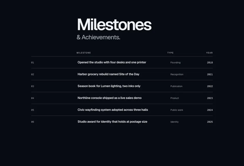
Milestones ledger with a display heading, labeled columns, and separator rows for title, type, and year.
block
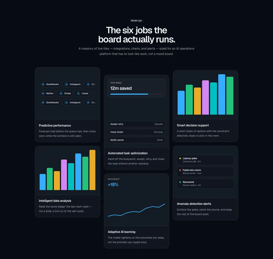
Three-column masonry bento of six bordered cards with integration pills, compact charts, and AI ops illustrations.
block
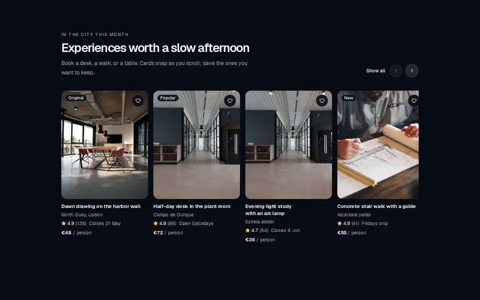
Horizontally scrollable marketing rail of listing cards with image, rating, price, and a favorite control.
block
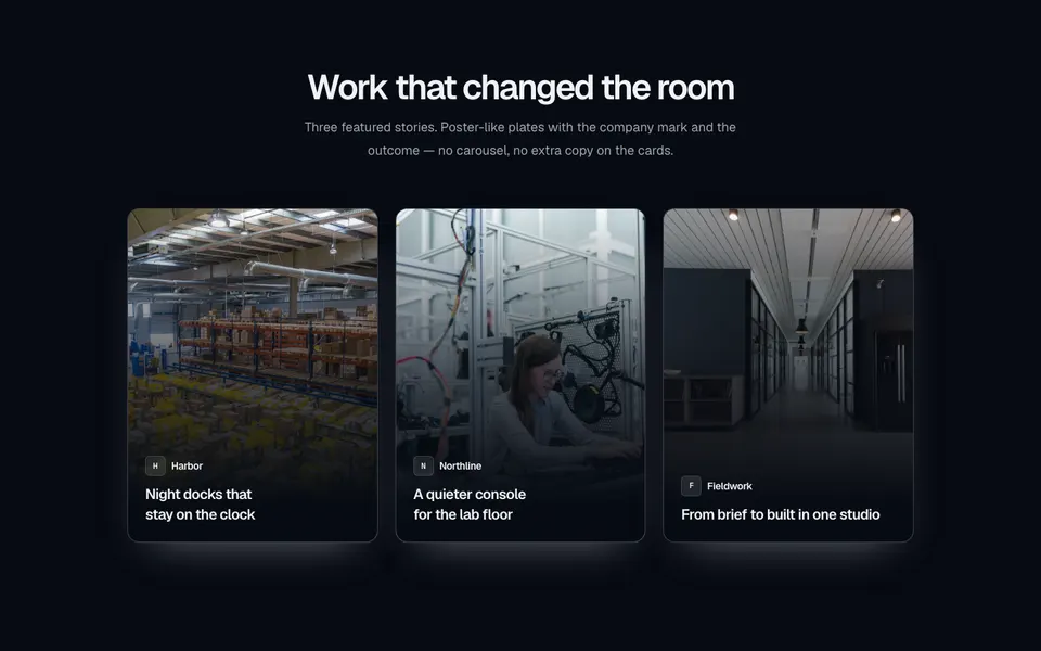
Centered case-study section with a three-column grid of portrait poster cards — full-bleed photography, a bottom gradient, company mark, and title.
block
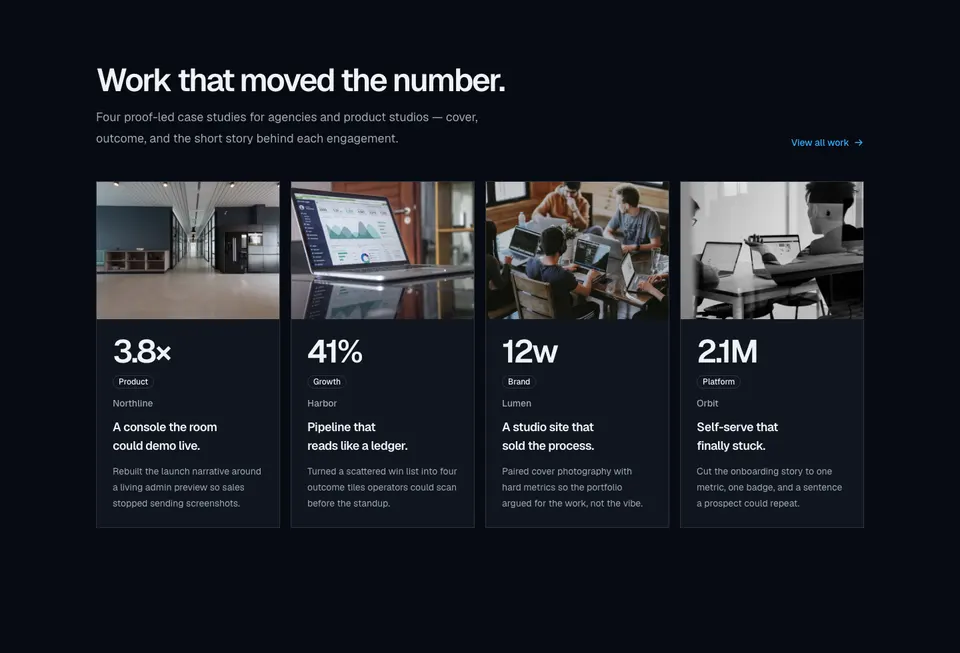
Four-column case-study grid with cover photographs, large outcome metrics, category badges, and short client stories.
block
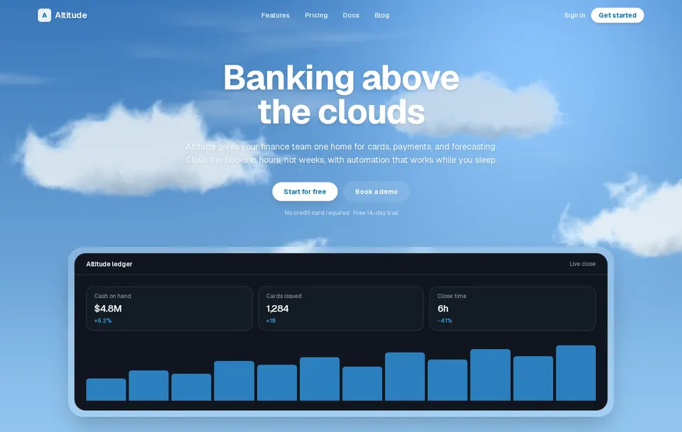
Soft procedural clouds that drift across a sky. Tune speed, count, and colors, then draw any content above the field.
block
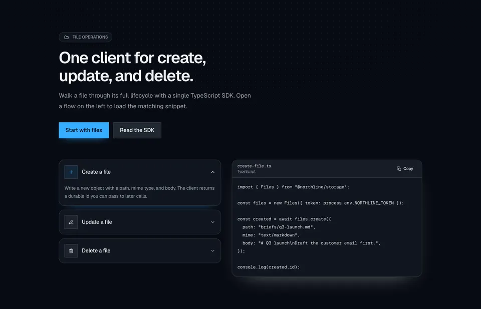
File-ops marketing section with a dotted radial wash, dual CTAs, accordion rows for create/update/delete, and a synced TypeScript snippet with copy.
block
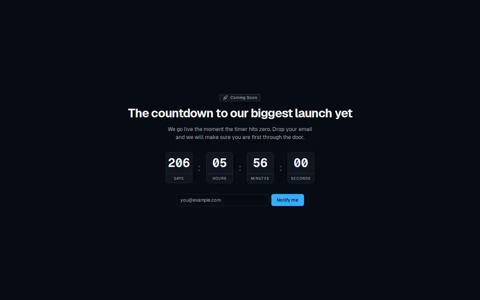
Centered coming-soon page with a live day-hour-minute-second countdown and an email notify form.
block
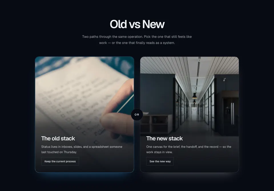
Centered old-versus-new marketing compare with two tall photo cards, bottom scrims, outline actions, and a circular OR chip in the gutter.
block
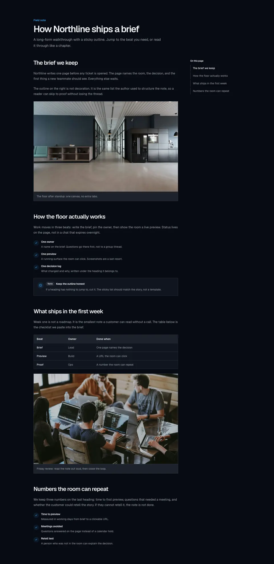
Long-form marketing article with a sticky in-page outline, scroll-linked active sections, and rich body blocks for images, lists, tables, and callouts.
block
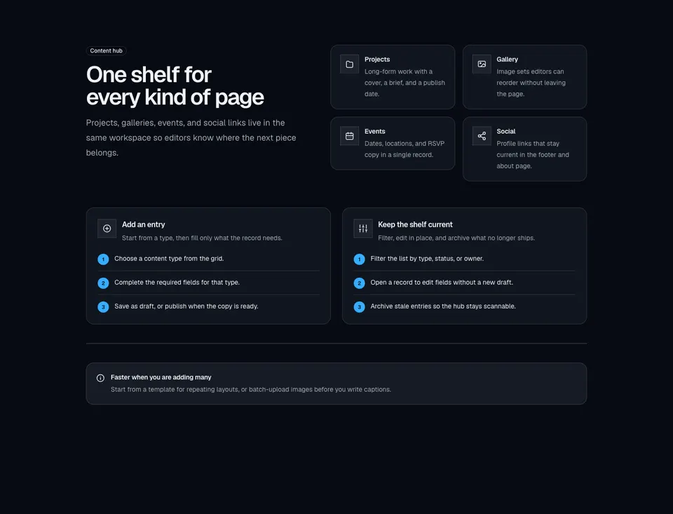
Content-hub explainer with a labeled intro, icon type grid, create and manage how-to panels, and an inline tip alert.
block
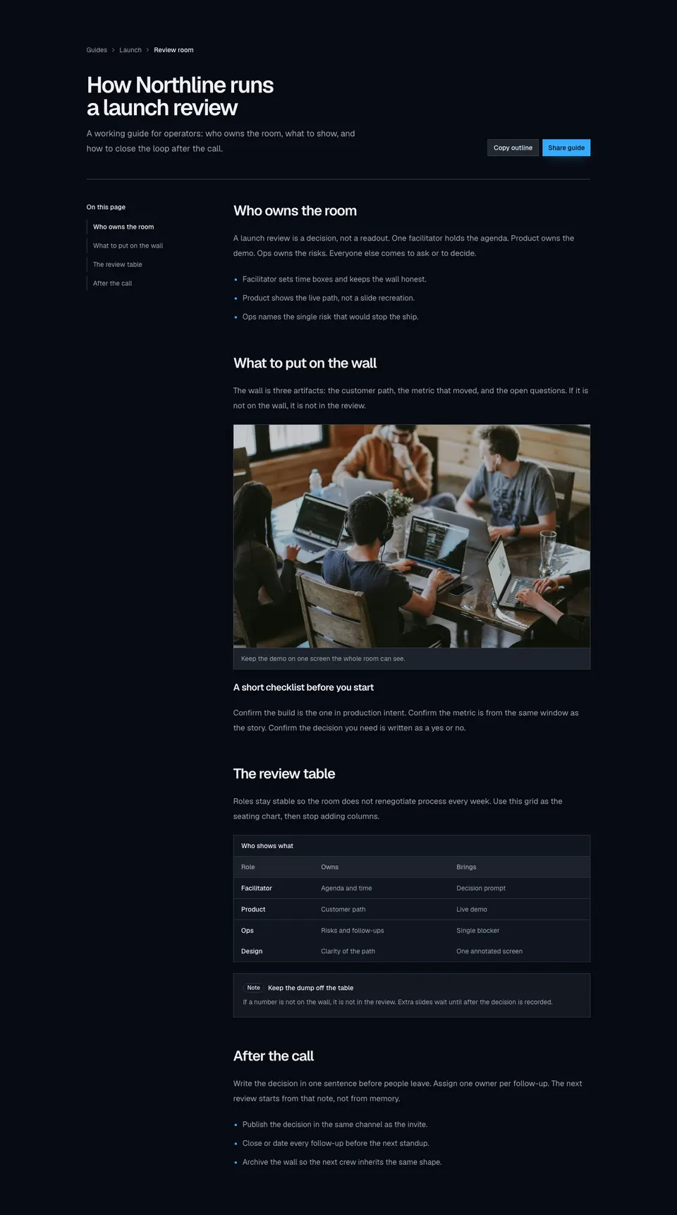
Knowledge-style marketing article with breadcrumbs, headline actions, a sticky topic rail, inline figures, a data table, and a callout.